
When you're building a startup, your website isn't just a digital brochure; it's a growth engine. Think of it as a powerful tool that works around the clock to attract customers, establish your credibility, and ultimately, drive revenue. For any new business, a well-crafted website is your hardest-working employee right from day one.
Why Your Website Is Your Most Valuable Employee

It’s tempting to view your startup's website as just another line item in the budget, but it’s so much more than that. It’s your lead salesperson, your number one brand ambassador, and the very foundation of your credibility in the market. In a world where attention is the most valuable currency, your site is the first handshake you offer a potential customer. It has to be firm, confident, and memorable.
This is especially critical when you realize how quickly people form opinions online. In fact, a staggering 94% of users base their first impression of a business on its website design alone. That judgment happens in a fraction of a second and can be the deciding factor between a visitor sticking around to learn more or bouncing away for good.
Your Digital Storefront
Let’s use an analogy. Imagine your website is a physical storefront. Would you want the entrance to be cluttered, the lighting to be dim, or the signage to be confusing? Of course not. An effective online presence simply applies these same commonsense principles to the digital world.
- Clear Navigation: This is like the brightly lit aisles in your store, guiding visitors effortlessly to exactly what they're looking for.
- Compelling Content: This is your expert sales staff, ready to answer questions and articulate the real value of your products or services.
- Strong Visual Design: This is your store's decor and ambiance, creating a welcoming atmosphere that perfectly reflects your brand's personality.
When these pieces come together harmoniously, they build immediate trust and nudge visitors toward taking action. This intentional design is crucial, and you can explore more about why web design is important to understand its full impact.
For a startup, every single visitor is precious. A thoughtfully designed website ensures you make the most of every interaction, turning casual curiosity into concrete conversions and browsers into brand advocates. It’s an investment that keeps paying dividends long after launch.
In the end, great startup web design isn't just an expense; it's a direct investment in customer acquisition, brand perception, and sustainable growth. The table below breaks down the key pillars every founder needs to focus on to get it right.
The Core Pillars of a Growth-Driven Startup Website
This table offers a quick-look summary of the essential components every founder must prioritize for a successful online presence.
| Pillar | Why It Matters for Your Startup |
|---|---|
| User Experience (UX) | A seamless, intuitive journey keeps users engaged and dramatically reduces the chance they'll leave for a competitor. |
| Clear Value Proposition | Instantly communicates what you do and for whom, capturing attention in those crucial first few seconds. |
| Mobile-First Design | Ensures a flawless experience for the majority of users who will inevitably visit your site on a smartphone. |
| Scalable Foundation | Your site should be built to grow with your business, allowing you to add features without needing a complete overhaul. |
Getting these four pillars right from the start sets a strong foundation, creating an asset that doesn't just look good but actively contributes to your bottom line.
How Much Should a Startup Website Really Cost?
For any startup founder, the budget is king. Every dollar has a job to do, and figuring out how much to spend on a website can feel like a high-stakes guessing game. It’s a classic balancing act: you need to conserve cash, but you also need a website strong enough to actually grow your business. Making the right call here isn't just about saving money today; it's about setting your company up for success tomorrow.
Think of it like getting your first company vehicle. You could buy a cheap, used scooter to get around (the DIY builder), hire a mechanic to customize a reliable van (a freelancer), or lease a fleet of branded trucks (an agency). Each option gets you on the road, but the cost, capabilities, and long-term value are worlds apart.
A classic rookie mistake is getting fixated on the upfront price. The true cost of website design for startups isn't just the invoice for the build. It's the ongoing maintenance, the cost of scaling up, and whether the site can pivot as quickly as your business model does.
Choosing Your Build Path
The single biggest lever on your website budget is how you decide to build it. You’ve got three main paths, and each makes sense for different stages and goals. Let's look at the real-world differences.
- DIY Website Builders: Platforms like Wix, Squarespace, or Shopify are the quickest and cheapest ways to get online. They're perfect for pre-seed startups that just need to validate an idea, throw up a simple marketing page, or launch a basic online store without breaking the bank.
- Hiring a Freelancer: This is your middle-of-the-road option. You get more custom work and deeper expertise than a DIY template, but without the sticker shock of a full agency. It’s a fantastic choice when you need a more polished, unique site but are still operating on a tight budget.
- Partnering with an Agency: This is the premium play. An agency brings a whole team to the table—strategists, designers, developers, project managers. This route is for well-funded startups that need complex features, serious strategic guidance, and a process that’s completely managed for them.
The price gap between these choices is huge. For instance, the average cost for a small business website can run from $2,000 to $9,000, while a DIY site can get started for as little as $16 a month. That massive difference is exactly why so many startups begin with a builder to plant their digital flag. You can dig into more stats around this on Wix's breakdown of small business website costs.
Aligning Your Budget with Your Funding Stage
Your website spend should be a direct reflection of your funding stage. You start lean and then invest more as you secure capital and find that all-important product-market fit.
Don't build a Ferrari of a website before you've even proven people want to buy your car. A simple, effective site that validates your core idea is infinitely more valuable than a gorgeous, expensive one that nobody uses.
Here’s a practical way to think about it:
- Pre-Seed / Bootstrapped: Your one and only goal is validation. Keep the budget minimal, almost certainly under $1,000. A sharp-looking premium template on a DIY builder is your best friend. Focus everything on a crystal-clear value proposition and a single call-to-action.
- Seed Stage: Now you’ve got some funding and need to get traction. Your budget can realistically be in the $3,000 to $15,000 range. This opens the door to a custom design from a skilled freelancer or a small, nimble agency, giving you a stronger brand presence and more specific features.
- Series A and Beyond: With serious capital in the bank, the focus shifts to aggressive scaling. Here, the budget can easily be $20,000+. This level of investment gets you a full-service agency, advanced custom functionality, deep user research, and the ongoing optimization needed to support a booming user base.
When you match your spending to your startup’s maturity, your website stops being an expense. It becomes a smart, calculated investment in growth.
Building Your Minimum Viable Website
Before you even think about building that perfect, all-singing, all-dancing website, you need to launch something much leaner. This is the whole idea behind a Minimum Viable Product (MVP) website. It’s not about being cheap or cutting corners; it's about being smart. You focus only on the essential features needed to see if your idea has legs, gather real-world feedback, and start bringing in leads—all without burning through your precious time and capital.
Think of it like a movie trailer. A good trailer doesn't give away the entire film. Instead, it hits you with the most exciting plot points, introduces the main players, and leaves you wanting more. Your MVP website does the exact same thing for your startup: it presents your core value and convinces visitors to take that next step.
Nailing the Essentials Above the Fold
The second someone lands on your homepage, a stopwatch starts. You have just a few seconds to grab their attention. That initial screen, the part they see without scrolling—what we call "above the fold"—is your most valuable piece of digital real estate.
Your number one job here is to deliver a killer value proposition. This is a short, punchy statement that immediately answers three questions for your visitor:
- What do you actually do?
- Who is this for?
- Why should they care?
A vague or confusing value proposition is the fastest way to send a potential customer packing. A fintech startup’s homepage can't just say "Financial Solutions." It needs to be specific, like: "The Easiest Way for Freelancers to Manage Invoices and Get Paid Faster." For an MVP, that kind of clarity is everything.
Designing an Intuitive User Journey
Once you've hooked them with your value proposition, you need to show them the way. This is where simple, intuitive navigation is key. An MVP website should have a logical, almost predictable, structure. A visitor should never have to hunt for information.
With an MVP, less is almost always more. Fight the urge to add every page you can think of. A clean navigation menu with just the essentials—like "Features," "Pricing," and "About Us"—creates a smooth, frictionless path for users, helping them understand what you offer without feeling overwhelmed.
The image below shows how even in the earliest wireframing stages, the goal is to map out this journey on paper before a single line of code is ever written.
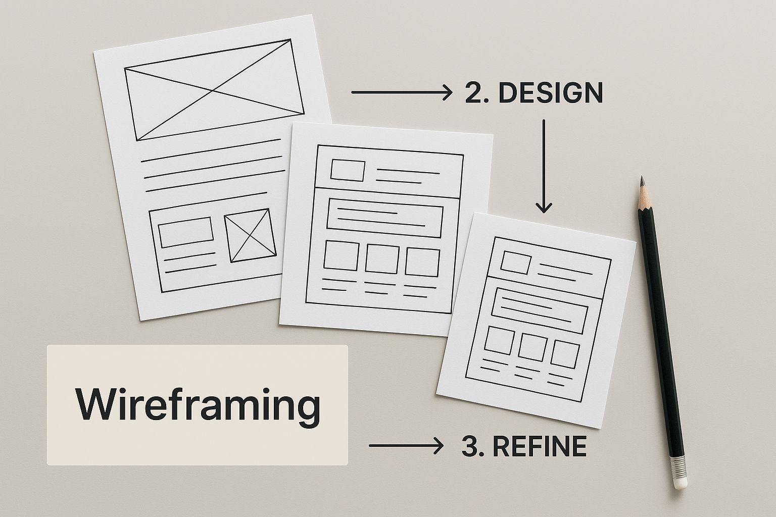
This wireframing process forces you to think through the user's flow, making sure every single element has a clear purpose and guides them toward that all-important conversion.
The Power of a Single, Compelling Call-to-Action
Every page on your MVP site needs a job to do, and that job usually ends with a Call-to-Action (CTA). This is the one specific action you want your visitor to take. For an early-stage startup, it's almost always about generating a lead or making that first sale.
Don't muddy the waters by cluttering your pages with competing CTAs. Instead, zero in on a primary CTA that directly supports your main business goal.
- For a SaaS startup: Your main CTA will likely be "Start Your Free Trial" or "Request a Demo."
- For an e-commerce brand: It's all about "Shop Now" or "Add to Cart."
- For a service-based business: "Get a Free Quote" or "Schedule a Consultation" are your money-makers.
These CTAs are where the magic happens; they turn passive browsers into active leads and paying customers. To get a deeper dive into the entire process, from initial idea to a fully launched site, check out this excellent guide on website development for startups.
As you think about how to build your site efficiently, it pays to explore different platforms. Comparing tools and their features, like in this review of the best Notion website builder tools, can help you land on a solution that fits both your MVP needs and your budget.
By focusing on these core elements—a strong value proposition, simple navigation, and a clear CTA—your MVP website becomes a lean, mean, validation machine, ready to prove your startup's potential in the real world.
Designing for Future Growth and Performance
A website isn't a one-and-done project. What looks great on launch day can quickly become a digital ball and chain if you don't build it for the future. I've seen it happen too many times: a startup's site works perfectly for the first few months, but crumbles the moment they try to scale or handle a sudden spike in traffic.
Thinking about growth from day one is like pouring the foundation for a skyscraper. You have to engineer it to support every floor you plan to add later. If you don't, you're setting yourself up for a costly, disruptive teardown right when your business should be taking off. This means picking the right tech, designing for flexibility, and being obsessive about performance.
Choosing a Scalable Tech Stack
The technology powering your website is what ultimately decides its limits. A tech stack that's fine for a simple MVP can quickly turn into a bottleneck when you're ready to add complex features or your user base explodes. You need a foundation that grows with you, not against you.
For many startups, this means leaning on a platform known for its massive ecosystem and flexibility. A great example is WordPress. It’s so popular because it can start as a simple five-page site and evolve into a full-blown e-commerce machine or membership portal. Its real strength lies in the vast library of plugins and themes that allow for near-limitless expansion. This adaptability is why it powers such a huge chunk of the internet and why many developers can turn around projects in under a month—a critical advantage when you need to get to market fast.
A scalable tech stack is one that says "yes" to your future ideas. Whether you need to add an e-commerce store, a customer portal, or API integrations, your underlying technology should enable progress, not block it.
The Value of Modular Design
Forget about building rigid, static pages. The smart way to design is with a modular approach. This means creating a library of reusable components—things like testimonial blocks, feature grids, or call-to-action banners—that you can mix and match.
Think of it like playing with LEGOs. Once you have a collection of versatile bricks, you can assemble, rearrange, and build new pages on the fly without calling a developer for every tiny tweak. This isn't just a neat trick; it's a strategic advantage.
- Speed and Agility: You can spin up new landing pages for marketing campaigns in hours, not weeks.
- Brand Consistency: Every page you create, new or old, automatically maintains a consistent look and feel.
- Cost-Effectiveness: It empowers your marketing team to make updates themselves, drastically cutting down on long-term development costs.
When your website is built this way, you're not just launching a site; you're building a system. For those running online stores, this is where you can start weaving in a comprehensive e-commerce growth strategy to ensure your site can handle more products and customers down the line.
Why Site Speed Is a Business Metric
Let's be clear: in the startup world, website speed isn't a technical nicety. It's a core business metric that directly impacts your bottom line. A slow website bleeds money. It frustrates users, kills conversions, and even hurts your Google rankings. Consider this: a single one-second delay in page load time can lead to a 7% reduction in conversions. For a cash-strapped startup, that's a wound you can't afford.
Optimizing for performance isn't optional; it's essential for growth. Here are a few must-do's to keep your site snappy:
- Compress Your Images: Giant, unoptimized images are the number one cause of slow websites. Use tools to shrink their file size before you upload them. It makes a massive difference.
- Utilize Browser Caching: Caching tells a visitor's browser to save parts of your site, like your logo and core files. When they return, the site loads almost instantly because it doesn't have to fetch everything all over again.
- Minimize Your Code: Clean, efficient code (HTML, CSS, JavaScript) just runs faster. This means getting rid of clunky plugins, unused scripts, and anything else weighing your site down.
When you build a scalable foundation with a flexible design and a relentless focus on performance, you get more than just a website. You get a growth engine, ready for whatever comes next.
Translating Your Brand Into a Digital Experience
Your brand isn't just a logo and a handful of colors. It’s the gut feeling people have when they hear your company's name. Your website’s job is to take that feeling and give it a digital home, turning abstract concepts like your mission and values into something people can actually see, click, and connect with.
This is where a good website becomes a great one. A truly effective startup site tells your story without needing a single paragraph of "About Us." It's a carefully choreographed dance of visuals, words, and interactions that makes a visitor feel like you get them. Nail this, and you’re not just building a website; you're building trust and recognition from the moment someone lands on your page.
More Than Just a Pretty Face
Translating your brand effectively goes much deeper than just making things look nice. It's about injecting your startup's personality into every pixel. A great way to think about it is to ask: if my brand were a person, what would they be like? Fun and a bit quirky? Serious and reliable? The answer to that question should guide every design choice you make.
To really get this right, you need to explore comprehensive web design principles that balance both how a site looks and how it works. This ensures your website doesn't just wear the right outfit but also acts in a way that’s true to your brand's character.
Your website should feel like a natural extension of your brand’s personality. Every button, every font, and every image should work together to communicate who you are and why it matters.
Building Your Digital Style Guide
Consistency is the secret sauce to a memorable brand. Without it, your message gets muddled. This is where a digital style guide becomes your best friend—it's a simple rulebook for your website's look and feel, making sure everything from the homepage to the contact form feels like it came from the same team.
Your style guide should cover a few key areas:
- Typography: Pick one or two font families that truly reflect your brand’s voice. A traditional serif font can feel established and authoritative, whereas a clean sans-serif often feels more modern and approachable. Define specific sizes and weights for everything—headings, body copy, and links.
- Color Palette: Don't just stick to your logo color. Define a full palette with primary, secondary, and accent colors. Then, give each color a job. For example, maybe your bright accent color is only used for call-to-action buttons to make them pop.
- Imagery & Iconography: Settle on a consistent visual style. Are you using vibrant, optimistic photos of real people, or are you going for sleek, minimalist product shots? A unified approach here makes your brand instantly recognizable.
Tone of Voice and Micro-Interactions
Your brand's personality shines through in your words, too. A consistent tone of voice is essential, from the headline on your homepage to the text on a "submit" button. A playful startup might use emojis and casual language, while a B2B software company will likely lean into a more professional, direct tone.
Don't forget the little things, either. Micro-interactions are those tiny, satisfying animations that provide feedback—a button that subtly changes color when you hover over it or a checkmark that animates after a successful form submission. These details add a layer of polish and personality, making the whole experience feel more thoughtful and human.
This whole process is foundational to building a strong digital presence. For a more detailed guide on this, our post on how to create a brand identity offers a complete framework. By thoughtfully weaving your brand into every part of your website design for startups, you’ll do more than attract visitors—you’ll create advocates who feel a genuine connection to your mission.
Measuring What Matters for Website Growth
A stunning website is great, but if it isn't driving results, it's just an expensive brochure. Once your startup site goes live, the real work starts. It’s time to look past the aesthetics and get serious about what your site actually achieves. This means cutting through the vanity metrics and focusing on the numbers that signal real business health and sustainable growth.
Think of your website as a new hire. You wouldn't judge their performance on their outfit, would you? Of course not. You'd measure their output, their impact, and their contribution to the company's goals. The same logic applies here. Clicks and page views might give you a temporary ego boost, but they don't keep the lights on. The mission is to turn your site from a static digital billboard into a data-driven engine that powers your startup forward.
Setting Up Your Analytics Foundation
Before you can measure anything, you need the right tools wired up. Your very first move should be installing a solid analytics platform. For nearly every startup, this is going to be Google Analytics 4 (GA4). It’s the industry standard for a reason: it's free, incredibly powerful, and gives you a deep understanding of how people actually behave on your site.
Getting your analytics set up is a Day Zero task. Seriously. Without this data, you’re flying blind and making critical business decisions based on gut feelings instead of hard evidence. The insights you'll gather will illuminate where you're winning and, more importantly, where you're losing potential customers.
Moving Beyond Vanity Metrics
It's incredibly easy to get obsessed with numbers that look impressive on a chart but mean very little for your bottom line. We call these vanity metrics. A big spike in traffic feels great, but it’s completely hollow if none of those visitors stick around or take action. True performance is measured by what people do, not just how many show up.
A thousand visitors who bounce in three seconds are worth less than five visitors who sign up for your free trial. Your focus should always be on the metrics that tie directly to your core business objectives.
Instead of chasing empty numbers, shift your attention to Key Performance Indicators (KPIs) that tell the true story of your business's health.
- Conversion Rate: This is the big one. It’s the percentage of visitors who complete a goal—whether that's making a purchase, signing up for your newsletter, or booking a demo. A rising conversion rate is the clearest sign that your website is effectively turning traffic into tangible business value.
- User Engagement: This tells you if people actually like what they see. Key metrics here include average session duration and pages per session. When engagement is high, it means your content is hitting the mark and your user experience is keeping people interested.
- Customer Lifetime Value (CLV): For any startup with a subscription or repeat-purchase model, CLV is king. It estimates the total revenue you can expect from a single customer over their entire relationship with you. A website that attracts high-CLV customers is an engine for long-term, predictable profitability.
The Power of A/B Testing
Once you’re tracking the right KPIs, you can start making them better. The most reliable way to do this is through A/B testing, sometimes called split testing. It's a straightforward but powerful experiment where you pit two versions of a webpage against each other to see which one performs better.
For instance, you could test two different headlines on your homepage. The goal? To see which one gets more people to click through to your pricing page. By changing just one thing at a time and measuring the results, you can make informed decisions that create a compounding effect. This constant cycle of testing, learning, and refining is how you take your website design for startups from good to great, ensuring it's always working as hard as you are.
Frequently Asked Questions About Startup Web Design
Jumping into web design for a new startup naturally brings up a lot of questions. I get it. Let’s cut through the noise and tackle some of the most common concerns founders have when building their digital presence for the first time.
How Much Should a Startup Really Spend on a Website?
There's no single price tag, and honestly, you should focus more on the value you're getting than the cost itself. If you're at the pre-seed stage, you can get a surprisingly professional-looking site using a premium template on a builder for less than $100 a month. The goal here is to validate your idea without burning through precious cash.
Once you've secured seed funding, your budget can expand. It's common for startups at this stage to invest anywhere from $5,000 to $15,000 for a more tailored website built by a freelancer or a small agency. Your budget should always reflect your funding stage and immediate business goals, whether that's simply testing the waters or aggressively pursuing user growth.
Should I Use a Template or Build a Custom Website?
For the vast majority of early-stage startups, a well-chosen, high-quality template is the smartest move. It offers the perfect blend of speed and affordability, getting you to market quickly without the hefty price tag of a fully custom build. You can still infuse your brand's personality and get a professional result without the long, drawn-out timeline.
A completely custom website is a fantastic asset, but it makes the most sense after you’ve found product-market fit. At that point, you’ll likely need unique features or complex integrations that a template just can't handle. Until then, sticking with a template is the leaner, more strategic choice.
Your homepage is, without a doubt, the most critical page on your entire website. Think of it as your digital front door. It has mere seconds to tell a visitor: What do you do? Who is this for? And why on earth should they care? If you can't nail that, they're gone.
How Soon Do I Need to Think About SEO?
From the absolute beginning. Day one. Good Search Engine Optimization isn't something you can just bolt on later; it needs to be woven into the very fabric of your site from the start.
This means getting the fundamentals right before you even launch.
- Mobile-first design: Your site must be flawless on a smartphone. No exceptions.
- Fast load times: Slow pages bleed visitors. Speed is a feature.
- Clean URL structures: They should be simple enough for a human to read and a search engine to understand.
- Basic on-page SEO: This includes clear page titles and meta descriptions that accurately summarize your content.
Building on this solid foundation from the get-go will give you a major leg up and set the stage for sustainable traffic down the road.
Ready to build a startup website that doesn’t just look sharp but actually fuels your growth? The team at Sugar Pixels lives and breathes this stuff, creating custom, performance-focused digital experiences for businesses just like yours. We’ll sweat the technical details so you can stay focused on your vision. Start your project with us today!