The correct facebook event cover size for 2026 is 1920 x 1005 pixels with a 1.91:1 aspect ratio. If your cover is built at any other shape, especially an older 1920 x 1080 layout, Facebook is more likely to crop it in ways that cut off important content.
If you're reading this, there's a good chance you've already designed a cover that looked clean in Canva or Photoshop, then uploaded it and watched Facebook trim the top, bottom, or sides in all the wrong places. That happens constantly with event graphics because the canvas can look fine in your design file but break once Facebook adapts it for different screens.
The fix isn't complicated. Use the correct canvas, keep critical content centered, export the right file type, and check the final result on both desktop and mobile. If you want a second opinion alongside this guide, PostOnce has a useful ultimate Facebook Event Cover Size Guide that pairs well with a practical production workflow.
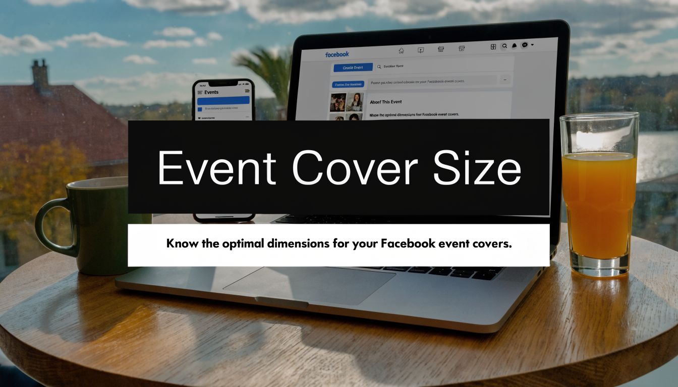
Your Guide to the Perfect Facebook Event Cover
A facebook event cover isn't just decoration. It does the job of a poster, headline, and first impression all at once.
Most bad event covers fail in predictable ways. The image is too short, too tall, too small, or the text sits too close to the edge. Then Facebook crops it, enlarges it, or compresses it, and the final result looks sloppy even when the original design was strong.
The right approach is simple:
- Start with the exact canvas: Build at 1920 x 1005 pixels.
- Design for cropping: Keep the event name, date, and any key visual in the center area.
- Export for clarity: Choose a file type that fits the kind of artwork you're using.
- Check the live version: Always preview the uploaded image on a phone and desktop screen.
Practical rule: If a date, logo, or call to action matters, don't place it near the outer edges of the cover.
That small discipline saves time, avoids rework, and keeps the event page looking professional from the first publish.
Quick Reference The Official Facebook Event Specs
If you just need the specs and want to get back into your design tool, use this table.
Facebook Event Cover Photo Specifications 2026
| Specification | Recommendation |
|---|---|
| Recommended size | 1920 x 1005 pixels |
| Aspect ratio | 1.91:1 |
| Minimum accepted size | 1200 x 628 pixels |
| Best file types | JPG or PNG |
| Max file size | Under 50MB |
| Total pixel limit | Under 250 million total pixels |
| WebP support | Supported for static files |
| Best layout approach | Keep critical content centered |
A few practical notes matter here.
- Use the recommended size, not the minimum: Facebook accepts smaller files, but smaller artwork is more likely to look soft after upload.
- Keep the ratio correct: Even large images can crop badly if the shape is off.
- Stick with common formats: JPG and PNG are the safest choices for routine event design work.
If you're building templates for a team, save one locked master file at the correct dimensions so nobody has to guess.
Understanding the Correct 2026 Dimensions and Aspect Ratio
Facebook's current standard isn't arbitrary. It changed because the old one created avoidable problems on phones.
The official Facebook event cover photo size is 1920 x 1005 pixels with a 1.91:1 aspect ratio, established around June 1, 2024, shifting away from the previous 1920 x 1080 pixels format to better suit mobile viewing, where over 70% of event views occur. That update was made to reduce unwanted cropping on smaller screens, according to Evergreen Feed's breakdown of the official Facebook event cover photo size update.

Why the old size stopped working
Designers used to default to 1920 x 1080 because it matched a familiar widescreen layout. In practice, that extra height became a problem once Facebook prioritized mobile display. More vertical space in the source image meant more chances for the top and bottom to get trimmed.
That’s why older templates often look fine on a desktop preview but awkward on a phone. The design wasn't wrong by traditional standards. It was wrong for the way Facebook now presents event covers.
What the new aspect ratio changes
The 1.91:1 format gives you a slightly shorter canvas. That forces a cleaner composition and reduces the chance that decorative space above or below your main message gets chopped off.
The current standard rewards tighter composition. That's good for readability, especially when someone sees the event for the first time on a phone.
If you're still using an old branded template, update it now. Reusing legacy artwork is one of the easiest ways to create preventable display issues.
Mastering the Mobile and Desktop Safe Zones
The canvas size tells you how big the file should be. Safe zones tell you where your content should sit.
On desktop, Facebook can show the full banner area. On mobile, the view is tighter and more selective. That means the center of the image does the heavy lifting. If your event title lives on the far left, or your date sits too high, you’re taking a gamble.

Where to place the important content
Use the cover like a layered layout:
- Outer canvas: This is the full design space.
- Desktop area: Useful for secondary visuals and background composition.
- Mobile-focused center: The headline, date, and brand cue belong here.
- Critical safe zone: Treat the middle band as mandatory space for anything essential.
A practical mobile-first mindset helps here. If you need a deeper primer on that approach, this guide on mobile-first design explains the broader principle well.
What works in real layouts
Good event covers usually share these traits:
- One focal point. A speaker image, product visual, or strong background texture.
- Short text blocks. Event title first, then the most necessary supporting detail.
- Centered hierarchy. The eye lands in the middle, and the message is still readable when the view tightens.
The video below gives a useful visual walkthrough before you finalize placement.
Keep decorative elements near the edges. Keep business-critical information in the middle.
That one rule solves most facebook event cover size problems before they happen.
Recommended File Types and Export Settings
Once the canvas is right, export settings decide whether the upload stays crisp or falls apart.
Facebook supports multiple formats, but the safest routine is still JPG or PNG. According to Postfast's overview of Facebook Event cover photo specifications, Facebook keeps file limits under 50MB and 250 million total pixels, supports WebP for static files, and older 1920 x 1080 images can crop 7-8% vertically on mobile. That’s why 1920 x 1005 in JPG or PNG remains the safest setup.

JPG versus PNG
Use JPG when the cover is mostly photographic. It keeps file size manageable and usually performs well for image-heavy banners.
Use PNG when the design includes:
- Sharp text
- Logos
- Flat color blocks
- Graphic overlays
PNG often preserves edges and typography more cleanly, which matters when your event cover includes readable details.
Export settings that usually work
In Canva, Photoshop, and Figma, keep the process straightforward:
- Match the canvas exactly: Export at the design's native dimensions.
- Use sRGB: It reduces color surprises across screens.
- Avoid repeated re-exports: Every round of compression can soften the file.
- Start from a strong source image: If your original asset is too small, quality problems show up fast.
If your source photo is weak, fix that before layout. This walkthrough on how to upscale an image in Photoshop without losing quality is useful when you're working with a photo that isn't large enough for the final canvas.
How to Create and Upload Your Event Cover Photo
Uploading the file is easy. The mistakes usually happen right before or right after that step.
Simple upload workflow
Create the cover in your design tool
Build the file at the correct canvas size and export it as JPG or PNG.Open the Facebook event page
Go to the event you’re editing and locate the cover photo area.Choose the cover edit option
Facebook will give you an upload or edit prompt in the header area.Upload the finished image
Select the exported file from your computer.Check positioning
If Facebook offers repositioning, use it carefully. A properly built file usually needs little or no adjustment.
Final review before you leave it live
After upload, do two checks:
- Desktop check: Make sure the composition still feels balanced.
- Phone check: Confirm the key text remains visible and readable.
If the image needs dramatic repositioning after upload, that's usually a sign the design wasn't built for the right crop behavior in the first place.
A clean upload should feel boring. If you're fighting the crop tool, go back to the source file and fix the layout there.
That takes longer once, but it's faster than patching a flawed cover every time you promote an event.
Common Mistakes to Avoid with Your Event Cover
Most event cover issues aren't technical mysteries. They're production mistakes.
The errors that cause the most trouble
Using an old template
Legacy layouts often place text too high or too low, which creates trouble once Facebook trims the view.Designing with edge-heavy composition
Wide banners tempt people to spread content across the full width. That looks polished in a design file but breaks quickly on mobile.Starting with a low-quality source image
If the original photo is soft, noisy, or undersized, the uploaded cover won't magically improve.Adding too much text
Even if everything technically fits, crowded text blocks make the cover harder to read at a glance.
What usually works better
A stronger event cover is often simpler than people expect. Use one dominant visual, one clear headline, and only the supporting details that genuinely need to appear on the image itself.
Another common mistake is treating the cover like a flyer. A Facebook event page already contains the event details elsewhere on the page. The cover should attract attention and orient the viewer, not carry every line of information you have.
If the design feels busy before upload, it will usually feel worse once compressed and viewed on a phone.
Troubleshooting Common Upload and Display Issues
When a facebook event cover size issue shows up after upload, the fix is usually straightforward if you diagnose the right problem.
My image looks blurry
This usually comes from one of three things: the source image was too weak, the file was exported too aggressively, or the uploaded image was smaller than ideal.
Try this:
- Re-export from the original design file
- Use PNG if the cover contains text-heavy graphics
- Replace low-resolution source photos before exporting again
Facebook won't accept my file
When this happens, the file itself is usually the issue.
Check for:
- Unsupported or awkward export format
- Excessive file size
- Corrupt file export from the design tool
A fresh export as JPG or PNG usually solves it.
The image is cropped in the wrong place
If the crop feels wrong, the design is often relying on edge placement for important content.
Fix it by:
- Moving the title, date, and logo inward.
- Reducing vertical clutter.
- Re-uploading the revised file instead of trying to force a crop adjustment.
The cover looks distorted
Distortion usually means the file ratio doesn't match the expected event cover shape.
If the image appears stretched, don't resize it manually inside Facebook. Go back to Canva, Photoshop, or Figma and rebuild it on the proper canvas.
That gives you a clean result instead of a compromised one.
Streamlining Your Design for Multi-Platform Promotion
One of the biggest workflow problems isn't Facebook by itself. It's adapting one event creative across several channels without rebuilding the whole thing each time.
Facebook uses 1920 x 1005 px, LinkedIn uses 1600 x 900 px, Instagram favors 1080 x 1080 px, and X uses 1500 x 500 px. The Brief notes this mismatch as a common challenge for multi-channel event campaigns in its guide to cross-platform event image sizes.

Build a master template, not separate random files
A better workflow is to create one master event design system with flexible layers:
- Core visual asset: Photo, illustration, or branded background
- Central content block: Event name and must-have details
- Platform variants: Saved artboards for each channel
This keeps your campaign visually consistent even when each platform demands a different crop.
What to keep consistent across channels
The safest elements to standardize are:
- Headline treatment
- Color palette
- Primary image
- Typography pairing
The crop can change. The campaign identity shouldn't.
If you're building a broader launch plan around the event, these social media advertising ideas can help you think beyond the cover graphic itself.
Frequently Asked Questions About Event Covers
Can I use the same dimensions for every event?
Yes, if you're creating a standard event cover workflow, use the same correct canvas for each new event and swap the content inside the template. That saves time and prevents repeated setup mistakes.
Should I trust older blog posts about facebook event cover size?
No, not automatically. A lot of older articles still recommend legacy dimensions. If a guide tells you to build around the older widescreen layout, treat it as outdated and verify before using it.
Is PNG always better than JPG?
Not always. PNG is often the better choice for text and graphics. JPG is usually fine for photo-led covers where file efficiency matters more than razor-sharp text edges.
What if I already uploaded a cover and the event is live?
You can replace it. Just make sure the updated version doesn't create a visibly different campaign look unless you're intentionally refreshing the event branding.
How much text should go on the cover?
As little as you can get away with while still making the event immediately understandable. Clear beats clever here. If someone has to squint or pause, the design needs simplification.
If you're also trying to improve the post copy, creative, and follow-up promotion around the event, this guide on how to increase social media engagement is a helpful next read.
If you want event graphics, landing pages, and promotion assets that work together, Sugar Pixels helps businesses build clean, conversion-focused digital campaigns without the usual design guesswork.