
In a crowded digital marketplace, a seamless and intuitive website is no longer a luxury; it's the foundation of customer satisfaction and business growth. A positive user experience (UX) converts casual visitors into loyal customers, reduces bounce rates, and directly impacts your bottom line. When users can effortlessly find what they need, their trust in your brand deepens, leading to higher engagement and conversions. Consider the micro-interactions that shape this journey; exploring a well-designed support system, for instance, shows how chatbots can significantly improve customer experience by providing instant, helpful answers.
Many businesses, however, struggle to move beyond generic advice, failing to implement the specific strategies that drive tangible results. This comprehensive guide cuts through the noise. We will explore ten critical user experience design best practices, from foundational principles like User-Centered Design and Information Architecture to advanced concepts like Emotional Design. Each practice is broken down with actionable insights, real-world examples, and clear implementation tips to help you build interfaces that are not only functional but also delightful.
This article is designed to be your go-to resource, providing a clear roadmap for creating superior digital products. You will learn how to prioritize user needs, structure information logically, ensure accessibility for all, and optimize performance for a frustration-free experience. Whether you're a startup building your first product or an established enterprise refining your digital presence, mastering these principles will empower you to win hearts, minds, and market share. Let's dive into the practices that will set your business apart.
1. User-Centered Design (UCD)
At its core, User-Centered Design (UCD) is an iterative design philosophy that places real human needs at the heart of every decision. Instead of creating a product and hoping people like it, UCD flips the script: it starts with a deep understanding of the users, their goals, and their pain points. This approach, championed by pioneers like Don Norman and consultancies such as IDEO, is fundamental to creating products that are not just functional but also intuitive and delightful to use.
Embracing UCD is a core tenet of effective user experience design best practices because it directly links design choices to user satisfaction and business success. By grounding your work in empirical data about your audience, you minimize guesswork, reduce the risk of costly redesigns, and build products people genuinely want to use. Companies like Apple and Airbnb have famously used UCD principles, conducting extensive research and testing to refine products like the iPhone and the travel booking experience, ensuring they align perfectly with user expectations.
How to Implement a UCD Process
To successfully adopt a UCD approach, your team must commit to a cycle of understanding, designing, and validating with users. This isn't a one-off task but a continuous loop of learning and refinement.
- Start with Research: Before a single pixel is designed, conduct foundational user research. This can include interviews, surveys, and contextual inquiries to uncover user behaviors, needs, and motivations.
- Create Data-Driven Personas: Synthesize your research into detailed user personas. These are not imaginary characters but archetypes based on real data that represent your key user segments, helping your team maintain focus on who they are designing for.
- Involve Users Continuously: Use participatory methods like co-design workshops to make users active partners in the design process. Regular usability testing at every stage, from low-fidelity wireframes to high-fidelity prototypes, is crucial for validating assumptions and identifying issues early.
The following infographic illustrates a simplified, foundational UCD workflow that anchors the process in user data.
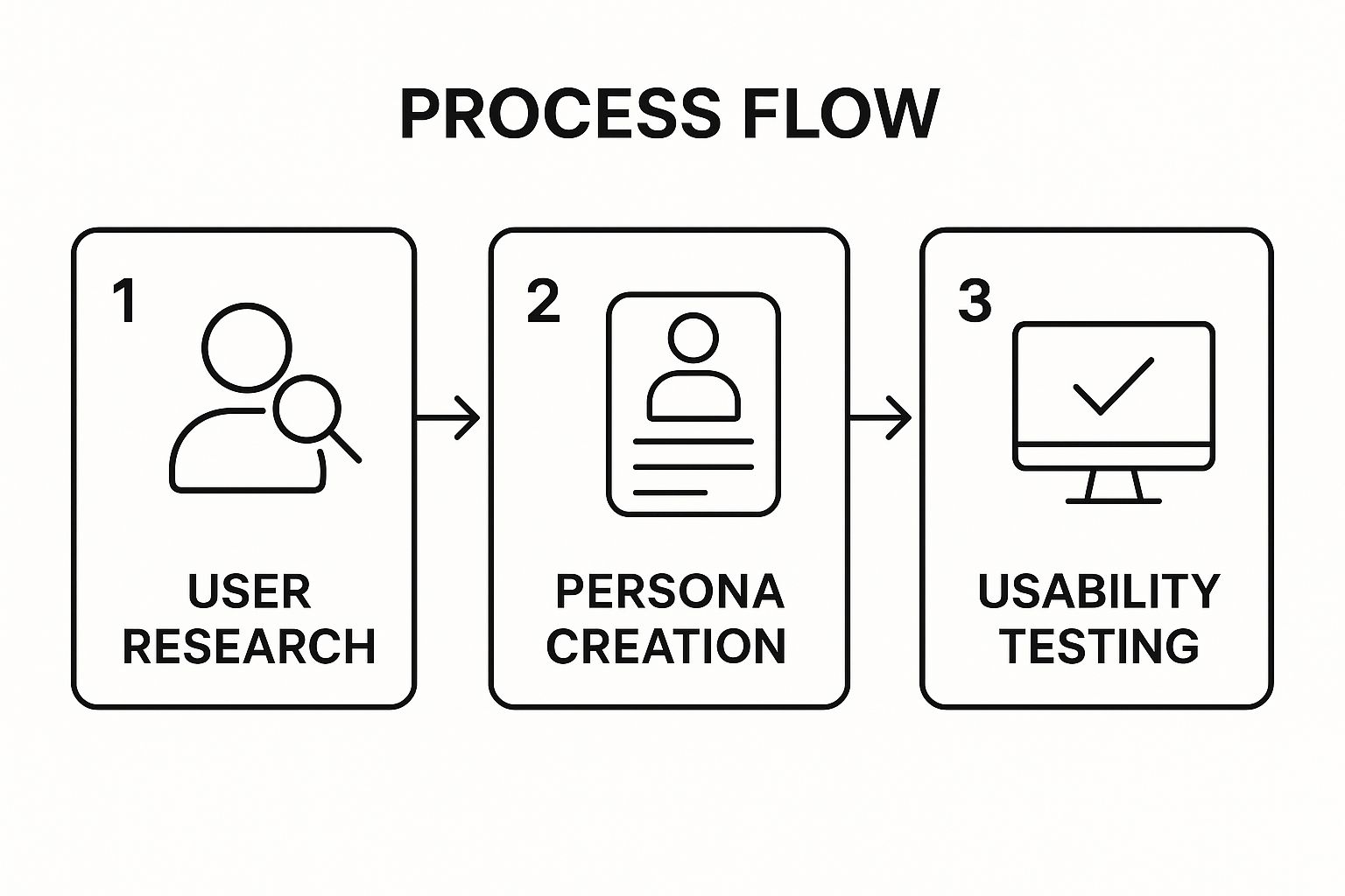
This process flow highlights how each stage builds upon the last, creating a solid foundation of user understanding that directly informs and validates the final product.
2. Mobile-First Responsive Design
Mobile-First Responsive Design is a strategic approach that inverts the traditional design process. Instead of designing for a large desktop screen and then scaling down, this method starts with the smallest screen: mobile. Popularized by experts like Luke Wroblewski, it forces designers to prioritize the most essential content and functionality first, addressing the constraints of a mobile environment from the outset. Once the core mobile experience is solid, the design is progressively enhanced for larger screens like tablets and desktops.
Adopting this methodology is a critical component of modern user experience design best practices because it directly addresses user behavior. With mobile internet usage now dominant, designing for mobile first ensures a seamless and optimized experience for the majority of users. This approach leads to faster load times, cleaner interfaces, and improved usability on all devices. Companies like Twitter and Starbucks have successfully implemented this, creating streamlined mobile experiences that then scale gracefully to their desktop counterparts, ensuring brand and functional consistency.

How to Implement Mobile-First Design
Implementing a mobile-first strategy requires a shift in mindset, focusing on constraints as a catalyst for innovation. This ensures the final product is lean, focused, and performs well where it matters most. To discover more about the specific advantages, you can explore the benefits of responsive website design on sugarpixels.com.
- Prioritize Content Ruthlessly: On a small screen, every element must earn its place. Start by identifying the absolute critical user tasks and content. Remove anything that is non-essential for the mobile context to reduce clutter and cognitive load.
- Design for Touch: Mobile interaction is fundamentally different from using a mouse. Design with large, easy-to-tap targets and consider the "thumb zone," placing primary navigation and action buttons where they are easily reachable.
- Use a Flexible Grid: Build your layout using a fluid grid system with relative units like percentages or
emsinstead of fixed pixels. This allows the layout to adapt smoothly across different screen sizes and orientations. - Test on Real Devices: Browser emulators are helpful, but they cannot fully replicate the experience of using a physical device. Regular testing on a variety of popular smartphones and tablets is essential to catch performance issues and interaction quirks.
3. Information Architecture and Navigation Design
Information Architecture (IA) is the art and science of organizing and structuring content in a digital product. Often called the "blueprint" of a site or app, it focuses on how information is labeled and arranged so that users can navigate intuitively and find what they need without confusion. Championed by pioneers like Peter Morville and Louis Rosenfeld, good IA makes complex information systems feel simple and logical, directly supporting a user's journey from point A to point B.
Effective IA is a cornerstone of user experience design best practices because it prevents user frustration and cognitive overload. When users can predict where to find information, they feel more in control and are more likely to achieve their goals, leading to higher satisfaction and conversion rates. Amazon's meticulously organized product categories and faceted search filters are a prime example of IA at scale, allowing millions of users to easily browse and locate specific items within a vast inventory. Similarly, Netflix’s content categorization helps users discover new shows based on familiar genres and personalized recommendations.
How to Implement Strong IA and Navigation
Building a solid information architecture requires understanding user mental models and translating them into a logical structure. This process should happen early in the design phase, before any visual design begins.
- Understand User Mental Models: Conduct card sorting exercises, either open or closed, to discover how users naturally group and label content. This insight is crucial for creating categories and navigation that feel intuitive to your target audience.
- Map the Structure Visually: Before wireframing, create site maps and user flow diagrams. These documents serve as blueprints, outlining the hierarchy of pages and the paths users will take to complete key tasks, ensuring a cohesive and logical structure.
- Design for Clarity and Consistency: Use clear, consistent labeling for all navigation elements, links, and buttons. Avoid jargon and ensure terminology is uniform across the entire product. Implement multiple navigation pathways, such as a primary menu, contextual links, and a robust search function, to accommodate different user behaviors.
- Test Your Navigation Early and Often: Validate your IA with real users through tree testing or first-click testing on early-stage prototypes. This helps identify confusing labels or illogical paths before they are built, saving significant time and resources.
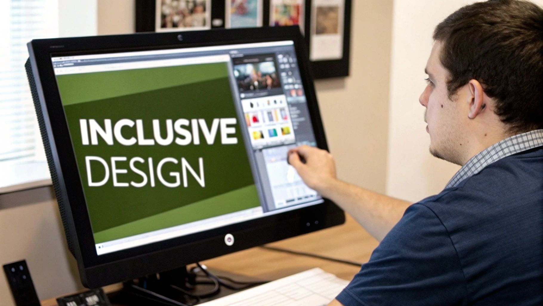
4. Accessibility and Inclusive Design
Accessibility and Inclusive Design is a foundational practice focused on creating digital products that are usable by everyone, regardless of their abilities. This approach goes beyond mere compliance with standards like the WCAG (Web Content Accessibility Guidelines) to actively consider people with visual, auditory, motor, or cognitive impairments. Popularized by thought leaders like Kat Holmes and organizations such as Microsoft, inclusive design is built on the principle that designing for someone with a permanent disability can also benefit people with temporary or situational limitations.
Embracing this philosophy is a crucial component of user experience design best practices because it expands your potential audience and fosters a more equitable digital environment. By making your product accessible, you not only avoid potential legal issues, as seen in the Target settlement, but you also create a more robust and user-friendly experience for all. For example, high-contrast text benefits users with low vision as well as someone using their phone in bright sunlight. Apple’s VoiceOver and Microsoft’s commitment to inclusive design in its Office suite demonstrate how these principles lead to innovative, market-leading products.
How to Implement Accessibility and Inclusive Design
Integrating accessibility requires a proactive, not reactive, mindset. It should be woven into your design and development process from the very beginning, rather than treated as an afterthought.
- Prioritize Semantic HTML: Use correct HTML5 tags (like
<nav>,<main>,<article>) and a logical heading structure (H1, H2, H3). This creates a clear, navigable document outline for screen readers and search engines alike. - Ensure Sufficient Contrast: Check that all text and meaningful interface elements meet or exceed WCAG's color contrast ratio guidelines. This ensures readability for users with low vision or color blindness.
- Provide Content Alternatives: Offer transcripts for audio, captions for video, and descriptive alt text for images. To truly ensure inclusivity, consider implementing features such as text-to-speech tools for visual impairment, which are vital for users with varying visual abilities.
- Test with Assistive Technologies: Go beyond automated checkers. Manually test your interface using screen readers (like NVDA or VoiceOver), keyboard-only navigation, and other assistive tools to understand the real-world user experience. Involve users with disabilities in your usability testing to gain invaluable, direct feedback.
5. Design Systems and Consistency
A Design System is a comprehensive collection of reusable components, patterns, and guidelines that dictate how a brand's digital products should look and behave. More than just a style guide, it's a living library that unifies design, development, and content creation, ensuring a cohesive user experience across all platforms. This concept, championed by figures like Brad Frost and Nathan Curtis, is a cornerstone of modern digital product development.
Embracing a design system is a critical user experience design best practices because it enforces consistency, which in turn builds user trust and familiarity. When UI elements and interactions are predictable, users can navigate more confidently and achieve their goals faster. This efficiency isn't just for users; it also accelerates design and development cycles, allowing teams to build higher-quality products more quickly. Industry-leading examples like Google's Material Design and Shopify's Polaris demonstrate how a robust system can scale complex ecosystems gracefully.
How to Implement a Design System
Building a design system is a strategic investment that pays dividends in consistency and efficiency. It requires a collaborative, cross-functional effort to create a shared source of truth.
- Start Small and Iterate: Begin by auditing your existing UI to identify the most frequently used elements like buttons, form fields, and typography. Create a "minimum viable design system" with these core components and expand it over time as new needs arise.
- Establish Cross-Functional Ownership: Involve both designers and developers from day one. This collaboration ensures that components are not only visually correct but also technically sound, accessible, and performant. This shared ownership fosters adoption and long-term success.
- Document Everything Clearly: Documentation is what transforms a component library into a true design system. For each component, provide clear guidelines on its purpose, usage rules (the "when" and "why"), and visual specifications. Atlassian's Design System is a masterclass in thorough documentation.
- Create a Governance Model: Define a clear process for how the system is maintained, updated, and how new components or patterns can be proposed and added. This prevents the system from becoming outdated or fragmented.
6. Performance Optimization and Load Times
Performance Optimization is the discipline of creating fast-loading, responsive digital experiences that respect the user's time and patience. In an age of instant gratification, slow load times are a critical design flaw. This practice involves a combination of front-end development techniques and thoughtful design choices to ensure an interface not only loads quickly but also feels fast and seamless to the user. Experts like Steve Souders and teams at Google have proven that performance isn't just a technical concern; it's a core component of user satisfaction.
Adopting performance optimization is a non-negotiable part of modern user experience design best practices because speed directly correlates with user engagement, conversion rates, and even SEO rankings. A laggy interface leads to frustration, high bounce rates, and lost revenue. For instance, Pinterest reduced perceived wait times by 40%, which increased search engine traffic and sign-ups by 15%. Similarly, when Walmart improved its page load times by just one second, it saw up to a 2% increase in conversions, demonstrating the immense business value of speed.
How to Implement Performance Optimization
Effective performance optimization requires a proactive and holistic approach, integrating speed-focused goals into the design and development lifecycle from the very beginning. It's about making deliberate choices to keep the user experience lightweight and responsive.
- Set a Performance Budget: Before development starts, define clear performance goals. A performance budget sets limits on metrics like total page size, the number of HTTP requests, or a target load time (e.g., under 2 seconds). This ensures the entire team works toward a common, measurable goal.
- Optimize All Assets: Compress images using modern formats like WebP, which offer superior compression compared to traditional JPEGs and PNGs. Minify CSS, JavaScript, and HTML files to reduce their size, and be judicious about adding heavy custom fonts or third-party scripts that can slow down rendering.
- Design for Perceived Performance: Use techniques that make the interface feel faster even while content is loading. Implementing skeleton screens (placeholders that mimic the layout of the page) or progressively loading images gives users immediate visual feedback, reducing the perceived wait time and making the experience feel more fluid. You can learn more about how to optimize website performance.
7. User Feedback and Testing Integration
User Feedback and Testing Integration is the practice of systematically gathering, analyzing, and acting on user input throughout the entire design lifecycle. Instead of relying on internal assumptions, this approach uses real data from actual users to guide and validate every decision. Popularized by thought leaders like Steve Krug and enabled by platforms like UserTesting.com, this method transforms design from a subjective art into a data-informed science.
Integrating continuous testing is one of the most critical user experience design best practices because it removes guesswork and anchors product development in reality. It allows teams to identify usability issues, validate hypotheses, and uncover new opportunities before investing significant resources in development. For example, Dropbox famously used a simple explainer video to test its core value proposition before building the full product, while Netflix constantly A/B tests everything from thumbnail images to UI layouts to optimize engagement.
How to Implement User Feedback and Testing
Successful integration requires a commitment to listening to users consistently and making their feedback a non-negotiable part of your workflow. This process should be embedded from the earliest conceptual stages through post-launch optimization.
- Test Early and Often: Begin testing with low-fidelity prototypes or even paper sketches. Early feedback is cheaper to implement and prevents teams from becoming too attached to flawed ideas.
- Combine Qualitative and Quantitative Methods: Use usability testing and interviews to understand why users behave a certain way. Complement this with quantitative data from A/B tests and analytics to understand what they are doing at scale for a comprehensive view.
- Establish a Regular Cadence: Don't treat testing as a one-time event. Schedule regular, recurring sessions, even if they are small and informal. This creates a continuous stream of insights and normalizes user feedback within the company culture.
- Democratize Insights: Share key findings, video clips, and user quotes widely across the organization. When engineers, marketers, and executives see firsthand user struggles, it builds empathy and creates a shared sense of purpose.
8. Content Strategy and Microcopy
Content Strategy and Microcopy are the disciplines of using language to create a clear, helpful, and guided user experience. This goes far beyond just filling in text boxes; it involves deliberately crafting every word on an interface, from button labels and error messages to tooltips and success notifications. A strong content strategy, as championed by pioneers like Kristina Halvorson, ensures that the words are as thoughtfully designed as the visual elements, transforming a functional interface into a conversational and intuitive one.
Integrating this approach is a crucial component of user experience design best practices because it directly shapes user perception and guides their actions. Clear, concise, and brand-aligned language reduces cognitive load, prevents user errors, and builds trust. For example, Slack’s conversational microcopy makes the app feel friendly and approachable, while Stripe’s precise instructions demystify the complex process of online payments, showcasing how strategic content can significantly enhance usability and user confidence.
How to Implement Content Strategy and Microcopy
Effective implementation requires treating content as a core design element from the very beginning, not as an afterthought. This involves a commitment to clarity, consistency, and empathy in all user-facing language.
- Develop a Voice and Tone Guide: Create a formal guide that defines your brand's voice (personality) and tone (the emotional inflection of that voice in different contexts). This ensures consistency, whether a user is reading an error message or a celebratory notification.
- Write for Clarity, Not for Jargon: Always use the language of your users. Avoid internal, technical, or business jargon that could cause confusion. For instance, use "Your files have been saved" instead of "Operation successful: Data persistence achieved."
- Test Your Words: Just as you conduct usability testing for visual layouts, test your microcopy. A/B testing different button labels or error messages can reveal which version is more effective at guiding users and reducing friction.
- Focus on Action and Reassurance: Good microcopy tells users what happened, why it happened, and what to do next. An effective error message, for example, doesn't just say "Invalid input"; it explains what was invalid and how to fix it.
By aligning your digital messaging with user needs, you can transform your interface into a more human-centered experience. This approach is closely tied to broader marketing efforts, as the voice and tone in your product should be consistent with your brand's overall communication. Understanding how these disciplines overlap is key to a cohesive strategy. Learn more about how content strategy connects with broader marketing on sugarpixels.com.
9. Visual Hierarchy and Typography
Visual Hierarchy and Typography is the art and science of arranging design elements to guide the user's eye and communicate order of importance. It uses principles like size, color, contrast, and spacing to create a clear path through the content, ensuring users can find what they need effortlessly. A strong hierarchy prevents cognitive overload, while thoughtful typography enhances readability and establishes brand personality.
This is a critical component of user experience design best practices because it directly influences how users perceive and process information. A well-executed visual hierarchy makes an interface feel intuitive, while poor typography can render it confusing and unreadable, no matter how functional it is. For example, Medium's focus on large, readable fonts and generous white space has made it a go-to platform for long-form content, proving that typography can be a core feature. Similarly, Apple’s meticulously designed San Francisco font system ensures legibility and consistency across all its devices, from a tiny watch screen to a large desktop monitor.
How to Implement Strong Visual Hierarchy and Typography
To create a system that is both beautiful and functional, you need a deliberate and structured approach. This involves establishing clear rules and testing them rigorously to ensure they meet user needs. A fundamental aspect of crafting compelling user experiences is mastering the art of design in typography, which significantly impacts readability and visual appeal.
- Establish a Typographic Scale: Define a clear and consistent scale for your headings, subheadings, body text, and captions. Using a modular scale (e.g., a 1.25 ratio) creates a harmonious and logical relationship between different text elements.
- Limit Your Font Choices: Stick to a maximum of two or three font families to maintain visual cohesion and avoid a cluttered look. A primary font can be used for headings and a secondary, highly readable font for body text.
- Prioritize Accessibility and Readability: Ensure your text has a sufficient color contrast ratio against its background (WCAG AA standard is 4.5:1 for normal text). Use ample white space around text blocks and between lines (line height of 1.4x to 1.6x is a good start) to improve readability.
- Test on Real Devices: What looks good on a design canvas may not perform well on an actual screen. Always test your typography choices on various devices and screen sizes to check for legibility and rendering issues.
10. Emotional Design and User Psychology
Emotional design is the practice of creating products that elicit appropriate emotions in users to create a positive experience. It goes beyond mere functionality to forge a deeper, more personal connection, recognizing that people make decisions based on feelings as much as logic. This approach, championed by experts like Don Norman and Aarron Walter, leverages principles from psychology to build interfaces that are not only usable but also delightful, trustworthy, and memorable.
Integrating emotional design is a crucial component of modern user experience design best practices because it directly influences user loyalty and engagement. When a product resonates on an emotional level, users are more likely to forgive minor flaws, recommend it to others, and form lasting habits around its use. Apps like Duolingo leverage this by using gamification and encouraging mascots to make learning feel rewarding, while Headspace uses calming animations and gentle language to create a serene, supportive environment for meditation.
How to Implement Emotional Design
Successfully applying emotional design requires a nuanced understanding of your users' emotional states and psychological triggers throughout their journey. The goal is to create positive interactions that reinforce the product's value and purpose.
- Create Moments of Delight: Identify opportunities to add small, unexpected, and joyful interactions. This could be a charming animation when completing a task, a witty error message, or personalized celebratory feedback. These micro-interactions can transform a mundane process into a memorable one.
- Leverage Psychological Principles Ethically: Apply concepts like social proof (e.g., testimonials, user counts) and reciprocity (e.g., offering free value upfront) to build trust and encourage engagement. It's vital to use these persuasive techniques transparently and ethically to enhance the user experience, not manipulate it.
- Design for Specific Emotional States: Consider the user's likely emotional state at different points in their journey. A user resetting a password is likely frustrated, so the interface should be simple, clear, and reassuring. In contrast, a user completing a major milestone might appreciate an enthusiastic, celebratory design.
User Experience Design Best Practices Comparison
| Item | Implementation Complexity 🔄 | Resource Requirements 🔄 | Expected Outcomes ⭐📊 | Ideal Use Cases 💡 | Key Advantages ⚡📊 |
|---|---|---|---|---|---|
| User-Centered Design (UCD) | High – iterative with feedback loops | High – extensive research & testing | High user satisfaction, reduced failure risk | Products needing deep user insight and usability | Intuitive interfaces, early issue detection |
| Mobile-First Responsive Design | Medium to High – progressive enhancement | Medium – design & dev iterations | Better mobile performance, SEO improvement | Websites/apps prioritizing mobile users | Mobile optimization, future-proofing |
| Information Architecture & Navigation Design | Medium – requires content planning | Medium – content audit & expertise | Improved findability and task completion | Complex content-heavy sites | Reduces cognitive load, scalable structure |
| Accessibility and Inclusive Design | Medium – specialized standards | Medium to High – testing & updates | Expanded reach, legal compliance, usability | Products targeting diverse user abilities | Social responsibility, usability for all |
| Design Systems and Consistency | High – upfront creation & governance | High – maintenance & collaboration | Consistent UI, increased efficiency | Large multi-product teams or scalable projects | Consistency, collaboration efficiency |
| Performance Optimization & Load Times | Medium to High – ongoing optimization | Medium – development & monitoring | Faster load times, higher engagement & SEO | Sites where speed impacts conversions | Reduced bounce rates, lower server costs |
| User Feedback and Testing Integration | Medium to High – continuous testing | Medium to High – research resources | Data-driven decisions, reduced failure risk | Iterative product development needing validation | Increased user satisfaction, usability |
| Content Strategy and Microcopy | Medium – requires content expertise | Medium – content creation/updates | Clear guidance, reduced confusion | Interfaces where text guides user interactions | Improved task completion, brand trust |
| Visual Hierarchy and Typography | Medium – typographic design principles | Medium – design & testing | Improved readability and comprehension | Content-rich interfaces needing clarity | Enhanced accessibility, professional look |
| Emotional Design and User Psychology | Medium – psychology integration | Medium – research and design | Strong emotional connections, user engagement | Products aiming for memorable, engaging UX | User loyalty, behavior influence |
Turning UX Theory into Business Reality
Navigating the landscape of user experience design best practices can feel like assembling a complex, multi-layered puzzle. We've explored the foundational pillars, from the empathetic core of User-Centered Design (UCD) and the structural clarity of Information Architecture to the non-negotiable standards of Accessibility and the rapid efficiency of Performance Optimization. Each practice, whether it’s the strategic use of microcopy or the psychological pull of emotional design, represents a critical piece in creating a holistic, engaging, and effective digital product.
However, the true power of these principles isn't found in understanding them in isolation. It's unlocked when they are woven together into the very fabric of your business operations. The journey from a theoretical checklist to a living, breathing user-centric culture is where sustainable success is born. It's the difference between a website that simply exists and a digital experience that actively works for you, converting visitors, building loyalty, and enhancing your brand's reputation.
From Principles to Profit: The Strategic Imperative of UX
The most impactful takeaway from this comprehensive guide is that exceptional UX is not a project with a start and end date; it's a continuous, iterative process. Your users' needs, behaviors, and expectations are not static. They evolve with technology, market trends, and cultural shifts. Therefore, your approach to UX must be equally dynamic.
Think of it as a flywheel. Integrating user feedback and testing (Practice #7) fuels your understanding. This insight informs your content strategy and visual hierarchy (Practices #8 and #9), which are then implemented consistently through a robust design system (Practice #5). Each improvement, guided by these interconnected practices, adds momentum, making your digital products more intuitive, enjoyable, and valuable over time. This momentum translates directly into tangible business outcomes: higher engagement, better conversion rates, and increased customer lifetime value.
Your Actionable Roadmap to UX Excellence
The path to mastering UX can seem daunting, but progress begins with a single, focused step. You don't need to overhaul your entire process overnight. Instead, adopt an incremental approach to implementation.
Here is a practical starting point:
- Conduct a UX Audit: Begin by evaluating your current digital presence against one or two key practices. For instance, start with Accessibility (Practice #4) using automated tools and a manual checklist. Or, focus on Performance Optimization (Practice #6) by running your site through Google's PageSpeed Insights to identify immediate, high-impact fixes.
- Establish a Feedback Loop: If you haven't already, implement a system for gathering consistent user feedback (Practice #7). This could be as simple as adding a survey tool like Hotjar or as involved as scheduling regular user interviews. Make listening a non-negotiable part of your workflow.
- Prioritize Mobile-First: When planning your next feature or content update, force yourself to design for the smallest screen first (Practice #2). This discipline ensures your experience is streamlined and functional for the majority of users, and it makes scaling up to larger screens a more intentional process.
By committing to these user experience design best practices, you are not just refining an interface; you are building a more resilient, competitive, and customer-focused business. You are investing in a foundation that will support your growth for years to come, ensuring your brand not only survives but thrives in an increasingly crowded digital world. The ultimate goal is to create experiences so seamless and intuitive that they feel invisible, leaving the user with a lasting sense of satisfaction and trust.
Ready to transform these best practices from a list into a powerful business asset? The team at Sugar Pixels specializes in engineering user-centric digital experiences that drive growth, from intuitive website design to comprehensive brand strategy. Let's work together to build a digital presence that your customers will love.