
In a multi-device reality, a website that isn't responsive is a website that's failing its audience. A user's experience must be seamless, whether they are browsing on a compact smartphone, a standard laptop, or an expansive desktop monitor. Achieving this level of fluidity requires more than just resizing content; it demands a deliberate, strategic approach grounded in proven techniques. This comprehensive guide moves beyond surface-level advice to explore the most critical responsive web design best practices that distinguish amateur sites from professional, high-performing digital platforms.
We will provide actionable insights, practical code snippets, and clear examples to help you build websites that are not only flexible but also fast, accessible, and optimized for business goals. Forget generic tips; this listicle is designed for immediate implementation. You will learn how to:
- Adopt a mobile-first mindset to prioritize core content and functionality.
- Implement fluid layouts using Flexbox and CSS Grid for perfect alignment on any screen.
- Strategically manage breakpoints and media queries to control how your design adapts.
- Optimize images and media to ensure fast load times without sacrificing quality.
- Create touch-friendly interfaces that improve usability on mobile devices.
By mastering these principles, you can ensure your website delivers a consistent and compelling experience for every visitor, regardless of how they access it. The following sections break down each practice into digestible, actionable steps, empowering you to build a truly adaptive and future-proof online presence.
1. Adopt a Mobile-First Design Philosophy
The cornerstone of modern responsive web design best practices is the "mobile-first" philosophy. Instead of designing a complex desktop site and then trying to strip it down for smaller screens (a process known as graceful degradation), you start with the most constrained view: the mobile device. This approach forces you to prioritize core content and essential functionality from the very beginning.
By designing for the smallest screen first, you establish a strong, lean foundation. You identify what is absolutely necessary for the user experience, ensuring the most critical information is front and center. As screen real estate increases, you progressively enhance the design by adding features, more complex layouts, and richer media that are suitable for larger viewports. This methodology leads to cleaner, more efficient code and significantly better performance on mobile devices, which is a critical ranking factor for Google's mobile-first indexing.
How to Implement a Mobile-First Approach
To effectively adopt this strategy, your process needs a fundamental shift. Start by creating wireframes for a small screen, typically around a 320px width. This forces a focus on content hierarchy and user flow without the distraction of expansive design elements.
When writing your CSS, use min-width media queries to add styles as the screen gets larger. This is the technical backbone of progressive enhancement.
/* Base styles for all screens (mobile) */
.container {
width: 100%;
padding: 10px;
}
/* Styles for tablets and larger */
@media (min-width: 768px) {
.container {
max-width: 720px;
margin: 0 auto;
}
}
This ensures mobile browsers only load the essential CSS, improving load times. For a deeper dive into this essential approach, consider consulting a practical guide to mobile-first design for more detailed implementation steps.
Finally, prioritize usability on touch devices. Ensure all interactive elements like buttons and links have a minimum touch target size of 48×48 pixels to prevent user frustration. The numerous benefits of responsive design are most effectively realized when you build from a solid, mobile-centric foundation.
2. Fluid and Flexible Grids
A core tenet of responsive web design best practices is the use of fluid and flexible grids. Instead of relying on rigid, pixel-based layouts that break on screens they weren't designed for, a fluid grid uses relative units like percentages, em, and rem. This allows layout elements to scale proportionally based on the size of the viewport, creating a more adaptable and seamless user experience across a vast range of devices.
Pioneered by Ethan Marcotte in his foundational work on responsive design, this approach ensures that the relationships between elements are maintained, regardless of screen size. The layout gracefully contracts and expands, preventing awkward horizontal scrollbars and broken designs. It forms the structural backbone that allows content to reflow intelligently, making it a non-negotiable technique for modern web development. When combined with media queries, fluid grids provide precise control over how the layout adapts at key screen sizes.
How to Implement Fluid Grids
Transitioning to fluid grids requires thinking in proportions rather than fixed pixels. The fundamental formula for converting a pixel-based design to a percentage-based one is: (target / context) * 100 = result%. Here, the "target" is the width of your element, and the "context" is the width of its containing element.
For more complex and two-dimensional layouts, CSS Grid offers an even more powerful and intuitive solution.
/* A basic two-column fluid layout */
.parent-container {
display: flex;
width: 100%;
}
.main-content {
/* This column takes up 70% of the parent container /
width: 70%;
margin-right: 2%; / Gutter */
}
.sidebar {
/* This column takes up the remaining 28% */
width: 28%;
}
This simple example ensures that the main-content and sidebar elements will always maintain their proportional relationship. For a deep dive into the powerful capabilities of modern layout systems, the CSS Grid documentation on MDN is an invaluable resource.
Finally, remember to test your fluid layouts not just at your main breakpoints, but also at intermediate sizes. This helps you catch any unexpected content wrapping or element collision issues, ensuring a truly "fluid" experience for every user. The principles of a fluid grid system are what make responsive design truly work.
3. Master Media Queries and Strategic Breakpoints
At the core of responsive web design are media queries, the CSS feature that allows you to apply styles conditionally based on device characteristics like viewport width, height, or orientation. Breakpoints are the specific points where a website's layout adjusts to provide the optimal user experience. Mastering these is a fundamental responsive web design best practice that brings your designs to life across the device spectrum.
Instead of targeting specific devices, which is an outdated and unsustainable approach, you should let your content dictate the breakpoints. A breakpoint should be added only when the content starts to look misaligned or "breaks." This content-driven approach ensures your design is robust and future-proof, adapting gracefully to new screen sizes without constant maintenance. This technique gives you precise control, ensuring legibility and usability are never compromised.
How to Implement Media Queries and Breakpoints
Effective implementation begins with a solid strategy. While many frameworks like Bootstrap offer predefined breakpoints (e.g., 576px, 768px, 992px), a custom approach is often superior. Start with your mobile-first base styles and use min-width media queries to introduce layout changes as the screen expands.
Using relative units like em or rem in media queries is a best practice for accessibility, as it ensures breakpoints adapt if a user changes their browser's default font size.
/* Base styles apply to all screens */
.main-content {
padding: 1rem;
}
/* At 48em (approx 768px), introduce a two-column layout */
@media (min-width: 48em) {
.main-content {
display: grid;
grid-template-columns: 2fr 1fr;
gap: 1.5rem;
}
}
This method ensures a seamless transition between layouts. To make this process more efficient, you can document your chosen breakpoints in a style guide, creating a single source of truth for your development team. For further insight into crafting these queries, the MDN Web Docs on media queries provides a comprehensive resource.
Finally, always test your breakpoints rigorously. Use browser developer tools to resize the viewport and, more importantly, test on a range of real devices. This hands-on testing reveals issues that emulators might miss, guaranteeing your responsive design performs flawlessly in the real world.
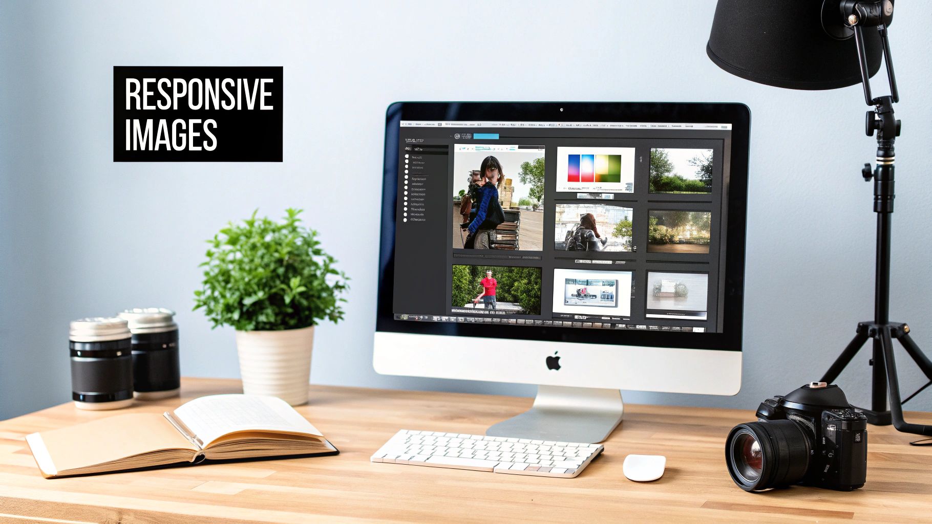
4. Responsive Images and Media
A critical element of modern responsive web design best practices is managing images and media effectively. Serving a massive, high-resolution desktop image to a mobile user on a slow connection creates a poor experience and hurts performance. Responsive images solve this by delivering different image files optimized for the user's viewport size, screen resolution, and device capabilities. This ensures fast load times without sacrificing visual quality.
By using HTML attributes like srcset and the <picture> element, you can provide the browser with a set of image sources. The browser then intelligently selects the most appropriate one, a technique mastered by sites like Shopify, which serves perfectly sized product images to every visitor. This not only improves performance but also conserves user data, a key consideration for mobile audiences.
How to Implement Responsive Images
The srcset attribute is your primary tool for resolution switching, allowing you to serve different image sizes based on viewport width. For "art direction," where you might want to show a completely different crop of an image on mobile versus desktop, the <picture> element provides more granular control.
Start by defining a set of image breakpoints and use modern formats like WebP, which offer superior compression, with fallbacks for older browsers.

This code tells the browser to try loading the WebP version first, and if not supported, it falls back to the PNG. To prevent content from jumping as images load, a major usability issue, always define the aspect ratio in your CSS.
Finally, implement lazy loading using the native loading="lazy" attribute. This simple addition defers the loading of off-screen images until the user scrolls near them, dramatically improving initial page load speed. You can find comprehensive guides on this technique at MDN Web Docs on Lazy Loading for more details.
5. Flexible Typography (Fluid Type Scaling)
Beyond fluid layouts, true responsiveness extends to the very text on the page. Flexible or fluid typography is a powerful technique where font sizes automatically scale based on the viewport's width, ensuring optimal readability and aesthetic balance across all devices. Instead of setting rigid font sizes for different breakpoints, fluid type smoothly transitions, creating a more harmonious and professional user experience.
This approach uses modern CSS functions like clamp() or calculations involving viewport units (vw) to create a font size that grows and shrinks with the screen. This is a key element in advanced responsive web design best practices because it prevents awkward line breaks and maintains the intended visual hierarchy without manual adjustments for every possible screen size. It ensures your headings feel like headings and your body text remains legible, whether on a small phone or a large desktop monitor.
How to Implement Fluid Typography
The most effective way to implement fluid typography is with the CSS clamp() function. This function takes three arguments: a minimum value, a preferred (scalable) value, and a maximum value. This prevents text from becoming too small on narrow screens or excessively large on wide ones.
Start by defining your type scale using relative units and viewport widths. Using CSS custom properties makes this system manageable and scalable.
:root {
–font-size-base: clamp(1rem, 1.5vw + 0.5rem, 1.25rem);
–font-size-h1: clamp(2rem, 5vw + 1rem, 4rem);
}
body {
font-size: var(–font-size-base);
}
h1 {
font-size: var(–font-size-h1);
}
This setup establishes a base font size that scales gently and a heading that scales more dramatically, maintaining a clear hierarchy. For practical implementation, especially when converting from pixel-based designs, an external tool can be incredibly helpful. Consider using a Rem Converter tool to streamline your unit conversions and ensure consistent scaling.
Finally, always test your typography on actual devices. Pay close attention to line-height and line length (measure) to ensure readability isn't compromised at the extremes of your supported screen sizes. This small detail elevates your design from simply functional to truly polished.
6. CSS Flexbox and Grid Layouts
Gone are the days of relying on floats and positioning hacks for layout. Modern responsive web design best practices are built upon the powerful foundations of CSS Flexbox and Grid. These layout modules provide a robust and predictable way to arrange elements, making complex responsive designs more intuitive to build and maintain. Flexbox excels at one-dimensional layouts (arranging items in a single row or column), while Grid is designed for two-dimensional layouts (aligning items in both rows and columns simultaneously).
Using these tools is essential for creating fluid, dynamic interfaces. Flexbox is perfect for component-level arrangements like navigation bars, button groups, and card elements, where you need to align items along a single axis. Grid, on the other hand, is ideal for orchestrating the overall page structure, such as the main content area, sidebars, headers, and footers. A key benefit is the ability to easily reorder content for different viewports without changing the HTML markup, a significant advantage for mobile-first design.

How to Implement Flexbox and Grid
The most effective strategy is to combine both modules. Use Grid for the macro-layout of your page and Flexbox for the micro-layouts within individual components. This layered approach leverages the strengths of each system to create sophisticated, responsive designs. For example, you can define a main page grid and then use Flexbox to align the items inside the header or a card component.
Here’s a practical example of combining both for a responsive card layout:
/* Page-level layout using Grid */
.page-container {
display: grid;
grid-template-columns: repeat(auto-fit, minmax(300px, 1fr));
gap: 20px;
}
/* Component-level alignment using Flexbox */
.card-header {
display: flex;
justify-content: space-between;
align-items: center;
}
This combination ensures your high-level structure adapts gracefully while the inner components remain perfectly aligned. The gap property in both Grid and Flexbox is also crucial for maintaining consistent spacing between elements without complex margin calculations. For a visual introduction to these concepts, the video below offers an excellent overview of the fundamentals.
7. Touch-Friendly Interface Design
An essential component of responsive web design best practices involves optimizing interfaces for touch interaction. Unlike a precise mouse cursor, fingers are large and less accurate. Designing for touch means accommodating these physical constraints to create an experience that is intuitive and error-free on mobile devices and tablets, preventing user frustration and improving usability.
This practice moves beyond simply making a design fit a smaller screen; it rethinks how users interact with elements. It involves enlarging interactive elements, providing ample spacing between them, and offering clear visual feedback for every tap and swipe. Companies like Apple and Google have set the standard with their detailed interface guidelines, making touch-friendliness a non-negotiable aspect of modern design. Ignoring these principles can render an otherwise beautiful design practically unusable on a touchscreen.
How to Implement Touch-Friendly Interfaces
The primary goal is to make interaction effortless. A critical first step is to ensure all interactive elements, like buttons and links, meet minimum size requirements. According to WCAG and Google's Material Design guidelines, touch targets should be at least 48×48 pixels. This provides enough surface area for a user's finger to tap accurately without accidentally hitting an adjacent element.
Proper spacing is just as crucial. Implement a minimum of 16 pixels of margin between touch targets to create a safe zone and reduce tap errors. You must also provide alternatives for interactions that rely on mouse-specific events.
/* Base styles for a touch-friendly button /
.touch-button {
display: inline-block;
padding: 12px 24px;
min-width: 48px; / Minimum touch target width /
min-height: 48px; / Minimum touch target height /
line-height: 24px; / Vertically centers text within the 48px height /
margin: 8px; / 16px total space between buttons */
cursor: pointer;
}
/* Provide visual feedback on tap, not just hover */
.touch-button:active {
background-color: #cccccc;
transform: translateY(1px);
}
Since there is no "hover" state on touch devices, use :active or :focus states to provide immediate visual feedback when an element is pressed. This confirms to the user that their action was registered. For a more comprehensive look at these principles, explore these user experience design best practices which expand on creating intuitive interactions. Finally, always test your design on actual devices, using your own fingers, not a mouse emulator, to identify real-world usability issues.
8. Progressive Enhancement and Graceful Degradation
A core philosophy in responsive web design best practices is building a resilient user experience that works for everyone, regardless of their device or browser capabilities. Progressive enhancement and graceful degradation are two sides of the same coin aimed at achieving this universality. Progressive enhancement starts with a baseline of core content and functionality that works on even the most basic browsers. From there, you layer on more advanced features and richer experiences for more capable browsers. Graceful degradation, conversely, starts with the full-featured experience and ensures it can fail gracefully, remaining functional on older browsers by removing non-essential features.
Modern development strongly favors progressive enhancement. By building from a simple, functional base, you guarantee that essential tasks like submitting a form or reading content are always possible. This approach naturally leads to more accessible, performant, and maintainable websites. It prioritizes content and core user journeys, ensuring your site's primary purpose is never compromised by a browser's limitations or a user's disabled JavaScript.
How to Implement Progressive Enhancement
Adopting this strategy means structuring your development workflow around a "content first, enhancements second" model. The foundation of this approach is clean, semantic HTML, which ensures your content is accessible and understandable even without CSS or JavaScript.
Your CSS should enhance the HTML's presentation, and your JavaScript should enhance the user experience, not create it. Use feature detection, not browser detection, to apply enhancements.
// Check if the Fetch API is supported before using it
if ('fetch' in window) {
// Enhance the experience with a modern, asynchronous data request
fetch('/api/data')
.then(response => response.json())
.then(data => {
// update UI with new data
});
} else {
// The form will submit normally, relying on a server-side response
// No enhancement is applied, but core functionality remains
}
This ensures that only browsers capable of handling a feature will receive the code for it. For example, a search form should work with a standard server-side submission. You can then enhance it with JavaScript to provide instant, live search results for users with capable browsers. This layered approach is a hallmark of robust, responsive web design.
9. Performance Optimization and Lazy Loading
A responsive design that loads slowly is a failed design. Performance optimization is a non-negotiable component of modern responsive web design best practices, directly impacting user experience, conversion rates, and SEO rankings. Instead of forcing users to download every single asset on page load, especially on mobile networks, smart optimization defers the loading of non-critical resources. This ensures the user sees and interacts with the most important content immediately.
Techniques like lazy loading for images and iframes, code splitting, and prioritizing critical CSS are fundamental to this process. By loading assets only when they are needed, you significantly reduce initial page load time, data usage, and browser workload. This is especially crucial for mobile users who may have slower internet connections. A fast, responsive site feels professional and user-centric, which is essential for retaining visitors and is a key metric in Google's Core Web Vitals.
How to Implement Performance Optimization Techniques
Effective optimization involves a multi-faceted strategy that targets different types of content. For images, the simplest and most effective method is native lazy loading, which is now supported by all major browsers. It's as easy as adding an attribute to your image tag.
You can also use JavaScript libraries for more advanced lazy loading effects, such as the blur-up technique popularized by platforms like Medium. This shows a low-quality placeholder that transitions to the high-quality version once loaded.

Beyond images, prioritize loading critical, above-the-fold CSS and defer the rest. Also, use dynamic imports to split your JavaScript bundles, ensuring users only download the code necessary for the current view. For a comprehensive look at boosting site speed, you can review this guide on how to improve website loading speed for more advanced strategies.
Finally, always optimize your assets before implementing lazy loading. Compress images, minify your CSS and JavaScript files, and leverage a Content Delivery Network (CDN) to serve static files from locations closer to your users. These foundational steps ensure your deferred assets still load as quickly as possible when they are requested.
10. Configure the Viewport Meta Tag Correctly
The viewport meta tag is a small but powerful piece of HTML that acts as a direct instruction to the browser on how to control the page's dimensions and scaling. Without it, mobile browsers will often render the page at a desktop screen width and then shrink it down, resulting in tiny, unreadable text and a frustrating user experience. Properly configuring this tag is a non-negotiable first step for any responsive design.
This tag, placed within the <head> of your HTML document, tells the browser to match the page width to the device's screen width and to establish an initial 1:1 scale. This simple declaration is the trigger that allows your media queries and responsive layouts to function as intended. It's a foundational element that ensures the browser respects the fluid, adaptable design you've carefully crafted, making it one of the most critical responsive web design best practices.
How to Implement the Viewport Meta Tag
Implementing the viewport tag is straightforward. The standard, recommended tag should be one of the first elements in your HTML <head>. This ensures the browser can parse it immediately before it begins rendering page content.
The most common and widely accepted implementation provides the essential instructions for a responsive layout without imposing unnecessary restrictions on the user.
Here's what each part does:
width=device-width: This sets the width of the viewport to the physical width of the device's screen.initial-scale=1.0: This establishes the initial zoom level when the page is first loaded, creating a 1:1 relationship between CSS pixels and device-independent pixels.
For a modern, user-friendly experience, avoid using user-scalable=no or setting a maximum-scale. These attributes prevent users from zooming, which is a major accessibility issue for those with low vision. Adhering to the standard viewport configuration is a cornerstone of building a truly accessible and functional responsive website.
Top 10 Responsive Design Best Practices
| Item | Implementation Complexity 🔄 | Resource Requirements ⚡ | Expected Outcomes ⭐ | Ideal Use Cases 💡 | Key Advantages 📊 | Quick Tip 💡 |
|---|---|---|---|---|---|---|
| Mobile-First Design Approach | Medium (🔄🔄) — constrained initial design thinking | Moderate (⚡⚡) — device testing, performance focus | High (⭐⭐⭐⭐) — better mobile performance & SEO | Mobile-first apps, content-driven sites, limited bandwidth users | Prioritizes essential content, faster loads, improved mobile indexing | Start with 320px wireframes; use min-width media queries |
| Fluid and Flexible Grids | Medium (🔄🔄) — requires proportional math | Low‑Moderate (⚡⚡) — CSS work and tests | High (⭐⭐⭐⭐) — smooth scaling across viewports | Flexible layouts, galleries, content sites needing proportional scaling | Proportional scaling, fewer strict breakpoints, easier maintenance | Use (target/context)×100 formula and combine with media queries |
| Media Queries and Breakpoints | Low‑Medium (🔄🔄) — straightforward but can grow complex | Low (⚡) — CSS rules and breakpoint tests | High (⭐⭐⭐⭐) — precise control at specific viewports | Targeted device tailoring, complex responsive adjustments | Precise layout control, wide browser support, performance tuning per context | Write mobile-first with min-width; document breakpoint strategy |
| Responsive Images and Media | High (🔄🔄🔄) — multiple sources, formats and markup | High (⚡⚡⚡) — image generation, optimization pipeline, CDN | Very High (⭐⭐⭐⭐⭐) — major bandwidth & LCP improvements | Image-heavy sites, e‑commerce, news/media publishers | Bandwidth savings, better load times, art-direction per device | Use srcset/picture, modern formats (WebP/AVIF), and lazy loading |
| Flexible Typography (Fluid Type Scaling) | Medium (🔄🔄) — requires calc()/clamp() tuning | Low (⚡) — CSS only, testing across viewports | High (⭐⭐⭐⭐) — consistent readability and hierarchy | Content sites, design systems, variable-width layouts | Smooth scaling, fewer breakpoints, improved readability | Use clamp() with sensible min/max and test extremes (e.g., clamp(1rem, 1vw+1rem, 2rem)) |
| CSS Flexbox and Grid Layouts | Medium (🔄🔄) — learning curve but consistent | Low (⚡) — CSS expertise and cross‑browser checks | Very High (⭐⭐⭐⭐⭐) — simplifies complex responsive layouts | Page-level grids, cards, navigation, complex component layouts | Powerful alignment, fewer hacks, less reliance on floats/media queries | Use Grid for 2D layouts and Flexbox for 1D; combine for best results |
| Touch-Friendly Interface Design | Low‑Medium (🔄🔄) — design & testing focus | Low (⚡) — device testing and spacing adjustments | High (⭐⭐⭐⭐) — better usability and accessibility on touch devices | Mobile/tablet apps, interactive controls, consumer-facing sites | Reduces errors, aligns with mobile UX, improves accessibility | Maintain ≥48px touch targets and ~16px spacing; test with real fingers |
| Progressive Enhancement & Graceful Degradation | Medium‑High (🔄🔄🔄) — layered planning and fallbacks | Moderate (⚡⚡) — server fallbacks, feature detection, testing | High (⭐⭐⭐⭐) — broad compatibility and resilient UX | Public websites, accessibility-focused projects, wide-audience apps | Works without JS, better SEO, robust on slow/legacy environments | Start with semantic HTML, use feature detection (Modernizr/@supports) |
| Performance Optimization & Lazy Loading | High (🔄🔄🔄) — tooling, critical CSS, monitoring | High (⚡⚡⚡) — build tools, CDNs, performance monitoring | Very High (⭐⭐⭐⭐⭐) — faster loads and improved Core Web Vitals | All sites (critical for image-heavy and SPAs) | Faster LCP, reduced bandwidth, improved engagement & SEO | Use native loading='lazy', extract critical CSS, monitor Web Vitals |
| Viewport Meta Tag & Device Configuration | Very Low (🔄) — single configuration line | Very Low (⚡) — no extra tooling | High (⭐⭐⭐⭐) — enables responsive behavior correctly | Every responsive website | Essential for correct scaling and safe-area handling | Always include ; avoid disabling zoom |
Bringing It All Together for a Seamless User Experience
We've explored a comprehensive set of ten responsive web design best practices, moving from foundational philosophies like the mobile-first approach to the technical nuts and bolts of fluid grids, flexible typography, and performance optimization. The journey from concept to execution is a detailed one, but the destination is always a consistent, high-quality user experience across every device imaginable.
Mastering these principles is no longer a "nice-to-have" skill for web professionals; it is the absolute standard. Today's users expect and demand a seamless transition from their desktop at work, to their tablet on the couch, to their smartphone on the go. Any friction in that journey, whether it's a slow-loading image, a hard-to-tap button, or a broken layout, can result in lost engagement, conversions, and revenue.
Your Responsive Design Action Plan
The path to a truly responsive website is not a one-time fix but a continuous commitment to quality and user-centricity. As you move forward, focus on integrating these practices into your workflow.
- Audit Your Current Site: Use browser developer tools to simulate different devices. Where does your current design excel, and where does it break? Identify the most critical points of failure, such as unoptimized images or poorly configured breakpoints.
- Prioritize a Mobile-First Mindset: For your next project or redesign, challenge your team to design and build for the smallest screen first. This fundamental shift forces you to prioritize core content and functionality, leading to a cleaner, more focused experience on all devices.
- Embrace Modern CSS: If you're still relying on older layout methods, now is the time to master Flexbox and Grid. These powerful tools are purpose-built for creating the complex, fluid layouts that modern responsive design demands.
- Test, Test, and Test Again: Implementation is only half the battle. A rigorous testing strategy, combining automated tools with real-world device testing, is essential to catching the inevitable bugs and edge cases that arise across the vast landscape of devices and browsers.
By weaving these responsive web design best practices into the fabric of your development process, you transform your website from a static page into a dynamic, adaptable platform. This adaptability is the key to future-proofing your digital presence, ensuring it remains effective and accessible as new devices and screen sizes emerge. Ultimately, a well-executed responsive design demonstrates a deep respect for your user's time and context, building trust and fostering a stronger connection with your brand. It’s an investment that pays dividends in user satisfaction, search engine visibility, and bottom-line business results.
Ready to transform these best practices into a powerful, high-performing website for your business? The team at Sugar Pixels specializes in crafting custom, pixel-perfect responsive experiences that engage users and drive growth. Let us handle the technical complexities so you can focus on what you do best. Contact Sugar Pixels today for a consultation and see how a professionally built responsive site can elevate your brand.