
If you want to lower your website's bounce rate, you have to get one thing right: you must align what your visitors expect to find with the experience they actually get. It really boils down to three core pillars: your site needs to be fast, your content must be spot-on relevant, and the user experience should feel effortless. When those pieces click into place, people stick around.
What's Your Bounce Rate Really Telling You?

Before you start changing buttons or rewriting headlines, you need to understand the story behind the number. A "bounce" is just a single-page visit. Someone lands on your site and leaves without doing anything else—no clicks, no form fills, no second page views.
In Google Analytics 4 (GA4), the language has shifted slightly. A bounce is the opposite of an "engaged session." To be considered engaged, a visitor needs to do one of three things: stay for longer than 10 seconds, trigger a conversion, or view at least two pages.
Think of a high bounce rate as a failed first impression. It's a clear signal that there's a disconnect. If someone searches for "simple budget templates" and your ad sends them to a dense page about enterprise financial software, they're gone in a flash. The page didn't deliver on the promise.
Why You Should Care About Bounce Rate
A high bounce rate isn't just a vanity metric; it's a symptom of deeper problems that are likely costing you money. It’s one of the best diagnostic tools you have for finding friction in your user's journey.
Here’s why it deserves your full attention:
- Lost Opportunities: Each bounce is a potential lead, customer, or subscriber who walked away.
- Wasted Ad Spend: If you're paying to acquire traffic that leaves instantly, you're just throwing marketing dollars down the drain.
- Glaring UX Gaps: It often shines a spotlight on real issues like painfully slow load times, confusing navigation, or a clunky mobile layout.
- Content That Misses the Mark: It tells you that your content isn't matching the search terms you're targeting or the claims you're making in your ads.
A high bounce rate is rarely an isolated problem. It's often the most visible symptom of an underlying issue in your site's performance, user experience, or content strategy. Addressing it means improving the entire visitor journey.
So, What Is a Good Bounce Rate?
This is where context becomes king. There’s no universal "good" number because it depends entirely on the page's purpose and your industry. Trying to hit a single magic number is a fool's errand. Instead, use general benchmarks as a starting point to see where you stand.
To help you get a quick read on your own numbers, here's a general guide to interpreting your bounce rate.
| Bounce Rate Range | Performance Level | What It Means |
|---|---|---|
| 20% – 40% | Excellent | Your page is likely very well-aligned with user intent and highly engaging. |
| 41% – 55% | Good / Average | A solid performance, typical for many websites. |
| 56% – 70% | Average / High | Worth investigating, but could be normal for blogs or news sites. |
| >70% | Poor | This is a red flag on most pages and signals a significant user experience issue. |
Keep in mind that these are just guidelines. A blog post that quickly answers a user's question might naturally have a 70% bounce rate, and that's perfectly fine. But a 70% bounce rate on a key product page is a fire alarm—it means people are landing and leaving without even considering a purchase.
To get the full story, you have to look at bounce rate alongside other metrics like conversion rate and time on page. Understanding how all the different features of a website work together is crucial for seeing the bigger picture and making smart decisions.
Pinpointing the Real Problem: How to Audit Your Bounce Rate
Before you can fix a high bounce rate, you have to stop looking at the site-wide average. That number is practically useless. It's a messy blend of every page, traffic source, and visitor type, and it hides the specific problems that are actually costing you money. The first real step is to dig into your analytics and find the leaks.
For this kind of diagnostic work, Google Analytics 4 is your best friend. We're going to move past the dashboard overviews and slice up your audience data. By isolating specific user groups and their journeys, you can find out exactly which pages or campaigns are falling flat.
Slice and Dice Your Data to See What's Really Happening
Think of your website traffic like a party with several different groups of people. The friends who came for a deep conversation about your blog have totally different expectations than the people who showed up because a flashy ad promised them a huge discount. If you treat them all the same, you'll never understand why some are leaving early.
Start by breaking down your traffic along these three critical lines:
- By Traffic Source/Medium: How do visitors from
google / organicbehave compared to those fromfacebook / cpc? A sky-high bounce rate from your paid ads is a huge red flag that your ad copy and landing page aren't aligned. - By Device Category: Always compare
desktopvs.mobileusers. If your mobile bounce rate is way higher, you've almost certainly got a mobile user experience or page speed problem. It's one of the most common issues I see. - By Landing Page: Forget the site average and look at the bounce rates for individual pages. Your homepage might be doing great, but that brand new service page you launched could be hemorrhaging visitors.
This approach takes you from a vague, unhelpful observation like "our bounce rate is too high" to a specific, solvable problem: "the bounce rate for mobile users from our new Facebook campaign hitting our product page is 85%." See the difference? Now you have a clear place to start digging.
Here's what this looks like in GA4. You're looking for the pages with low engagement rates, as that's the modern equivalent of a high bounce rate.
This kind of report instantly shows you which pages are failing to grab a user's attention, making them prime candidates for your investigation.
A Quick Example: The E-commerce Store Bleeding Ad Spend
Let's make this real. Imagine you run an online store selling handmade leather goods. You just launched a Google Ads campaign for a new line of wallets, but sales are dead. Your overall site bounce rate is a pretty decent 48%, so at first glance, everything seems fine. But it's not.
You dive into your analytics and create a segment specifically for visitors who arrived from that new Google Ads campaign.
The discovery is a punch to the gut: the bounce rate for this specific segment is a staggering 92%. This isn't just a bounce rate problem; you're literally setting money on fire, paying for clicks from people who leave the second they arrive.
With this insight, you can form a sharp, focused hypothesis. The problem isn't the website as a whole; it's the specific journey from that ad to that landing page. Now, instead of guessing, you can investigate the likely culprits with precision:
- Message Mismatch: Does your ad scream "50% Off All Wallets!" but the landing page barely whispers about a 10% discount on a single item? That's a classic bait-and-switch that sends people packing.
- Content Disconnect: Did the ad feature a beautiful, rugged brown leather wallet, but the landing page is a confusing gallery of 20 different products in all shapes and colors? The user came for one thing and you gave them a chore.
- Performance Issues: How fast does that landing page load? Especially on a 4G connection? Most of your ad clicks will come from mobile, and if that page takes more than three seconds to load, you've already lost them.
This data-first approach kills the guesswork. You're no longer randomly changing button colors on your homepage. You've identified the exact, broken user journey, and now you have a concrete problem to solve. And that is the most critical step toward actually fixing your bounce rate.
Diagnosing the Root Causes of High Bounces
Okay, you've dug into your analytics and pinpointed where the bounce rate problem is. Now for the real detective work. Identifying the problem pages is one thing, but understanding why people are leaving in droves is another. A high bounce rate is almost always a symptom of a deeper issue—a disconnect between what a visitor expects and what your page actually delivers.
This isn't about guesswork. It's about systematically investigating the most common culprits. Think of yourself as a user experience detective, gathering clues to solve the case of the vanishing visitor. We'll focus on four main areas: performance, user experience, content relevance, and traffic quality.
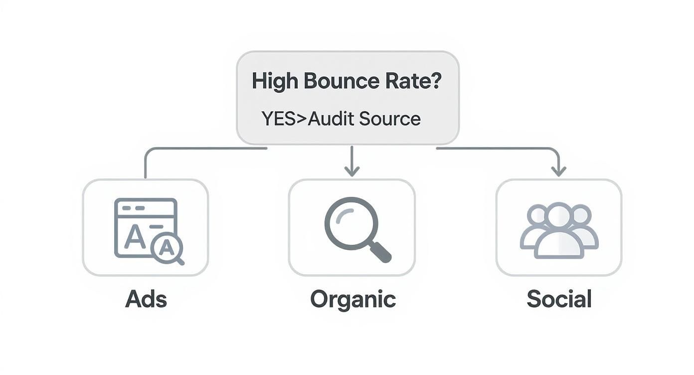
This flowchart is a great starting point for an audit because it forces you to look at the traffic source first. By figuring out where your bouncing visitors are coming from—whether it's an ad campaign, organic search, or a social media post—you can start to understand why their expectations aren't being met once they land on your site.
Is Your Site Speed Driving People Away?
Let's be blunt: the most common and unforgiving reason for a high bounce rate is a slow website. We live in a world of instant gratification, and every single second counts. If a user clicks a link and gets a blank white screen for even a few moments, their patience evaporates. They'll hit the back button without a second thought.
To get a hard look at your site's performance, run it through a tool like Google PageSpeed Insights. It gives you a detailed report card on how fast your page loads for both mobile and desktop users and, more importantly, provides specific recommendations for improvement.
It’s tempting to just look at the overall score, but you need to drill down into the key metrics:
- Largest Contentful Paint (LCP): This measures how long it takes for the main event—the largest image or text block—to show up. You want this to be under 2.5 seconds.
- First Input Delay (FID): This tracks how quickly your page becomes interactive (e.g., when a user can click a button). A good score here is less than 100 milliseconds.
When you're chasing down technical slowdowns, don't forget the backend. Issues with your server or applications can drag everything to a halt. It's worth exploring guides on solving application performance issues to see if server-side delays are the real culprit.
Auditing the User Experience and On-Page Friction
Even a lightning-fast site will hemorrhage visitors if the user experience (UX) is confusing or frustrating. This is where you have to put yourself in your visitors' shoes. Is your navigation intuitive? Can someone find what they're looking for without getting lost or annoyed?
One of the most powerful ways to diagnose UX problems is with user behavior analytics tools. Heatmaps, for instance, create a visual overlay showing exactly where users click, move their mouse, and how far they scroll. If you see that nobody is clicking your main call-to-action or that 80% of visitors never scroll past the fold, you've just found a major point of friction.
A confusing user interface is like a poorly designed physical store. If customers can't find the aisle they're looking for or the checkout counter is hidden, they're not going to stick around to make a purchase—they'll just leave.
Think about a common scenario: an e-commerce product page with a sky-high bounce rate. A heatmap might reveal that users are repeatedly clicking on a non-clickable brand logo, thinking it will do something, instead of the "Add to Cart" button. That’s a crystal-clear signal that your design is creating confusion and directly costing you sales.
Is Your Content Missing the Mark?
Your content is the promise you make to your visitors. When there's a mismatch between what your ad, search snippet, or social post promises and what your landing page actually delivers, users feel tricked. This disconnect is a primary driver of bounces.
For instance, if your Google Ad headline screams "50% Off All Running Shoes," but the landing page only features a small collection of discounted socks and one pair of last-season sneakers, visitors are going to feel bait-and-switched. They'll leave immediately because the page failed to deliver on its promise.
Dig into the search queries that bring users to your high-bounce pages. Are you ranking for terms that are only tangentially related to your content? If so, that's a sign you need to refine your SEO strategy to attract a more qualified audience whose intent perfectly aligns with what your page offers. It's about getting the right people to your site, not just more people.
High-Impact Fixes to Lower Your Bounce Rate

Alright, you've done the detective work and have a good idea of why people are bouncing. Now comes the fun part: fixing it. Knowing the problem is one thing, but implementing the right solutions is what will actually move the needle.
This is your playbook for making smart, high-impact changes. We're going to skip the fluff and get straight into the practical fixes that address the most common reasons visitors leave a site prematurely. The goal here is to make your website more welcoming, intuitive, and genuinely useful from the moment someone lands on it.
Start with the Need for Speed
Let's be blunt: slow websites kill conversions. Of all the reasons people bounce, a sluggish page load is the most common and the least forgiving. If your site takes more than 3 seconds to load, you've already lost a huge chunk of your audience before they’ve even seen your content.
You don't need a massive, months-long site overhaul to see a difference. Some of the biggest speed boosts come from simple tweaks:
- Shrink Your Images: This is almost always the biggest offender. Huge, unoptimized image files will bring any page to a crawl. Use a tool like TinyPNG to compress them without losing noticeable quality. It’s a game-changer.
- Turn On Browser Caching: Caching lets a visitor's browser "remember" parts of your site. When they come back, it loads almost instantly. Most modern hosting providers or CMS plugins have a simple one-click setting for this.
- Clean Up Your Code: Over time, websites accumulate bloated code from old plugins, themes, or unused features. A developer can help you minify your CSS, JavaScript, and HTML, which strips out unnecessary characters and makes the files much lighter.
For a deeper dive into more advanced techniques, our guide on how to improve website loading speed has you covered.
Overhaul Your Content for Scannability
Once the page loads, the next test is the content itself. Is it a giant, intimidating wall of text? If so, you can count on people hitting the back button.
People don’t read online; they scan. Your job is to make your content easy to digest at a glance. Simple formatting adjustments can completely transform a page from overwhelming to inviting.
A visitor should grasp the core message of your page within five seconds. If they have to work to find what they're looking for, they won't. They'll just leave.
Structure is your best friend here. Use clear headings, short paragraphs, and bullet points to break up the text. One of the most underrated tools is a Table of Contents (ToC) at the top of long articles. It empowers users to jump directly to the section they care about most, satisfying their intent immediately and drastically cutting the chance of a bounce.
Craft Calls-to-Action That Actually Guide People
A page without a clear next step is a dead end. If a visitor finishes reading and has no idea what to do next, you've failed them. Every single page on your website needs a primary Call-to-Action (CTA) that tells them precisely what their next move should be.
Your CTA shouldn't feel tacked on; it should be the logical conclusion of the page's content.
- Use Action-Oriented Language: Ditch "Submit" or "Click Here." Instead, use phrases that promise value, like "Get Your Free Quote" or "Download the Ebook."
- Make It Stand Out: Your main CTA button needs to pop. Use a color that contrasts with the rest of the page—something that draws the eye without clashing with your brand.
- Place It Where It Matters: The CTA should be visible "above the fold" (without scrolling) and repeated further down the page. Don't make someone hunt for it when they're ready to take action.
If you're running an ecommerce store, this is non-negotiable. Mastering Shopify conversion rate optimization is often about creating a series of clear, compelling CTAs that guide a user from product page to checkout.
Make or Break: The Mobile Experience
With well over half of all web traffic coming from mobile devices, a subpar mobile experience is simply unacceptable. If people have to pinch-and-zoom to read your text or can't tap a button without hitting three others, your mobile bounce rate will be through the roof.
Responsive design is just the starting point. A truly mobile-first approach means thinking about the user's context—they're probably on the go, distracted, and short on time. Your mobile site needs to be a lean, clean, and fast version of your desktop site, focused on getting them what they need with minimal friction.
The easiest way to check? Pull out your own phone and use your site. Can you read everything easily? Is navigation a breeze? This simple self-audit almost always uncovers obvious problems you can fix right away.
Prioritizing Your Fixes
Not all fixes are created equal. Some are quick wins, while others are major projects. To help you decide where to start, use this matrix to weigh the potential impact against the effort required.
Bounce Rate Fixes Prioritization Matrix
| Solution | Potential Impact (High/Medium/Low) | Implementation Effort (High/Medium/Low) | Best For |
|---|---|---|---|
| Optimize Page Speed | High | Medium | All websites, especially those with high bounce rates on landing pages. |
| Improve Content Readability | High | Low | Blogs, long-form content pages, and service pages. |
| Clarify CTAs | Medium | Low | E-commerce sites, landing pages, and lead generation pages. |
| Enhance Mobile UX | High | High | Any site where mobile traffic is a significant percentage of visitors. |
| Fix Broken Links/404s | Medium | Low | Older websites with lots of content and internal links. |
| Refine Ad Targeting | High | Medium | Campaigns driving paid traffic with low engagement or conversion rates. |
Focus on the "High Impact, Low Effort" items first. Improving your content's readability and clarifying your CTAs can often be done in an afternoon and deliver immediate results. From there, you can move on to the more resource-intensive tasks like a major mobile UX overhaul or deep-diving into page speed optimization.
Measuring and Refining Your Improvements
https://www.youtube.com/embed/eiIhTbFP0ls
Making changes to your site is a great first step, but it's only half the battle. The real progress comes from measuring the impact of those fixes, learning from the data, and doing it all over again. Tackling a high bounce rate isn't a one-and-done task; it’s an ongoing process of refining the user experience.
If you’re not testing your changes, you’re just guessing. A data-driven approach is what separates the sites that struggle from the ones that thrive. It helps you turn those educated guesses into confident, impactful decisions.
A/B Testing Your Way to Better Engagement
The gold standard for validating your improvements is A/B testing (or split testing). The concept is simple: you create two versions of a page—the original 'control' and a new 'variation'—and show them to different segments of your traffic. By comparing the results, you get definitive proof of what actually works for your audience.
You can A/B test just about anything. To get the most bang for your buck, start with these high-impact elements:
- Headlines and Subheadings: Does a benefit-oriented headline like "Get Flawless Skin in 30 Days" resonate better than a feature-focused one like "Our Advanced Skincare Formula"?
- Call-to-Action (CTA) Button: Experiment with the text ("Get Started Free" vs. "Sign Up Now"), the color (a bold, contrasting green vs. your standard brand blue), or even its placement on the page.
- Page Layout and Media: What happens if you swap that static hero image with a customer testimonial video? Does it keep people around longer? Test it and find out.
Let's say a product page has a 75% bounce rate. You suspect the main image just isn't cutting it. You could run an A/B test where one version shows the standard product photo, and the other features a 30-second video of the product in action. If, after a week, the video version’s bounce rate drops to 55%, you’ve got a clear winner.
Looking Beyond Bounce Rate
While lowering your bounce rate is a solid goal, it doesn't paint the full picture. You need to look at related metrics to understand how people are actually behaving on your site. After all, not all single-page visits are bad.
Pull in these complementary metrics for a more complete story:
- Average Engagement Time (GA4): This Google Analytics 4 metric shows you the average time your page was the primary focus in someone's browser. A user might spend five minutes reading every word of your article and then leave. That’s an engaged visitor, not a failed session.
- Scroll Depth: This shows you how far people are actually scrolling. If 90% of visitors bounce before scrolling at all, the problem is right at the top of the page. But if they're making it 75% of the way down before leaving, your content is probably hitting the mark, but your final CTA might be falling flat.
True optimization isn't just about preventing a bounce; it's about understanding the user's journey on a single page. A visitor who reads your entire blog post and then leaves is far more valuable than one who leaves after two seconds.
Analyzing these metrics together gives you a much richer, more actionable understanding of user behavior. For those ready to dig deeper, learning how to track website traffic will equip you to set up custom tracking that aligns perfectly with your business goals.
This cycle of testing, measuring, and refining is how you build a website that doesn't just attract traffic but actually serves people, turning quick bounces into meaningful engagement.
Common Questions About Bounce Rate (And What Most People Get Wrong)
As you dig into your site's analytics, you'll inevitably run into a few head-scratchers about bounce rate. It’s one of those metrics that seems simple on the surface but has a lot of hidden depth. Let’s clear up some of the most common points of confusion I see all the time.
Is a High Bounce Rate Always a Bad Thing?
Absolutely not. This is probably the biggest misconception out there. While a high bounce rate can signal a problem, you have to look at the context.
Think about someone Googling your business's address. They land on your contact page, grab the address, and leave. Mission accomplished, right? That’s a bounce, but it's also a successful user interaction. The page did its job perfectly.
The same goes for a blog post that answers a very specific question. If a visitor gets the information they needed and leaves satisfied, that's a win. The trouble starts when you see a high bounce rate on a page where you need the user to take another step, like a product page, a category page, or the first step of a checkout process.
The goal of the page is everything. For quick-answer content, contact pages, or single-page sites, a high bounce rate can actually mean you’re being incredibly efficient.
How Does Mobile Usability Affect Bounce Rate?
More than you can imagine. Today, a clunky mobile experience is one of the fastest ways to send your bounce rate through the roof. Most of your traffic is likely coming from phones, and those users have zero patience for friction.
Put yourself in their shoes. You click a link and the page loads slowly. The text is tiny, forcing you to pinch and zoom. The buttons are too small to tap without hitting the wrong one. What do you do? You hit the back button. Instantly.
A website that is fast, readable, and easy to navigate on a phone isn't a luxury anymore; it's the bare minimum. A responsive design is the start, but the real goal is an experience that feels completely natural and effortless for someone on the go.
What Is the Difference Between Bounce Rate and Exit Rate?
It's easy to mix these two up, but they tell you very different stories about user behavior. Getting this right is crucial for finding the real problems on your site.
- Bounce Rate: This is all about single-page visits. It’s the percentage of people who land on a page and leave without clicking anything else on your site.
- Exit Rate: This tracks the last page a user sees in a session, no matter how many other pages they visited before it.
Here’s the simple way to remember it: every bounce is an exit, but not every exit is a bounce.
A high exit rate on your order confirmation or "thank you" page is perfectly normal—where else would they go? But a high exit rate on the second page of your checkout form? That's a massive red flag. It tells you that something on that specific page is causing people who were already engaged to give up and leave.
Ready to turn those bounces into conversions? The team at Sugar Pixels specializes in creating fast, intuitive, and engaging websites that captivate your audience from the first click. Learn more about our web design and optimization services.