To slash your cart abandonment rate, you have to get ahead of the common frustrations that make people leave. Think about it: unexpected shipping costs, being forced to create an account, or a checkout process that feels like a maze. The goal is to build trust by being upfront about costs and making the journey from cart to confirmation completely seamless.
Understanding The 'Why' Behind Abandoned Carts
Before you start changing things, you need to play detective and figure out the real reasons shoppers are leaving your store. Every time someone clicks "add to cart," they're showing clear intent to buy. An abandoned cart isn't just a lost sale; it's a story about friction, doubt, or a last-minute hiccup in their journey.
The reasons people bail are often more psychological than you might expect. Sure, high shipping fees are a classic culprit, but plenty of other small details can chip away at a customer's confidence right when they're about to pull the trigger.
The Most Common Culprits
Cart abandonment isn't just a minor issue—it's a huge and growing one. The global average has crept up to a staggering 70.19%, which is a significant jump from just a few years ago. This tells us that customer expectations are higher than ever. To learn more about what these numbers mean, you can find some great insights in these cart abandonment statistics.
The biggest friction points usually boil down to a few key areas:
- Surprise Costs: This is the big one. Unexpected shipping fees, taxes, and other charges that pop up at the last second are the number one reason people abandon their carts.
- Checkout Roadblocks: A long, clunky checkout process is a conversion killer. Forcing users to create an account or not offering a guest checkout option adds unnecessary steps and frustration.
- Trust and Security Gaps: If your site looks unprofessional, lacks security seals (like an SSL certificate), or has a murky return policy, shoppers will hesitate to hand over their credit card details.
Tackling how to reduce cart abandonment starts with empathy. You need to put yourself in your customer's shoes and walk through your own checkout. Where does it feel confusing, unfair, or untrustworthy?
A Closer Look at Checkout Friction
To really understand what's tripping up your customers, let's break down some of the most common issues. These are the little snags that, when added up, can cause a massive drop-off right before the finish line.
Common Checkout Friction Points and How to Fix Them
| Friction Point | Impact on Shoppers | Actionable Solution |
|---|---|---|
| Unexpected Shipping Costs | Creates "sticker shock" and breaks trust. Shoppers feel ambushed by last-minute fees. | Display shipping costs or a shipping calculator early in the process, ideally on the product or cart page. |
| Forced Account Creation | Acts as a barrier, especially for new customers who aren't ready to commit to a full account. | Offer a prominent guest checkout option. You can always ask them to create an account after the purchase. |
| Complex Checkout Forms | Long, confusing forms with too many fields are overwhelming and feel like a chore. | Simplify your forms. Only ask for essential information and use features like address auto-complete. |
| Lack of Payment Options | Customers have strong preferences for certain payment methods (e.g., PayPal, Apple Pay) for security and convenience. | Offer a variety of popular payment gateways. Digital wallets are a must-have for mobile shoppers. |
| Hidden Return Policy | An unclear or hard-to-find return policy creates uncertainty and risk, making shoppers hesitant to buy. | Make your return policy easy to find and understand. Link to it clearly from your product pages and checkout. |
By addressing these specific points, you’re not just making small tweaks; you’re fundamentally improving the customer’s experience and removing the very reasons they were leaving in the first place.
Diagnosing Your Store's Weak Points
Okay, so you know the common problems, but which ones are affecting your store? It’s time to move from general stats to your own data. This is where you get specific.
Tools that show user behavior, like the heatmaps in Hotjar or Crazy Egg, are invaluable. They can show you exactly where people are dropping off in your checkout funnel. Are they leaving when they see the shipping options? Or is it the payment page that's causing trouble? This information is pure gold.
Don't forget to simply ask your customers. Post-purchase surveys or feedback forms for users who abandoned their carts can give you direct, honest answers. You might find out your site loads too slowly on mobile or that a popular payment method is missing. Pinpointing these precise issues lets you stop guessing and start making data-driven improvements that will directly boost your bottom line.
Crafting a Checkout Experience That Just Works
Think of a confusing or long-winded checkout as the online version of a ridiculously long line at a store. What do most people do? They walk away. Your mission is to make the journey from adding an item to the cart to seeing that "Thank You" page so seamless that your customer barely even thinks about it. It’s all about getting out of their way.
One of the biggest culprits I see tripping up customers is the forced account creation. For someone new to your brand, being asked to create a password and hand over personal info before they can even buy feels like a big, unnecessary commitment. It’s no surprise that 26% of shoppers will ditch their cart if you make them create an account first. The fix is beautifully simple: make guest checkout the most obvious option.
You can always invite them to create an account on the confirmation page after the sale is complete. At that point, they’ve already bought from you and are far more likely to see the value.
Keeping the Flow Simple and Focused
Once a customer hits that "Checkout" button, their focus should be on one thing: completing the purchase. This isn't the time for distracting navigation menus, pop-up ads, or "you might also like" suggestions. A clean, minimalist page design works wonders here.
A simple progress indicator can be a game-changer. Just a small visual bar showing where they are—like "Shipping," "Payment," and "Review"—gives customers a sense of control. It answers the question, "How much longer is this going to take?" and keeps them moving forward.
I've seen a couple of checkout formats work really well for this:
- Single-Page Checkout: This lays out all the fields—shipping, billing, and payment—on one page. It feels fast because there are no page reloads, and the customer can see the entire scope of what's needed at a glance.
- Accordion-Style Checkout: This is a smart way to keep a single page from feeling overwhelming. It breaks the process into collapsible sections. When a customer finishes their shipping info, that section closes, and the payment section opens. It’s a clean, linear path that guides them step-by-step.
Designing Smarter Forms
Every single field in your checkout form is a tiny bit of work for your customer. The more work, the higher the chance they’ll get frustrated and leave. The goal is to minimize typing and make the whole thing feel less like a chore.
Features like address auto-fill (using something like the Google Places API) are no longer just a nice-to-have; they're essential. As someone starts typing their address, it magically fills in the rest. This isn’t just faster; it also cuts down on typos that lead to frustrating delivery problems.
Your checkout should also be smart enough to anticipate what the user wants. That little checkbox for "My billing address is the same as my shipping address" is a perfect example. It's standard for a reason—it saves people from having to type out their information twice. Getting these details right is a massive part of effective website design and digital marketing.
Of course, the platform you build your store on matters, too. If you're selling digital downloads or courses, checking out the best places to sell digital products can give you a head start, as many of them come with highly optimized, pre-built checkout systems that handle these technical details for you.
Optimizing for the Mobile-First Shopper
Let's be honest: shopping on a phone is a totally different ball game than on a desktop. The screen is smaller, our thumbs are way less precise than a mouse, and we're constantly getting interrupted. Simply shrinking your desktop site and calling it "mobile-friendly" is a direct path to frustrating your customers and killing your conversion rates.
This isn't just a hunch; the numbers back it up. The average cart abandonment rate on mobile devices is a staggering 85.65%. That’s a huge leap from desktop rates. It screams that users are running into mobile-specific roadblocks, like fumbling with tiny form fields or pecking out credit card numbers on a cramped keyboard. If you want to dig deeper into the data, these cart abandonment findings lay out the challenge pretty clearly.
So, a true mobile-first design isn't just a buzzword. It's essential for survival.
Make Everything Thumb-Friendly
On mobile, every single tap matters. Tiny, hard-to-hit buttons or links buried in small text are an instant source of frustration. To fix this, you have to design with thumbs in mind, creating a forgiving and effortless interface.
- Enlarge Buttons and CTAs: Your "Add to Cart" and "Proceed to Checkout" buttons should be big, bold, and have plenty of breathing room around them to prevent accidental taps.
- Simplify Navigation: Hide those complex, multi-level menus. The mobile checkout needs to be a laser-focused environment with a clear, single path to purchase.
- Use Visual Form Fields: Instead of clumsy dropdown menus for product options like size or color, switch to tappable visual swatches. They’re faster and far more intuitive on a small screen.
A great rule of thumb I always follow: design for one-handed use. If someone can't easily navigate your checkout while holding a coffee, it's too complicated. The goal is to make the process feel completely effortless.
Minimize Typing at All Costs
Nobody enjoys typing out their full address and credit card information on a tiny mobile keyboard. It’s tedious, and typos are almost guaranteed. The less you force your customers to type, the more likely they are to complete their purchase.
This is where integrating modern payment solutions becomes non-negotiable.
These services are game-changers. They let shoppers pay with a quick fingerprint or face scan, securely pulling their saved shipping and payment details. What was once a multi-step typing nightmare becomes a single, secure tap. Adding these options is one of the single most impactful changes you can make to slash mobile abandonment.
Look at the image below. It’s a perfect example of well-designed mobile input fields, featuring large tap targets and crystal-clear labels. This approach makes entering data so much less of a chore.
The key takeaway here is the generous spacing and large font size. This simple design choice reduces the mental effort required from the user and dramatically cuts down on errors. By respecting the physical reality of using a small touchscreen, you remove a massive layer of friction that sends so many potential customers running.
Building Trust Through Transparency and Social Proof
Doubt is a conversion killer. It’s that little voice in a shopper’s head that pops up right before they click "Buy Now." When a customer is on the fence, even a tiny flicker of uncertainty about your store's legitimacy or security can send them running. This is especially true when it comes to sharing their credit card details.
Building a solid foundation of trust isn’t just a nice-to-have. It's a fundamental part of keeping people from bailing on their carts.
The whole process starts with being radically transparent about costs. I’ve seen it time and time again: a customer is excited about their purchase, sails through to the final step, and then gets hit with an unexpected shipping fee. Research confirms this, showing that 48% of shoppers abandon carts because of surprise costs like shipping and taxes. Hiding those fees until the last second feels like a bait-and-switch, and it instantly shatters any trust you’ve earned.
The fix is simple: be upfront. Give customers a shipping calculator on your product pages. Clearly outline your shipping thresholds in the cart itself. A running total that updates with every change gives the customer a sense of control and prevents that final, deal-breaking "sticker shock."
Showcasing Security and Reliability
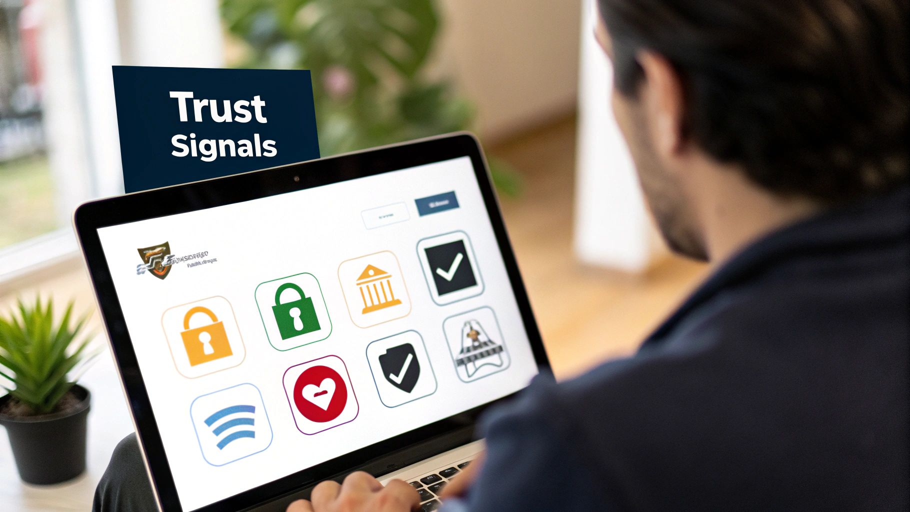
Beyond transparent pricing, shoppers need to feel their personal and financial data is safe. This is where visual trust signals become your best friend. They offer a silent, powerful reassurance that your store is legitimate and takes security seriously.
You should sprinkle these trust signals strategically throughout your checkout flow:
- Security Badges: Logos from well-known providers like McAfee, Norton, or even a simple "Secure SSL Connection" badge can work wonders. I always recommend placing them right near payment fields and the final "Complete Order" button.
- Payment Provider Logos: Displaying the icons for Visa, Mastercard, and PayPal borrows their established credibility. People feel much more comfortable using a payment method they already know and trust.
- Clear Policies: Don’t make people hunt for your return and refund policy. Link to it clearly from the cart and checkout pages. A generous, easy-to-understand policy dramatically lowers the perceived risk of making a purchase.
A shopper’s decision to buy often comes down to a simple question: "Do I trust this company?" Every security badge, clear policy, and upfront cost is a small 'yes' that builds toward the final conversion.
The Undeniable Power of Social Proof
Here’s a simple truth: people trust other people more than they trust brands. That’s the core idea behind social proof, and it’s one of the most effective ways to calm a nervous buyer’s mind.
Seeing that others have bought from you—and were happy they did—acts as a powerful, authentic endorsement. You can weave this customer-generated content directly into the shopping experience. For example, a feed of recent, positive reviews on a product page can give a hesitant shopper the final nudge they need to add that item to their cart.
Another tactic I love is using user-generated photos. Seeing a product being used by a real person in a real-world setting is infinitely more compelling than a polished studio shot. When you combine these elements, your brand feels more human and trustworthy, which is a direct line to your goal to reduce cart abandonment.
Winning Back Sales with Smart Recovery Emails
Let's be clear: an abandoned cart isn't a lost sale. Not yet, anyway. Think of it as a warm lead—someone who liked your products enough to add them to their cart. They're on the one-yard line, and a well-crafted email sequence is often all it takes to get them across the goal line.
Forget the old "one and done" email blast. A truly effective strategy is a timed sequence of messages, each with a specific job to do. This isn't about annoying your potential customers; it's about giving them a gentle, helpful nudge back to their cart. For a deeper dive into the mechanics, our guide on email marketing tips for small biz has some great complementary tactics.
The First Nudge: The Helpful Reminder
Your first email needs to be fast. I’m talking one to three hours after they’ve left your site. The purchase is still fresh in their mind, and a simple distraction—a phone call, a barking dog, a technical glitch—is often the real culprit.
The tone here is crucial: be a helpful assistant, not a pushy salesperson.
- Subject Line Ideas: "Oops, did something go wrong?" or "We saved your cart for you!"
- What to Include: Show them exactly what they left behind with crisp, clean product images. Most importantly, give them a big, obvious button that takes them directly back to their pre-filled cart. Hold off on offering a discount just yet; you'd be surprised how many people convert without one.
The Second Touch: Adding a Little Urgency
If 24 hours go by and the cart is still sitting there, it’s time for your second email. Now we can gently dial up the urgency or sweeten the deal. A little bit of FOMO (fear of missing out) can be a powerful motivator.
Mentioning that an item is a bestseller and might sell out, or that their cart reservation is about to expire, can work wonders. If you decide an incentive is needed, make it count.
Pro Tip: Free shipping often works better than a percentage discount. Why? Because unexpected shipping costs are one of the biggest reasons people abandon carts in the first place. You’re not just giving a discount; you’re solving a common problem.
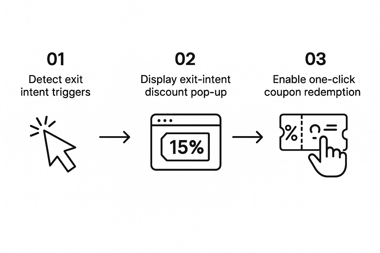
This approach works in tandem with on-site tools that can stop abandonment before it even happens, like an exit-intent popup.
As you can see, catching a customer on their way out with a simple offer can reduce the need for a full email sequence, turning a potential abandonment into an immediate sale.
The Three-Part Email Recovery Blueprint
To put this all together, I've mapped out a simple, three-part sequence that I've seen work time and time again. It’s a proven blueprint that balances helpfulness with persuasion, guiding the customer back without being aggressive.
| When to Send | Core Message & Tone | Strategic Goal | |
|---|---|---|---|
| Email #1 | 1-3 Hours | "We saved your items!" Helpful & low-pressure. |
Overcome simple distractions or technical snags. |
| Email #2 | 24 Hours | "Your cart is about to expire." Introduce scarcity or a small incentive. |
Create urgency and address price sensitivity (e.g., offer free shipping). |
| Email #3 | 3-4 Days | "Here’s a special offer to complete your order." Best offer, last chance. |
Make a final, compelling offer to secure the sale. |
This structured approach systematically addresses the most common reasons for abandonment and maximizes your chances of recovery with each message.
The Final Offer: Your Best and Last Shot
The third email, sent around the three or four-day mark, is your grand finale. Don’t just take my word for it—the data backs this up. Recovery emails have a phenomenal 39.07% open rate, and automated campaigns with three emails consistently outperform single-email sends by a massive margin.
This is where you bring out your best offer. If you were holding back on a discount code, now's the time to use it. Pair it with a strong subject line and a clear, urgent call to action.
To get more ideas on how to set this up, you can check out these marketing automation workflow examples, including abandoned cart recovery. By creating a deliberate, multi-step process, you build a reliable system for rescuing revenue that would have otherwise slipped away.
Common Questions About Cart Abandonment
https://www.youtube.com/embed/9jaKpLnm-WQ
Even when you're doing everything right, you'll still have questions about abandoned carts. It’s just part of the process. Getting solid answers to these common sticking points can be the key to turning a stalled recovery effort into a real success. Let's dig into some of the questions I hear most often.
What Is a Good Cart Abandonment Rate?
I get this question all the time. While the broad industry average sits around 70%, a truly "good" rate is all about your context. What are you selling? High-end electronics or luxury fashion will naturally see more "window shopping" and higher abandonment than, say, everyday household goods.
Instead of chasing a magic number, focus on improving your own baseline. A fantastic initial goal is to bring your current rate down by 10-15%. Don't get discouraged by the averages. The top-tier ecommerce stores might get down to 50-60%, but the only metric that really matters is your own steady improvement over time.
How Quickly Should I Send a Recovery Email?
Faster than you think. Almost always.
For that first abandoned cart email, the sweet spot is within one hour. Why so fast? Because the customer's interest is still high and the products are fresh in their mind. You're catching them while they're still in that buying mindset.
If you wait 24 hours, you've given them far too much time to talk themselves out of it, find a deal somewhere else, or just completely forget they were ever on your site. The first message should feel like a helpful nudge, not a hard sell.
Think of that first email as a customer service check-in. Something simple like, "Hey, looks like you left something behind. We saved it for you in case you had trouble checking out." That helpful, low-pressure approach works wonders for re-engagement.
Are There Other Ways to Retarget Shoppers?
Email is your workhorse, but you can't rely on it alone. To effectively recover lost sales, you need to cast a wider net. It's all about showing up where your customers are.
Here are a few other channels that work well:
- Social Media Retargeting: Use platforms like Facebook and Instagram to display dynamic ads. These can show the exact products someone viewed or added to their cart. It’s a powerful and visual reminder.
- Web Push Notifications: If a user has opted in, you can send a notification right to their browser. It's a great way to cut through a cluttered email inbox with a quick, direct message.
- SMS Marketing: This one is incredibly effective but requires a delicate touch. You must have explicit permission. For high-value carts, a well-timed text message can be the final push a customer needs, but use it sparingly to avoid feeling intrusive.
Will Discounts in Emails Hurt My Profits?
That’s a fair and important question. The key is to be strategic, not just throw discounts at everyone. Never lead with an offer in your first recovery email. Give them a chance to complete the purchase on their own first.
Hold that discount for the second or even third email in your follow-up sequence. You can also get smart about the type of incentive. Sometimes, offering free shipping is more compelling than a percentage-off discount because it solves one of the biggest reasons for abandonment: unexpected costs.
If you have more questions about implementing these tactics, you can find additional answers on our company's FAQ page.
Ready to transform your website from a source of frustration into a powerful conversion engine? Sugar Pixels offers comprehensive web design and digital marketing services to help you reduce cart abandonment and grow your business. Get your custom strategy today at sugarpixels.com.


