
In a world of short attention spans, website performance isn't just some tech-nerd metric to track—it’s a make-or-break factor for your business. Let's be honest, a slow website actively works against you. It creates a wall of frustration that sends potential customers running before they even see what you have to offer.
This isn’t about abstract numbers. It’s about meeting genuine user expectations and understanding the very real impact speed has on your bottom line.
Why Fast Websites Win
Slow-loading pages come with a steep price tag. Globally, it's estimated that businesses lose around $2.6 billion every year simply because their sites are too slow.
Think about your own experience. How long are you willing to wait? Research shows that 83% of people expect a page to load in three seconds or less. When a site misses that mark, the results are brutal. A delay of just two seconds can spike bounce rates by as much as 87%—that's a huge chunk of your audience and potential revenue, gone in an instant.
Google's own data backs this up. They found that increasing page load time from one to seven seconds skyrockets the probability of a mobile visitor leaving by 113%. Every single millisecond counts.
Getting to Grips with Core Web Vitals
To help us measure what "fast" actually feels like to a real person, Google gave us Core Web Vitals. These are specific, user-centric benchmarks that define a great on-page experience. Thinking about these metrics from the start is a crucial part of our philosophy on how to build a website that people love to use.
The three pillars you need to know are:
-
Largest Contentful Paint (LCP): This is all about perceived load speed. It measures how long it takes for the main event on the page—like a hero image or a big block of text—to appear. Your goal here is an LCP under 2.5 seconds. It answers the user’s first question: "Is anything happening?"
-
Interaction to Next Paint (INP): This one measures responsiveness. How quickly does your page react when someone clicks a button, opens a menu, or fills out a form? A good INP is under 200 milliseconds, making the site feel snappy and interactive, not clunky.
-
Cumulative Layout Shift (CLS): We've all been there—you go to click a link, and suddenly an ad loads and pushes everything down, causing a misclick. CLS measures this visual instability. A low score (ideally under 0.1) means your page is stable and predictable as it loads.
Optimizing for these vitals isn't just about chasing a better Google ranking. It’s about fundamentally respecting your user's time and giving them a smooth, professional experience. A fast, stable site builds trust, keeps people engaged, and ultimately drives more conversions.
For a deeper dive into the nuts and bolts of improving your site, these actionable web performance best practices are a fantastic resource.
Taming Those Bloated Media Files

If your website feels sluggish, there’s a good chance oversized media files are the culprit. They're the silent performance killers, adding unnecessary weight to your pages and causing visitors—especially those on mobile—to bounce. Getting a handle on your media is one of the single most effective things you can do for your site's speed.
The great news is you don't have to choose between a beautiful site and a fast one. Modern optimization techniques let you have both. This isn’t about degrading your visuals; it’s about making them load smarter and faster.
Start by Choosing the Right Format
Your first, and arguably easiest, win is picking the right file type for the job. Not all image formats are created equal, and the days of just defaulting to JPEG or PNG are long gone.
- JPEG: This is still your workhorse for photos and complex images with lots of colors and gradients. Its compression method is tailor-made for this kind of visual.
- PNG: Use this when you need sharp lines, like in logos or illustrations, or when an image requires a transparent background. It offers lossless compression, preserving every detail but often at the cost of a larger file size.
- WebP: This is the modern powerhouse. Developed by Google, WebP is a game-changer, offering compression that can result in files 25-34% smaller than their JPEG or PNG equivalents without any noticeable drop in quality. It also supports transparency. For most situations on the web today, WebP is the way to go.
Think of it this way: using an outdated format is like shipping a small item in a giant, heavy box. Switching to WebP is like using a perfectly sized, lightweight container that gets your content delivered much more efficiently.
Compress Everything, No Excuses
After you’ve picked the right format, the next step is compression. This process intelligently strips out unnecessary data from the file to shrink its size. You'll encounter two main types.
Lossless compression tidies up the file by removing non-essential metadata without altering the image pixels. The quality is 100% preserved, but the file size reduction is usually modest.
Lossy compression, on the other hand, achieves much more dramatic size reductions by permanently removing some pixel data. When done correctly, this removal is completely imperceptible to the human eye, but it can slash file sizes. For almost all web use, a well-executed lossy compression is the perfect balance.
Here's the bottom line: every single image you upload should be compressed first. This isn't just a suggestion; it's a foundational practice for any site that cares about performance.
This is especially true for e-commerce, where product photos are everything. If you're running an online store, a deep dive into how to optimize images and videos for Shopify can make a world of difference, ensuring your products look great without slowing down the shopping experience.
Use Responsive Images and Lazy Loading
Forcing a tiny smartphone to download a massive desktop-sized image is a huge waste of data and a direct cause of slow load times. This is where responsive images save the day. By using the srcset attribute in your HTML <img> tag, you can provide the browser with a menu of different-sized versions of the same image.
The browser then acts as a smart waiter, picking the "just right" size based on the user's screen. A phone gets a small, lightweight version, while a 4K monitor gets the beautiful, high-resolution version it can handle.
Finally, you need to implement lazy loading. This brilliant technique tells the browser not to load media files that are "below the fold"—meaning, off-screen. Instead of downloading every single image and video right away, it only loads what the user can see. As they scroll, the next set of images loads just in time. This drastically improves the initial page load time, getting your most important content in front of your audience much, much faster.
From Bloated to Blazing Fast: A Guide to Code Optimization
It’s not just heavy images that bog down a website. More often than not, the culprit is the code itself—the HTML, CSS, and JavaScript that form the very foundation of your site. Every extra comment, every unused line of code, and every inefficiently loaded script adds precious milliseconds, and sometimes whole seconds, to your load time.
Think of it this way: your code is your website's engine. A clean, finely tuned engine runs like a dream. A bloated one sputters, struggles, and leaves your visitors waiting. Getting your code in shape means stripping out the dead weight and making sure what's left is delivered to the user's browser as efficiently as possible. This is how you transform a clunky site into a genuinely fast and responsive experience.
H3: Minify Everything You Can
The first, and frankly easiest, win is minification. This is a simple, automated process that strips out all the characters from your code files that a browser doesn't need to function. We're talking about things like:
- Whitespace and line breaks
- Code comments
- Block delimiters (like curly braces in some contexts)
These elements are essential for developers to read and maintain the code, but to a web browser, they're just junk. By minifying your HTML, CSS, and JavaScript, you can easily slash their file sizes by 30-50%, sometimes even more. That translates directly into faster download and processing times.
Modern development tools like Webpack and popular CMS plugins (think WP Rocket for WordPress) can handle this for you automatically. You set it up once, and you get smaller files forever. It’s a foundational part of any serious approach to website design and digital marketing, where speed is just as important as aesthetics.
My Two Cents: Minification is a no-brainer. It's a "set it and forget it" optimization that gives you a permanent speed boost with zero downsides. If you're not doing it, you're leaving performance on the table.
H3: Hunt Down and Eliminate Unused Code
Over the years, websites collect what developers call "code debt." You try a new plugin, switch themes, test out a feature, and then move on. But the CSS and JavaScript that powered those old elements? They often get left behind, loading on every single page even though they do absolutely nothing.
This is pure dead weight. It’s like forcing your visitors to carry a backpack full of rocks just to see your content. It serves no purpose and only slows things down.
Your browser's built-in developer tools are your best friend here. The Coverage tab in Chrome DevTools, for instance, is a goldmine. It shows you exactly which lines of CSS and JavaScript were loaded on a page but never actually used. Digging in and removing this cruft, especially from old themes or deactivated plugins, can lead to some of the most significant performance gains you'll see.
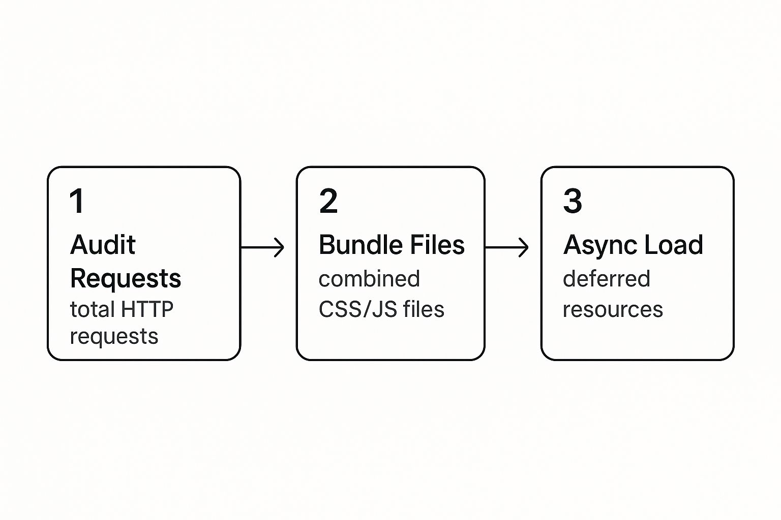
This visual breaks down the core principle perfectly: reduce what you send to the browser by auditing your assets, then control how you send it with smart loading strategies.
H3: Master Your JavaScript Loading Strategy
Not all JavaScript is critical. Some scripts are essential to make the page appear correctly, but others—like analytics trackers, social media widgets, or live chat pop-ups—can definitely wait. The problem is, by default, a web browser sees a <script> tag and stops everything. It pauses parsing the HTML and rendering the page until that script is downloaded and executed. This is called render-blocking, and it's a major cause of slow-loading pages.
Luckily, you have two powerful tools to fight this: the async and defer attributes.
async: Tells the browser to download the script in the background without stopping the HTML parsing. Once it's downloaded, then it will pause parsing to execute it. This is great for completely independent, third-party scripts that don't depend on anything else, like a Google Analytics tag.defer: This also downloads the script in the background. But the crucial difference is that it waits to execute the script until after the entire HTML document has been fully parsed. Deferred scripts also run in the order they appear in the code. This is almost always the best choice for scripts that need to interact with the page's content but aren't needed right away.
To make the differences crystal clear, here’s how they stack up against each other.
Impact of JavaScript Loading Attributes
| Attribute | HTML Parsing | Script Fetch | Script Execution | Best Use Case |
|---|---|---|---|---|
<script> |
Paused during fetch & execution | Immediately | Immediately after fetch | For critical scripts that must run before the page renders. |
<script async> |
Continues during fetch | In the background | As soon as fetch is complete (pauses parsing) | Independent, non-essential scripts (e.g., analytics). |
<script defer> |
Continues during fetch | In the background | After HTML parsing is complete | Most non-critical scripts, especially those needing the full DOM. |
In practice, switching non-essential JavaScript from the standard render-blocking method to defer is one of the most impactful changes you can make. It dramatically improves perceived load time and your Core Web Vitals scores because it lets your visitors see and interact with your content as quickly as possible. You're no longer making them wait for secondary features to load.
Building a High-Performance Server Foundation

You can have the most beautiful, streamlined code and feather-light images, but it all means nothing if your server takes an eternity to respond. Think of it this way: you wouldn't put a lawnmower engine in a Formula 1 car. A strong server foundation is the unsung hero of website performance, and without it, all your front-end work is for show.
This back-end performance is where many businesses find their competitive edge. It all boils down to your hosting environment and how fast it can process a request and fire back that first byte of data.
Winning the First Battle: Time to First Byte (TTFB)
Before a browser can even start to draw your webpage, it’s stuck waiting for your server to pick up the phone. That wait time is your Time to First Byte (TTFB). It’s the raw measure of how long it takes from the moment a user hits "Enter" on your URL to the instant the very first piece of your site's data arrives.
A sluggish TTFB is a dead giveaway that your server-side operations are the bottleneck. This could be anything from clunky database queries to bloated application code, or you might have just outgrown your hosting plan.
A good TTFB is anything under 200 milliseconds. If you're consistently seeing numbers over 600ms, that's a serious red flag demanding immediate attention.
Sure, you can dive deep into optimizing your application's logic and cleaning up database queries. But honestly, the fastest and most impactful fix for many is simply upgrading their hosting. Shared hosting is cheap for a reason—you're sharing resources with potentially hundreds of other sites, which almost guarantees inconsistent performance. Moving to a Virtual Private Server (VPS) or a dedicated server is often the key to unlocking the power needed for a consistently low TTFB.
Make Distance Irrelevant with a Content Delivery Network (CDN)
A Content Delivery Network (CDN) is one of the most powerful tools you can add to your performance toolkit. Its job is brilliantly simple: it makes geography irrelevant.
A CDN is a global network of servers that stores copies (caches) of your website's static files, like images, CSS, and JavaScript. When someone in Tokyo visits your site that’s hosted in New York, their request doesn't have to travel halfway across the globe. Instead, the CDN serves up your files from a local server right there in or near Tokyo. This simple trick dramatically slashes latency—the time it takes for data to travel—and gives your global audience a much faster experience.
Setting up a CDN is surprisingly easy these days and provides an immediate, noticeable speed boost for users everywhere. It's no longer an optional luxury; it's a foundational requirement for any serious online business.
Enable Modern Protocols and Compression
How your server talks to a browser has a huge impact on speed. Two crucial technologies you need to ensure are enabled are HTTP/3 and Brotli compression.
- HTTP/3: This is the latest version of the protocol that powers the web. It uses a new transport protocol called QUIC to deliver major performance boosts, especially over shaky connections like mobile networks.
- Brotli: A modern compression algorithm from Google that's even more efficient than the old Gzip standard. It makes your text-based files (HTML, CSS, JS) even smaller, so they download in a flash.
The digital world is unforgiving. With user expectations for speed at an all-time high—53% of mobile users will bail if a site takes more than three seconds to load—every millisecond counts. Hitting Google’s Core Web Vitals targets, like an LCP under 2.5 seconds, is directly tied to how responsive your server is.
To make sure your server foundation stays rock-solid, you need to keep an eye on it. Implementing proactive monitoring, as detailed in these network monitoring best practices, helps you spot and fix problems long before your users ever feel them.
Future-Proofing Your Site with Modern Web Tech

Keeping your website fast isn't just about fixing what's broken today; it's about building for tomorrow. The real secret to long-term performance is baking modern web philosophies right into your development process. This is what separates a site that's fast now from one that stays fast.
Think of it as moving from a reactive to a proactive mindset. Instead of constantly putting out fires and patching up performance issues, you're building a foundation so solid that those problems rarely crop up in the first place.
Adopt a Mobile-First Philosophy
For years, "mobile-first" has been a popular buzzword. Now, it's simply a non-negotiable reality. A mobile-first approach means you design and build for your most constrained users first—those on smaller screens, with spotty connections and less powerful devices. It forces you to prioritize what truly matters.
Starting with mobile compels you to be lean and ruthless about what's essential. You have to make tough calls on features, content, and imagery, ensuring only the most critical elements are there. From there, you can progressively enhance the experience for desktop users, adding richer content and more complex features where they make sense. It’s a far more effective strategy than taking a bloated desktop site and trying to cram it onto a phone.
The numbers don't lie. With 59% of all web traffic now coming from mobile, a clunky mobile site is a direct threat to your bottom line. It’s shocking, but mobile pages often take a staggering 87.8% longer to load than their desktop counterparts. This has a real-world impact on sales, as 45.4% of shoppers are less likely to buy from a slow site, and 36.8% are less likely to return. You can explore more about how ecommerce speed impacts shopper behavior and learn how to maintain peak performance.
Implement a Strict Performance Budget
Here’s one of the most powerful things you can do for long-term speed: set a performance budget. I'm not talking about money. This is a set of hard, measurable limits for your pages that your team agrees to never cross. It's a line in the sand that protects the user experience from feature creep and code bloat.
Your performance budget could include metrics like:
- Total Page Size: Keep the entire page under a certain size, say 1.5MB.
- Time to Interactive (TTI): The page must be fully usable in under 5 seconds on a slow 3G connection.
- Core Web Vitals: Set firm targets for LCP, INP, and CLS that are non-negotiable.
- Request Count: Limit the total number of HTTP requests to under 75.
By treating performance as a key feature with a fixed budget, you completely change the conversation. The question shifts from, "Can we add this feature?" to, "Can we add this feature without blowing our performance budget?"
This simple change forces creative problem-solving. It ensures speed remains a core priority throughout the site's entire lifecycle, not just an afterthought when things get slow.
Leverage Modern Front-End Frameworks
Today’s front-end frameworks have performance baked right into their DNA, making it easier than ever to build incredibly fast websites. Tools like Next.js (built on React) and SvelteKit are designed with speed as a core principle, offering powerful features that would be a nightmare to implement from scratch.
These frameworks handle a lot of the heavy lifting for you, including:
- Automatic Code Splitting: They intelligently break your JavaScript into smaller, manageable chunks. This means users only download the code they need for the specific page they're on, not the entire site's code at once.
- Server-Side Rendering (SSR) & Static Site Generation (SSG): Pages can be pre-built on the server or during the build process, sending fully-formed HTML to the browser. The result is a near-instant First Contentful Paint.
- Built-in Optimizations: Many come with automatic image optimization, smart script loading, and other performance-boosting features turned on by default.
Using these tools doesn't just make your site faster; it also makes your team more efficient. By letting the framework handle the complex optimizations, your developers can focus on what they do best: building a fantastic user experience on a foundation that is already blazing fast.
Common Questions on Website Performance
https://www.youtube.com/embed/GUfA3a0
Once you start digging into website optimization, you quickly realize that the theory is one thing, but putting it into practice is another. It's easy to read about image compression or caching, but what happens when you actually try it? What do you do next?
Let's walk through some of the most common questions that pop up when people start this journey. Think of this as your field guide for those frequent little hurdles. Getting these answers straight will give you the confidence to make the right moves and keep your site fast for the long haul.
What Tools Should I Use to Measure My Website Performance?
Knowing where to begin is often the hardest part. The good news is there are some incredible—and mostly free—tools out there that give you a crystal-clear look at your site’s performance. You don't need to be a developer to get real value from them.
From my experience, these are the tools you’ll want in your back pocket:
- Google PageSpeed Insights: This should be your first stop. It gives you a great mix of technical "lab" data and real-world user data, plus it scores your site against the all-important Core Web Vitals.
- GTmetrix: When you're ready to go a level deeper, GTmetrix is fantastic. It provides incredibly detailed reports, tracks your performance over time, and has a waterfall chart that shows you exactly which files are causing bottlenecks.
- Lighthouse (in Chrome DevTools): For a quick, on-the-fly check, you can't beat the Lighthouse tool built right into your Chrome browser. Just open DevTools (F12 or Ctrl+Shift+I), go to the Lighthouse tab, and run an audit. It’s perfect for instant feedback.
- WebPageTest: This one is for the serious sleuths. WebPageTest is the most advanced of the bunch, letting you test from different global locations and on different connection speeds to get an incredibly granular view of performance.
I usually start with PageSpeed Insights for a general score and then jump into GTmetrix to hunt down the specific problems.
How Often Should I Check My Performance?
Website performance isn't something you can just set and forget. It's more like routine maintenance on your car—it needs a regular check-up to keep running well. Your site is always changing with new blog posts, plugin updates, or fresh images.
As a baseline, I recommend doing a full, detailed performance audit at least once a month. This helps you spot any negative trends before they become big problems.
However, there are times when you absolutely must run a check right away. Do it immediately after:
- Installing or updating a plugin, app, or theme.
- Adding a new third-party script (like for a live chat, marketing pop-up, or new analytics tool).
- Uploading a bunch of new images or videos.
For any serious business or e-commerce site, setting up automated daily or weekly monitoring is a smart move. This way, you'll catch a performance drop the moment it happens, not after it's already cost you visitors or sales.
Which Optimization Gives the Biggest Bang for the Buck?
It's easy to feel buried under a mountain of optimization tips. But the 80/20 rule is your best friend here—a few key actions will give you the most dramatic improvements right out of the gate.
If you only have time to do a few things, make them these three. They deliver the biggest and fastest results, every time.
- Image Optimization: Hands down, this is the #1 reason most websites are slow. Unoptimized images are just dead weight. Properly compressing your images and serving them in a modern format like WebP will give you an immediate, noticeable speed boost.
- Caching & CDN: Getting your caching strategy right is a game-changer. Browser caching tells a visitor's computer to save files so it doesn't have to re-download everything on their next visit. A Content Delivery Network (CDN) then takes it a step further by storing copies of your site in servers around the world, drastically cutting down load times for your international audience.
- Deferring JavaScript: You have to tackle render-blocking JavaScript. Many scripts (like for analytics or social media widgets) don't need to load before the rest of your page is visible. Using the
deferattribute tells the browser to load these non-critical scripts after the main content, which makes the page feel much faster to the user.
Get these three fundamentals right, and you'll have solved the vast majority of common speed issues.
Will Optimizing for Speed Hurt My Design?
This is a fear I hear all the time, and it's completely understandable. But let me put it to rest: No, optimizing for speed will not hurt your design.
Modern performance isn't about cutting corners or making things look ugly. It’s about being smarter with your resources. The goal is to deliver the exact same beautiful, functional experience you worked so hard to create—just much, much faster.
Think about it: techniques like lazy loading images, minifying code, and using next-gen formats like WebP or AVIF shrink file sizes without any visible impact on quality. A fast, snappy website actually feels more professional and polished, which improves the user's perception of your design and your brand. Performance and design are partners, not rivals.
Keeping an eye on things is crucial, which is why building this into your routine is so important. Our guide to effective website maintenance can show you how to make this a seamless part of your workflow.