
Before you can boost your website's conversions, you have to know what you're aiming for. This means getting your measurement tools in place, figuring out what user actions really matter, and establishing a clear performance baseline. Without this foundation, you’re just guessing.
Setting the Stage for Conversion Growth

Jumping straight into A/B testing button colors or rewriting headlines without a solid measurement plan is a classic mistake. It's like starting a road trip without a map—you're definitely moving, but you have no clue if you're getting any closer to your destination.
The absolute bedrock of any good conversion rate optimization (CRO) strategy is knowing what you're trying to achieve and how you’ll track progress. This initial setup isn't optional. Skip it, and you’ll never know for sure which of your efforts actually moved the needle. The goal here is simple: replace assumptions with hard data.
Defining Your Conversion Goals
So, what does a "conversion" actually mean for your business? It’s not always just a sale. A conversion is any meaningful action a visitor takes that inches them closer to becoming a customer. To get a full picture of your website’s performance, you need to define both your primary and secondary goals.
-
Primary Goals (Macro-Conversions): These are the big-ticket items, the actions that directly impact your bottom line. Think of them as the main reason your website exists. For an e-commerce store, it’s a completed purchase. For a SaaS company, it might be a submitted demo request or a new subscription.
-
Secondary Goals (Micro-Conversions): These are the smaller, but still important, steps a user takes on their way to a primary goal. They signal interest and engagement. Examples include signing up for a newsletter, downloading an ebook, adding a product to the cart, or watching a product video.
Tracking both gives you a much richer understanding of the entire user journey. Someone might not buy today (primary goal), but if they subscribe to your email list (secondary goal), they’ve raised their hand and shown you they're interested.
Establishing Your Measurement Baseline
With your goals defined, it’s time to set up the right tools to track them. Google Analytics 4 (GA4) is the industry standard here, and it’s a powerhouse for getting this job done. By properly setting up event and conversion tracking in GA4, you can see exactly how many people are taking the actions you care about.
This initial data gives you your baseline conversion rate. This number is your starting point—the single most important metric you'll use to judge all your future optimization work. For instance, if you get 100 conversions from 5,000 visitors, your baseline conversion rate is 2%. Every test you run from here on out will be measured against this baseline to determine if it’s a win.
I see a lot of teams get hung up on industry-average conversion rates. While benchmarks can be useful for context, your most important competitor is your past self. Focus on consistently beating your own numbers.
To really set yourself up for success, it helps to understand the broader strategies for how to improve website conversion rates. This data-gathering phase grounds your entire plan in reality. By knowing exactly where you stand today, you can build a targeted, effective roadmap to turn your site into a reliable growth engine.
Finding the Friction in Your User Journey
Every visitor on your website leaves a trail of digital breadcrumbs. Each click, scroll, and hesitation tells a story about why they aren't converting. To boost your conversion rates, you have to become a bit of a digital detective, piecing together hard data and human psychology to find the friction points killing your sales.
This isn't about throwing ideas at the wall and hoping something sticks. It’s a methodical investigation. We'll start by looking at the big picture with quantitative data to figure out what is happening and where the problems are. Then, we’ll zoom in with qualitative tools to understand the why behind those numbers.
The Two Sides of the CRO Coin: Quantitative vs. Qualitative Data
A successful CRO strategy relies on understanding both what users do and why they do it. This table breaks down the two data types, the tools used to collect them, and the questions they answer.
| Data Type | What It Tells You | Common Tools | Example Question Answered |
|---|---|---|---|
| Quantitative | What, Where, How Many | Google Analytics, Adobe Analytics, CRM data | "At which step of our checkout funnel are we losing the most users?" |
| Qualitative | Why, How | Hotjar, Clarity, UserTesting, On-page surveys | "Why are users abandoning their carts on the shipping information page?" |
By combining these two perspectives, you move from simply identifying a problem to truly understanding its root cause. That's where real, impactful solutions come from.
Start by Following the Data Trail
Your analytics platform, whether it’s Google Analytics or something similar, is your crime scene map. It shows you exactly where you're losing people.
The first place I always look is the conversion funnel report or user flow visualization. These reports literally map out the journey visitors take through key steps—from the homepage to a product page, into the cart, and through to checkout.
You're on the hunt for a "leak"—a significant drop-off at a specific stage. For instance, if you see that 80% of users who add an item to their cart never even start the checkout process, you've found a massive clue. That checkout initiation step is a high-friction area that needs your immediate attention. Just like that, you have a clear starting point for your investigation.
Dig Deeper to Uncover the "Why"
Once you know where the problem is, you need to find out why it's happening. This is where you layer in qualitative tools to see what users are actually experiencing. These tools bridge the gap between abstract numbers and real human behavior.
-
Heatmaps: These give you a visual aggregate of where users click, move their mouse, and scroll. A heatmap from a tool like Hotjar might show that everyone is clicking on a non-clickable image, thinking it's a link. Or maybe they aren't scrolling far enough to even see your main call-to-action (CTA). That’s a quick design fix waiting to happen.
-
Session Recordings: Think of these as a DVR for your user's visit. Watching a handful of recordings from users who dropped off at your problem page can be an absolute goldmine. You might see them wrestling with a confusing form field, getting stuck in a frustrating loop, or hitting a bug you never knew existed.
Combining these tools gives you a powerful one-two punch. For a really thorough approach, a structured process like the one in this detailed website audit checklist helps ensure you don't miss any potential friction points.
Your analytics tells you people are leaving the checkout page. A session recording shows you why: they're getting furious because the "apply coupon code" field is buggy and keeps erasing their shipping info. That’s a concrete insight you can act on immediately.
When in Doubt, Just Ask Your Users
Sometimes, the most direct way to find out what's wrong is to just ask. Don't underestimate the power of gathering feedback directly from the people trying to use your site. And you can do it without being disruptive.
On-page surveys are fantastic for this. You can trigger a small, one-question survey on a page with a high exit rate. Ask something simple and direct, like, "Was anything stopping you from completing your purchase today?" The open-ended answers you get can be incredibly revealing.
Another effective tactic is an exit-intent pop-up. When a user's cursor moves toward the "close tab" button, a pop-up can appear with a last-chance discount or a quick question. This is your final opportunity to understand their hesitation or even recapture what would have been a lost sale.
By blending these three approaches—analyzing data, observing behavior, and asking directly—you get the full story. You're no longer guessing what to fix; you have a clear, evidence-based roadmap of problems to solve. And that's the foundation for making changes that actually increase your conversions.
Building a Smart Optimization Roadmap
So, you’ve done the hard work of diagnosing user friction. Now you're probably looking at a laundry list of potential fixes: broken links, confusing forms, weak calls-to-action, and pages that load at a snail's pace. The urge to dive in and fix everything at once is strong, but trust me, that’s a direct path to burnout with very little to show for it.
The real secret to boosting your website’s conversions isn't just finding problems—it's fixing the right problems first. This is where a strategic roadmap comes in. It’s your best defense against guessing what to work on, ensuring you prioritize changes based on solid data, not just gut feelings. It stops you from sinking weeks into a flashy redesign of a low-traffic page while a major bug in your checkout flow is silently costing you money every single day.
Introducing the PIE Framework for Prioritization
A brilliantly simple way to bring order to this chaos is the PIE framework. It’s a method I’ve used for years. It forces you to evaluate every potential fix through three critical lenses: Potential, Importance, and Ease. You just score each item from 1 to 10 for each category, then average them out to get a final priority score.
Here’s how it breaks down:
- Potential: How much room for improvement does this page or element actually have? A page with high traffic but a terrible conversion rate has massive potential. A page that’s already performing well? Not so much.
- Importance: How valuable is the traffic to this specific page? Your checkout and pricing pages are mission-critical. An old blog post from five years ago? Far less so.
- Ease: How difficult is this fix going to be to implement, really? Correcting a typo in a headline is super easy (that's a 10). Overhauling your entire site navigation is incredibly hard (that's a 1).
By running each potential project through this scoring system, you create a data-informed hierarchy. That broken "Add to Cart" button on your best-selling product page? It would score high on Potential and Importance, and might be an easy fix—shooting it straight to the top of your to-do list.
This approach turns your optimization efforts from a random collection of tasks into a structured, high-impact campaign. As you build out your roadmap, these SaaS referral conversion optimization tips can also offer some great ideas, especially if referrals are a big part of your growth engine.
Visualizing Your Friction Reduction Process
To build a roadmap that actually works, you need to be constantly gathering insights. It’s a continuous cycle of analyzing your data, observing what users are actually doing, and straight-up asking them for feedback.
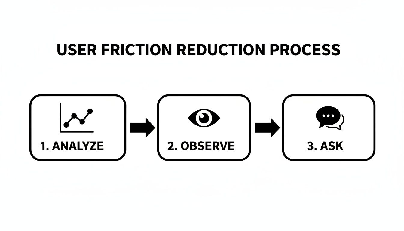
This flow is a great reminder that a strong optimization plan isn’t just about numbers; it’s about blending that quantitative data with real, human insights to pinpoint the most critical issues.
Putting It All Together in a Live Document
Your roadmap should never be a static file that gets forgotten in a folder. It needs to be a living, breathing document—think a shared spreadsheet or a Trello board—that your team is in every day.
Create a simple table with columns for the issue you've identified, the P, I, and E scores, the final priority score, your proposed solution (this is your hypothesis), and the project's current status.
Key Takeaway: The goal here is to build momentum with quick, high-impact wins. Fixing a glaring issue that boosts conversions by even 2% in the first week delivers tangible results and builds the confidence you'll need to tackle the bigger, more complex projects later on.
A structured process like this takes the emotion and guesswork out of the equation. It guarantees your team's limited time and resources are always focused on the changes that will actually move the needle, creating a clear and logical path to higher conversions.
Making High-Impact Changes That Actually Work
Alright, you've done the hard work of digging through the data and now you have a prioritized roadmap. It's time to shift from planning to doing—turning those insights into tangible changes that actually move the needle.
This is where you get your hands dirty and fix the friction points you uncovered. We'll walk through proven tactics across user experience, copywriting, and e-commerce that directly address why people don't convert. These aren't just random guesses; they're strategies for making it much, much easier for visitors to say "yes."
Streamlining the User Experience
A clunky, confusing website is the ultimate conversion killer. The goal is to make the journey so intuitive that your visitors don't even have to think about their next step. Every click should feel natural.
First up, take a hard look at your navigation. Is it simple? Predictable? If someone can't find your pricing or product categories in a few seconds, they're gone. I often see sites with bloated menus—consolidate items, use plain language (like "Contact Us" instead of "Let's Talk"), and make sure your search bar is front and center.
Next, let's talk forms. Nobody loves filling them out, but you can make it a lot less painful.
- Cut down the fields: Be ruthless. Do you really need a phone number just for a newsletter signup? Probably not. Only ask for what's absolutely essential at that moment.
- Use clear labels: Don't make people guess what you're asking for. Simple, direct labels and placeholder text go a long way.
- Help them succeed: Enable browser auto-fill and use inline validation to show errors in real-time. This stops frustration before they even think about hitting "submit."
Crafting Copy That Compels Action
Words sell. Every headline, button, and product description on your site has one job: to persuade. If your copy is generic, unclear, or all about you, you're bleeding customers.
Your value proposition needs to be impossible to miss, usually right in your hero section. In one or two sentences, you have to answer the user's biggest question: "What's in it for me?" Ditch the corporate jargon and focus on the benefit they get.
Headlines are your first impression. They have to grab attention and spark enough curiosity to keep someone scrolling. Instead of a bland "Our Services," try something that speaks to a result, like "Build a Website That Actually Grows Your Business." See the difference? One is a label, the other is a solution.
Finally, your calls-to-action (CTAs) need to pop. They should be specific, action-oriented, and stand out visually from everything else on the page.
I've seen a simple text change on a button dramatically increase clicks. Swapping a passive CTA like "Submit" for a value-focused one like "Get Your Free Quote" works because it tells the user exactly what they're getting. It removes hesitation.
By nailing these key copy elements, you turn a passive online brochure into an active sales tool. If you want to go deeper, our guide on landing page design best practices shows you how to blend this kind of copy with high-converting layouts.
Optimizing for E-Commerce Conversions
For e-commerce stores, the path from browsing to buying is full of moments that can either build confidence or create deal-breaking doubt. Your product pages and checkout are the final hurdles.
Product pages need way more than a price and a picture. To build trust and create desire, make sure you include:
- High-Quality Imagery: Show the product from every angle. Add a zoom feature. Even better, use video to show it in action. Let them see what they're getting.
- Detailed Descriptions: Don't just list specs. Tell a story. Explain how the product solves a problem or makes the customer's life better.
- Social Proof: This is non-negotiable. Feature customer reviews, ratings, and testimonials prominently. Seeing that other people bought and loved a product is incredibly persuasive. In fact, visitors who interact with reviews are often over 50% more likely to convert.
And that checkout process? It needs to be a frictionless slide, not an obstacle course. Ditch any distractions, cut out unnecessary steps, and for goodness' sake, offer a guest checkout option. A complicated checkout is one of the biggest reasons people abandon their carts. Keep it simple, secure, and fast.
The Overlooked Conversion Killer: Site Speed
You can get the UX and copy perfect, but it won't matter if your site takes forever to load. Site speed isn't just a technical metric—it's a massive part of the user experience and a huge factor in your conversion rate.
Think about this: the average e-commerce conversion rate globally hovers around a meager 2.5% to 3%. That means for every 100 visitors, maybe two or three will buy something. But here's the kicker: businesses that prioritize speed can shatter that benchmark.
Industry analysis shows that websites loading in just one second have conversion rates up to three times higher than sites that take five seconds. Compared to a site that takes 10 seconds? It’s a staggering five times higher. Walmart famously found that every one-second improvement in page load time boosted their conversions by 2%. The proof is in the data.
By implementing these high-impact changes, you’re tackling the most common reasons visitors bounce. You’re not just making your site look better; you’re making it work better—for your users and for your bottom line.
Testing and Iterating for Continuous Improvement

So, you've rolled out changes based on your roadmap. That's a huge step, but don't pop the champagne just yet. This isn't the finish line; it’s the starting line for the most critical part of CRO.
Real optimization isn't a one-and-done task. It's a continuous cycle of learning and refining. This is where you stop making educated guesses and start running controlled experiments to get undeniable proof of what works. Every test—win or lose—makes you smarter about your customers.
The Foundation of Smart Testing: A Strong Hypothesis
Before you touch any testing software, you need a clear, testable statement: your hypothesis. It's your theory about what will happen, why it will happen, and how you’ll measure it. A vague goal like "improve the button" won't get you anywhere.
A solid hypothesis is specific. It connects an action to an outcome.
Example Hypothesis: "Changing the main CTA button on the product page from gray to a high-contrast orange will increase clicks by at least 15%. We believe this is because the orange will stand out against our blue brand palette, creating a stronger visual cue and guiding users to the next step."
See how that works? It’s not just about changing a color. It forces you to articulate the why behind your idea, turning a random thought into a strategic experiment.
Running a Clean A/B Test
With a strong hypothesis in hand, you're ready to set up an A/B test (or split test). It’s simple in theory: you compare two versions of a page to see which one performs better.
In our example, you’d show 50% of your visitors the original page with the gray button (the "control"). The other 50% would see the new page with the orange button (the "variation").
The trick is to let the test run long enough to reach statistical significance. This is just a fancy way of saying you have enough data to be confident the results aren't a fluke. Most testing tools calculate this for you, but you should always aim for a confidence level of 95% or more before declaring a winner.
Of course, none of this matters if you aren't tracking the right outcomes. If you haven’t already, setting up Google Analytics goals is crucial for accurately measuring what a "conversion" actually means for each test.
Learning from Every Outcome
When your test is over, you’ll have one of three results. The key is to remember that every single outcome is a lesson that tells you what to do next.
-
A Clear Win: Your new orange button crushed the original. Fantastic! Roll out the winning version to 100% of your audience. But don't stop there. Document what you learned: "High-contrast CTAs drive more clicks on our product pages." Now, you can apply that insight to other key pages.
-
A Clear Loss: The orange button performed significantly worse. This is just as valuable as a win, I promise. It proves your initial assumption was wrong. Maybe the color clashed with your branding and felt cheap, or perhaps it was just distracting. The lesson might be, "Our users prefer subtle, on-brand CTAs."
-
Inconclusive: There was no meaningful difference between the two versions. This usually means the change wasn't big enough to move the needle. This is still a great insight! It tells you to stop wasting energy on button colors and start testing something with more impact, like the headline or the entire value proposition.
By adopting this cycle of hypothesizing, testing, and learning, you stop throwing spaghetti at the wall. You start building a site that evolves based on what your users actually do, not what you think they'll do. That’s how you get sustainable, long-term growth.
Common Questions We Hear About Boosting Website Conversions
Even with the best roadmap, you're going to have questions once you get your hands dirty with conversion optimization. It’s one of those fields where the devil is truly in the details. Getting a handle on a few common sticking points can save you a ton of headaches down the road.
Let's walk through some of the questions that come up time and time again.
What Is a Good Conversion Rate, Anyway?
This is, without a doubt, the number one question I get asked. The honest, no-fluff answer is: it completely depends on your industry, traffic source, device, and what you’re selling.
Sure, you'll see studies floating around that say the average e-commerce site converts at 2-3%. But if you're selling high-ticket B2B software, comparing your numbers to a fast-fashion brand is pointless. They're just not playing the same game.
Instead of chasing some mythical industry average, your real benchmark is you. If you're converting at 1.5% today, a "good" goal for next quarter is 2%. The most powerful data you have is your own history. Focus on beating your own numbers, month after month.
How Long Does an A/B Test Need to Run?
Forget about the clock. The real answer here is all about the data. A test needs to run long enough to achieve statistical significance. This is just a fancy way of saying you have enough data to be confident that your result isn't a fluke.
Most A/B testing platforms, like VWO or Optimizely, will do the math for you and tell you when you've hit a 95% confidence level.
A classic rookie mistake is calling a test the second one variation pulls ahead. Don't do it! You're setting yourself up for a false positive. You have to let the test run for at least one full business cycle (a week is a good minimum) to smooth out any weird fluctuations from weekday vs. weekend traffic. Patience pays off here.
Micro vs. Macro Conversions: Where’s My Focus?
You absolutely need to track both, but your north star—the metric you ultimately live and die by—is your macro-conversion. This is the big kahuna, the action that directly makes you money.
- A completed purchase
- A signed contract
- A "Request a Demo" form submission
Micro-conversions are the smaller, supporting steps people take along the way. Think of them as valuable breadcrumbs that show user engagement.
- Signing up for a newsletter
- Watching a product video
- Adding an item to the cart
Use these micro-conversions to figure out where things are breaking down, but always, always judge the success of your experiment on how it moved the needle on your main goal.
What if My A/B Test Has No Clear Winner?
First off, don't be discouraged. An inconclusive test is actually a win because it’s a learning opportunity. It’s data!
Usually, it means the change you tested was too subtle to actually change how people behaved. This is incredibly useful feedback. It tells you to stop wasting resources on things like tiny button color shades and to start thinking bigger. Maybe it's time to test a completely different headline, a new value proposition, or a redesigned hero section.
At Sugar Pixels, we don't just build pretty websites; we build conversion machines from the ground up and have the optimization strategies to keep you growing. Let us dive into the data so you can focus on running your business. Check out our web design and digital marketing services to see how we can help.