
Improving your website conversion rate isn't about guesswork or randomly changing button colors. It’s a methodical process of finding out where your users are getting stuck and systematically removing that friction. The goal is simple: turn more of the visitors you already have into customers by smoothing out their journey.
Your Starting Point: Understanding Your Conversion Rate
Before you can start fixing things, you need a clear picture of what's actually happening on your site. Jumping into Conversion Rate Optimization (CRO) without a baseline is like starting a road trip without a map—you're moving, but you have no idea if you're headed in the right direction.
So, let's start with the basics.
Your conversion rate is calculated with a simple formula:
Conversion Rate = (Number of Conversions / Total Number of Visitors) x 100
Of course, a "conversion" can mean different things. It might be a completed purchase, a form submission, a newsletter signup, or even just a click on a key link. You have to define what this goal is for your business and make sure you’re tracking it accurately. If you haven't set this up yet, a good place to start is our guide on how to set up Google Analytics goals.
Establishing a Realistic Baseline
Once you have your number, the inevitable next question is, "Is that good?" This is where benchmarks come in handy, but with a word of caution. It's helpful to know that the average website conversion rate for key actions (like sales or form fills) hovers around 2.9%.
Knowing where you stand gives you context and helps you set achievable goals instead of chasing a mythical number. It keeps you grounded.
Your goal isn't just to meet an industry average; it's to consistently beat your own previous performance. A 10% lift on your current conversion rate is a much more powerful and tangible target.
The journey starts with these foundational steps, which are crucial for building a solid CRO strategy.
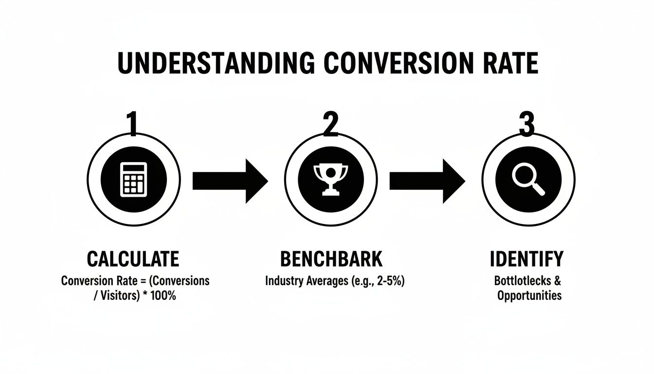
This process—calculate, benchmark, and then identify real opportunities—is the bedrock of any successful optimization effort. If you're ready to dig deeper, this practical playbook on increasing website conversion rates is an excellent resource.
Key Conversion Rate Benchmarks by Channel
To give you a better feel for what "average" looks like, here's a breakdown of conversion rates across different marketing channels. Use this table not as a strict rule, but as a guide to see where you might have the most room for improvement.
| Channel | Average Conversion Rate | Key Insight |
|---|---|---|
| Organic Search | 2.7% | Visitors arriving from search often have high intent, making them a valuable source of conversions. |
| Paid Search (PPC) | 3.2% | Highly targeted ads can drive immediate action, but optimizing landing pages is critical for success. |
| Email Marketing | 3.1% | A warm audience is more likely to convert. Segmentation and personalization are key levers here. |
| Social Media (Organic) | 1.1% | Conversions can be lower as users are often in a discovery mindset, not a buying one. |
| Referral Traffic | 4.6% | Traffic from trusted sources often converts at a much higher rate. Focus on quality partnerships. |
Remember, these are just averages. Your industry, audience, and offer will all influence your results. The real win comes from understanding your own numbers and working to improve them every single month.
Finding and Diagnosing Conversion Blockers
Alright, let's get into the detective work. If your conversion rates aren't where you want them to be, it’s not time to guess—it’s time to investigate. Your website is almost certainly leaking revenue, but the holes are rarely obvious. They’re the small, frustrating moments in the user journey that cause people to give up and leave.
Our job is to find those moments of friction. This isn't about pointing fingers at your design or copy. It's about getting into the heads of your visitors by following the digital breadcrumbs they leave behind. People don't bounce for no reason; they leave when they're confused, annoyed, or simply can't find what they came for.

Start with the "What": Digging into Google Analytics
Your first stop is always your analytics platform. For most of us, that's Google Analytics. This is where you uncover the "what"—the hard numbers that point you toward a problem. You’re looking for weird patterns and steep drop-offs.
Fire up these reports and start hunting for clues:
- Behavior Flow Report: Think of this as a map of the highways and backroads users take on your site. Are they getting stuck in strange loops? Are they exiting from a page that should be a stepping stone, like a product or service page? That's a red flag.
- Landing Page Report: Pay close attention to your most popular pages. If a page gets tons of traffic but has a sky-high bounce rate, you’ve found a prime suspect. It’s like a popular storefront that everyone looks at but no one enters.
- Funnel Visualization: For anyone with an e-commerce store or a multi-step form, this report is pure gold. It shows you exactly where people are jumping ship. Is it when they see the shipping costs? Or when they have to create an account?
Finding the pages with the highest exit rates in your conversion funnel tells you exactly where you're bleeding the most customers. This is ground zero for your investigation.
Remember the bigger picture, too. For instance, cart abandonment shot past 70% in 2024, largely thanks to unexpected fees at checkout. And benchmarks vary wildly by industry—food & beverage e-commerce converts at around 3.1%, while skincare is closer to 2.7%. Knowing why people in your niche leave can help you blow those averages out of the water. You can see more details about global conversion rates and their influencers on Statista.
Uncover the "Why" with Qualitative Tools
Analytics tells you what happened, but it can’t tell you why. For that, you need to see the site through your users' eyes. This is where we shift from spreadsheets to human behavior.
If analytics shows you the crime scene, qualitative tools give you the eyewitness accounts.
See Where People Click with Heatmaps
Heatmaps are one of my favorite tools for a quick gut check. They lay a color-coded visual over your pages, showing you exactly where people are interacting. I personally use tools like Hotjar or Crazy Egg for this.
Here’s what you can learn:
- Click Maps: See every click, even on things that aren't links. Are users furiously clicking on an image because they think it leads somewhere? That’s a classic user experience disconnect.
- Scroll Maps: This shows how far down the page people actually get. If your big, beautiful call-to-action is sitting below a fold that 80% of your visitors never reach, it might as well not exist.
- Move Maps: These track where the mouse cursor hovers, which is a surprisingly good proxy for eye-tracking. It shows you what elements grab attention, even if they don't get a click.
A heatmap might show you that everyone is ignoring your main "Request a Demo" button but are all clicking on a non-linked company logo in the footer. That's a powerful, actionable insight you’d never find in GA. A good website audit checklist can give you a structured way to look for these kinds of issues.
Watch Real User Journeys with Session Recordings
If you really want to build empathy for your users, watch session recordings. These are like mini-movies of actual people using your website. You can see their mouse movements, their hesitations, and their frustrations in real time.
When you're watching, keep an eye out for these tell-tale signs of a struggle:
- Erratic Mouse Movements: When a cursor zips back and forth across the screen, it often means the person is confused or can't decide what to do next.
- "Rage Clicks": This is my favorite. It’s when a user repeatedly clicks on a button or link that isn't working. It's the visual equivalent of someone shouting at the screen.
- Quick U-Turns: Did someone land on a page and leave in three seconds? They clearly didn't find what they expected. Why?
Once you combine the hard data from analytics with the visual stories from heatmaps and session recordings, you'll have a data-backed hit list of what to fix. You’ll stop thinking in vague terms like "the homepage needs work" and start identifying specific, solvable problems like, "The headline on the services page is confusing, and users are scrolling right past it."
How to Prioritize Your Fixes: The Impact vs. Effort Method
Alright, you’ve done the detective work. You’ve sifted through analytics, watched session recordings, and now you’re staring at a monster list of potential fixes. It’s a good problem to have, but it can also be paralyzing. Where do you even begin?
This is the exact point where most CRO initiatives lose steam. You can't fix everything at once, and trying to will just lead to burnout with little to show for it. The secret isn't to work harder; it's to prioritize smarter.
This is where the Impact and Effort Framework comes in. It’s a simple but incredibly powerful way to cut through the noise and figure out what to tackle first. It forces you to ask two simple questions for every item on your list:
- Impact: Realistically, how much could this change move the needle on our conversion goals?
- Effort: How much time, money, and developer muscle will this actually take to get done?
By scoring each idea against these two factors, you can plot everything onto a simple matrix. Suddenly, that overwhelming list becomes a clear, actionable roadmap. This little exercise is the key to building momentum and getting some early wins on the board.
Breaking It Down: The Four Quadrants
Once you plot your ideas, they’ll naturally fall into one of four categories. This visual approach is fantastic for getting your whole team on the same page about what truly matters.
Here’s a great example of what this looks like in the real world:

This matrix turns a messy to-do list into a focused game plan.
High Impact, Low Effort (Quick Wins): This is your gold mine. These are the no-brainers you should jump on immediately. Think simple fixes with big potential, like rewriting a confusing call-to-action button or adding a couple of trust seals to your checkout page.
High Impact, High Effort (Major Projects): These are the big, game-changing initiatives. We’re talking about things like a full website redesign or overhauling your entire pricing structure. They can produce massive results, but you need to plan for them and schedule them out for future quarters.
Low Impact, Low Effort (Fill-ins): These are the minor tweaks you can knock out when you have a bit of downtime. Fixing a typo on a low-traffic page is a perfect example. They’re worth doing eventually, but they should never distract you from the high-impact stuff.
Low Impact, High Effort (Time Sinks): Avoid these like the plague. These are the projects that suck up endless resources for virtually no return. Run away.
Putting the Framework into Practice
Let's say you run an e-commerce store. Your research turned up two problems: users are abandoning the site because of a confusing multi-step checkout form, and there's a broken link in the footer of your blog.
Fixing the checkout form is a High-Impact task—it directly affects sales. But it will also require developer time, making it High-Effort. That lands it squarely in the "Major Projects" quadrant.
The broken link is a Low-Impact issue; it probably has a tiny effect on revenue. But it’s an easy fix, making it Low-Effort. This is a classic "Fill-in" task. With this clarity, you know to schedule the checkout redesign as a priority project while someone fixes the link when they have 15 free minutes.
The real magic of this framework is that it forces you to justify every single task. It shifts your team’s mindset from "what can we do?" to "what should we do right now to make the biggest difference?"
By using this framework consistently, you build a sustainable process for continuous improvement. You guarantee your team is always focused on the activities that deliver the best results. And if you want to tie those results back to the bottom line, you can learn more about how to calculate marketing ROI in our detailed article.
Alright, you've done the detective work with analytics and heatmaps, and you have a solid list of what needs fixing. Now for the fun part: actually making the changes that will get more visitors to click, buy, and sign up.
This is where your data-driven insights become real-world improvements. We’re not just randomly tweaking buttons and colors. We're systematically making the entire journey for your user smoother, clearer, and more persuasive from the moment they land on your site.
Most of the meaningful improvements you'll make will fall into four buckets: the overall user experience, the words you use, how you present your offers, and how easy you make it for people to finish a task. Nailing all four creates a powerful effect that naturally guides people toward conversion.
Streamline Your User Experience and Boost Site Speed
Think of a clunky, slow website as a store with a sticky floor and messy aisles. People will just turn around and leave. Your absolute first priority is creating a seamless user experience (UX) that feels completely effortless.
Start by looking at your navigation. Can a brand-new visitor figure out what you do and where to go in less than five seconds? If not, it's too complicated.
- Simplify Your Menu: Cut it down to the essentials. Use dead-simple labels like "Services" or "Pricing," not clever but confusing jargon.
- Improve Internal Linking: Guide people logically from one page to the next. If you have a blog post about a specific problem, make sure there’s a can't-miss link pointing straight to the service page that solves it.
- Ensure Mobile Responsiveness: Your site has to be perfect on a phone. No exceptions. Buttons need to be tappable, text needs to be readable without pinching and zooming, and forms must be a breeze to fill out on a small screen.
And then there's speed. Site speed isn't a "nice-to-have"; it's a dealbreaker. Even a one-second delay in page load time can tank your conversions by 7%. Use a tool to compress your images, leverage browser caching, and get rid of any heavy scripts slowing things down. A fast site feels professional and trustworthy.
A great user experience isn’t about flashy animations. It's about making it ridiculously easy for people to get what they came for. Remove the friction, and you automatically get more conversions.
Craft Compelling Copy and Irresistible Calls to Action
The words on your website do all the heavy lifting. Your copy needs to connect with your visitor's pain points, explain your value in plain English, and tell them exactly what to do next. Bland, corporate fluff just gets ignored.
The single most important piece of copy on any page is your headline. It has one job: grab attention and promise a solution. A weak headline guarantees no one will read the rest of the page.
Let's look at a quick headline makeover:
- Before: Innovative Digital Solutions for Modern Businesses (What does this even mean? It's vague and stuffed with buzzwords.)
- After: We Build Websites That Double Your Leads in 90 Days (Now we're talking. It's specific, benefit-focused, and makes you want to know more.)
This same thinking applies to your calls to action (CTAs). Your buttons should be impossible to miss and use punchy, action-oriented language. Ditch "Submit" and try "Get My Free Quote." Instead of "Learn More," test out "See Pricing and Plans." Every single word matters.
Structure Pricing and Offers for Maximum Value
Sometimes, how you present your prices has a bigger impact than the prices themselves. You want to frame your offer not as a cost, but as a no-brainer investment.
Clarity is everything here. If someone can't understand your pricing in a few seconds, you've already lost them to confusion and doubt.
A few battle-tested tactics for pricing pages:
- Use a Comparison Table: Lay out the features of each plan side-by-side. This makes it easy for people to compare and find the right fit.
- Highlight the "Most Popular" Plan: A little bit of social proof goes a long way. Simply adding a badge or a colored border to your recommended plan can guide decisions in a huge way.
- Address Objections Head-On: Add a short FAQ section right on the page to answer questions about billing, contracts, or refunds. This proactive approach builds trust and melts away hesitation.
The way you structure your offer is also key. Unlocking higher conversion rates means benchmarking against industry medians that vary wildly—from SaaS at 3.8% to Legal's 12.3%. A one-size-fits-all approach fails; instead, tailor strategies to your niche. For e-commerce, skincare's 2.7% and food's 3.1% show impulse buys thrive on speed and visuals. For B2B services, lead gen hits 1.7-10.8% with gated content and demos. Implementing high-impact changes targeted to your industry is key to hitting and exceeding these benchmarks. Explore more on what makes a good conversion rate on Search Engine Land.
Eliminate Friction in Forms and Checkout Processes
We're at the finish line—the forms and checkout pages. This is where so many potential sales and leads go to die. Every extra field, every confusing step, and every ounce of uncertainty is a reason for someone to bail.
Your mantra here is simple: make it easier.
Only ask for what you absolutely need right now. Do you really need a phone number for a simple newsletter signup? Probably not. We've seen clients boost conversions by as much as 50% just by cutting the number of form fields from four to three.
For e-commerce checkouts, the stakes are even higher.
- Offer a Guest Checkout: Forcing people to create an account is one of the biggest conversion killers in the book. Always give them a guest option.
- Show a Progress Bar: Let shoppers know exactly where they are in the process (e.g., Step 1 of 3). This little visual cue reduces anxiety and keeps them moving forward.
- Display Trust Seals: Make your security logos (like SSL certificates) and accepted payment methods (Visa, PayPal, etc.) prominent. These small badges provide a powerful dose of reassurance right when people need it most.
By methodically making these kinds of changes, you’ll transform your website from a simple online brochure into a machine built for conversions. Each improvement, big or small, adds up to a better experience for your users and a healthier bottom line for your business.
Testing and Iterating for Continuous Improvement

Making data-backed changes is a huge leap forward, but it’s not the finish line. Let’s be honest: even the most well-researched idea is still an educated guess until it’s proven in the real world. This is why truly effective CRO is a constant cycle of testing, learning, and refining your approach. You’re building a system for never-ending improvement.
This is where A/B testing (or split testing) becomes your best friend. It’s a deceptively simple method. You create two versions of a webpage—the original "A" version and a "B" version with one specific change. Then, you show each version to different segments of your audience and see which one performs better. Simple, but incredibly powerful.
Building a Strong Test Hypothesis
A great A/B test never starts with a random thought like, "I wonder if a blue button would work better?" It begins with a strong, data-driven hypothesis. This isn't just a guess; it's a structured statement that connects a specific change to an expected outcome, giving your entire test a clear purpose.
A solid hypothesis usually follows this framework: If I [implement this change], then [this outcome will happen] because [this reason].
Let's make that real. Say your heatmap analysis showed that your main CTA button is getting ignored. Your hypothesis might look like this:
"If we change the CTA button text from 'Learn More' to 'Get Your Free Quote Now,' then we will see a significant increase in form submissions because the new copy is more specific and communicates immediate value."
See the difference? This isn't a shot in the dark. It’s a testable idea rooted in the diagnostic work you've already done. It turns your efforts from random tinkering into a methodical process.
Choosing What to Test and Running Clean Experiments
Once you have a solid hypothesis, it's time to run the experiment. The absolute golden rule here is to test only one variable at a time. If you change the headline, button color, and main image all at once, you'll have no clue which element actually moved the needle.
Looking for some high-impact elements to start with? Try these:
- Headlines and Subheadings: Does a benefit-driven headline beat a feature-focused one?
- Call-to-Action (CTA) Text: Test direct, action-oriented phrases like "Start My Trial" against softer options like "See Plans."
- Button Color and Size: Does a high-contrast color that pops off the page actually draw more clicks?
- Images and Videos: Will a photo of a person build more trust than a slick product shot?
- Form Length: What happens if you remove just one non-essential field? Will completions go up?
Tools like Google Optimize, Optimizely, or VWO make setting up these tests fairly straightforward. The key is to let your test run long enough to achieve statistical significance. This just means you have enough data to be confident the result isn't a fluke. Most tools will flag this for you, usually at a 95% confidence level.
Analyzing Results and Building Your Feedback Loop
When the test is done, it's time to dig into the results. There are only two outcomes, and I mean it when I say both are incredibly valuable.
If your "B" version wins, that's awesome! You've just found a data-proven way to lift your conversions. Go ahead and implement that winning variation for all your traffic. But don’t just stop there. Ask yourself: what did you learn? If a more specific CTA worked, where else on your site can you apply that insight?
But what if the original "A" version wins? That's not a failure—it's a critical insight. It means your hypothesis was wrong, and now you know something new and important about your audience. Maybe that original, broader CTA felt less committal and more approachable to them. This kind of learning is just as important as a win because it guides you toward a smarter hypothesis for your very next test.
This entire process creates a powerful feedback loop, turning your website from a static brochure into a living asset that constantly evolves and improves.
Common Questions About Improving Conversion Rates
Getting into conversion optimization always kicks up a few questions. As you start digging into analytics and sketching out tests, it’s completely normal to wonder about benchmarks, timelines, and where to even begin.
Let's walk through some of the most common things people ask when they start trying to improve their website's performance.
What Is a Good Conversion Rate to Aim For?
This is, without a doubt, the number one question I hear. And the answer is always the same: it depends.
Sorry, there’s no magic number. A "good" conversion rate is completely tied to your industry, your traffic sources, how much you’re charging, and your business model. It's a classic apples-to-oranges comparison.
An e-commerce store selling t-shirts for $20 might be thrilled with a 2.5% conversion rate, while a high-end B2B software company could consider 5% on its demo request form a massive win. The global average conversion rate hovers around 2-3%, but honestly, that number is so broad it's practically useless for setting your own goals.
Instead of obsessing over some universal benchmark, focus on improving your baseline. A 10% increase from your current conversion rate is a much more powerful and attainable goal than chasing an arbitrary industry average.
That's where the real wins are found—in steady, incremental improvements.
How Long Does It Take to See Results?
This one's a bit of a "how long is a piece of string?" question. The time it takes to see a real impact from your CRO efforts really boils down to two things: the size of the change you make and how much traffic your site gets.
A simple, obvious fix on a high-traffic page could show a difference almost immediately.
- Quick Wins: If you fix a busted checkout button or rewrite a super confusing headline on your homepage, you could see a positive shift in user behavior and conversions within days.
- A/B Tests: On the other hand, a proper A/B test needs time to collect enough data to be statistically valid. For a site with decent traffic, this might take a few weeks to a month. End a test too early, and you risk making decisions based on bad data.
It's best to think of conversion optimization as a long game, not a one-and-done project. Small, consistent improvements are what build significant, lasting growth over time. For more tips on business growth and engaging customers, you can explore their blog.
Should I Focus on More Traffic or a Better Conversion Rate First?
This is a fantastic strategic question, and my answer is almost always the same: start with your conversion rate.
Think about it this way: driving more traffic to a website that leaks customers is like pouring water into a bucket full of holes. It's just a massive waste of money, effort, and opportunity.
First, you need to patch the holes in your user journey. By making sure every visitor you already have has the best possible experience, you make your entire marketing spend more effective.
Once your site is humming along and reliably turning visitors into customers, then every dollar you spend on ads or SEO will deliver a much higher return.
Fix the bucket before you turn up the hose. It's the only sustainable way to scale.
Ready to transform your website from a digital brochure into a powerful conversion tool? The expert team at Sugar Pixels specializes in creating performance-driven websites that not only look great but also deliver measurable results. Let us help you diagnose your conversion blockers and implement strategies that turn more visitors into loyal customers. Discover our web design and marketing services today!