
If you want to genuinely improve your website's conversion rate, you need a system. It’s a simple but powerful loop: first, diagnose what's causing friction for your users, then prioritize the fixes that will actually move the needle, and finally, validate your changes with real data. This is how you stop guessing and start making informed decisions that lead to more sign-ups, sales, and leads.
Building Your CRO Foundation
It's tempting to jump straight into changing button colors or A/B testing headlines you saw in a case study. But without a solid foundation, you’re just throwing spaghetti at the wall. Real conversion rate optimization (CRO) isn't about finding a magic bullet; it's a disciplined process that starts with understanding what a "conversion" even means for your business.
A conversion isn't always a final sale. It's any meaningful action a user takes. Defining these goals is your first real step.
- E-commerce Store: The big one is a completed purchase, of course. But smaller wins, or micro-conversions, like adding an item to the cart or signing up for your email list, are just as important to track.
- B2B SaaS Company: Here, a key conversion is likely a demo request or someone starting a free trial.
- Local Service Business: It could be as simple as a phone call from the "click-to-call" button or a submitted contact form.
Once you know what you’re measuring, you can figure out your starting point. The conversion rate formula is straightforward: (Total Conversions / Total Visitors) x 100. This number is your baseline. Everything you do from here on out will be measured against it. For a good overview of what's possible, check out these proven tips to improve website conversion rates.
The Core CRO Framework
The entire optimization journey we're about to walk through is built on a simple, repeatable framework. This structure ensures every change you make is deliberate and aimed at driving tangible results.
The process flow below breaks it down into three core stages.
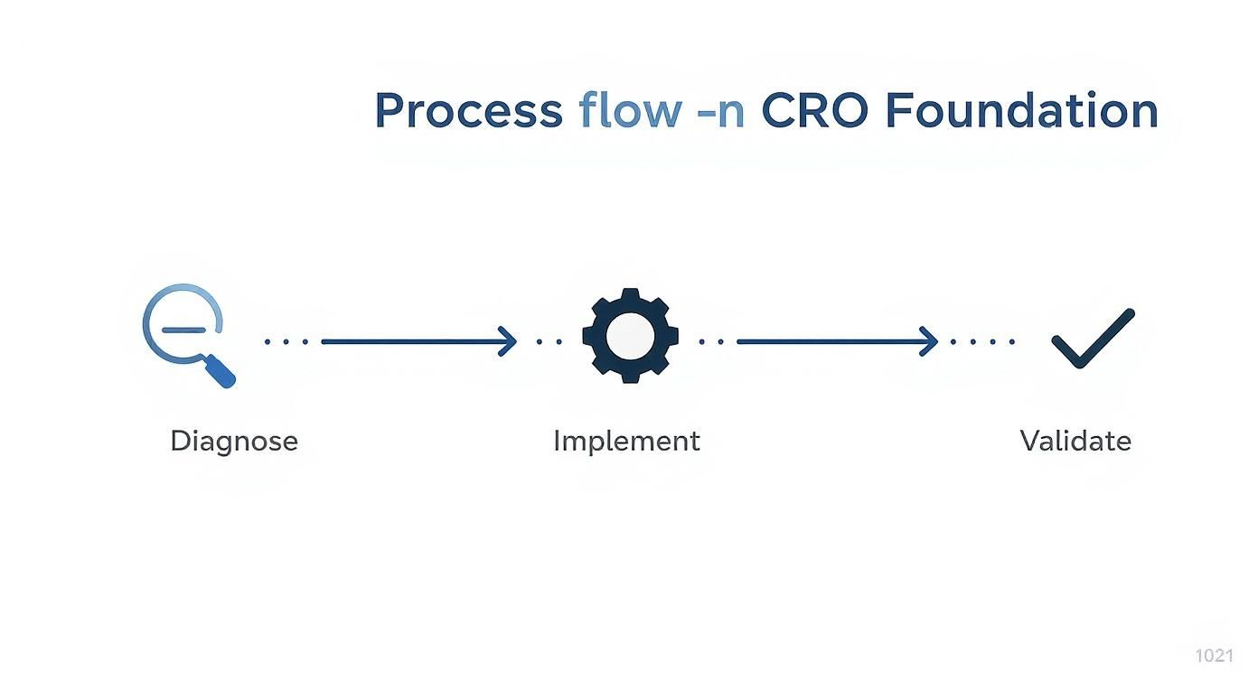
This cycle of Diagnose, Implement, and Validate creates a continuous feedback loop. It's a strategic approach that shifts the focus from just adding new https://www.sugarpixels.com/features-of-a-website/ to making what you already have work harder and smarter.
By mastering this framework, you transform your website from a static brochure into a dynamic tool that consistently turns visitors into valuable customers. It’s the difference between hoping for growth and engineering it.
This mindset is everything. It forces you to get into your users' heads, pinpoint their frustrations, and systematically remove the barriers that are stopping them from taking that final, valuable step.
Finding Where Your Website Is Leaking Money

Before you can start fixing things, you have to play detective. Every website, no matter how slick, has "leaks"—those specific pages or steps where interested visitors suddenly give up and leave. Your job is to find those cracks in the foundation. This isn't about throwing spaghetti at the wall to see what sticks; it's a systematic diagnosis.
Your first stop is your quantitative data. Think of tools like Google Analytics 4 (GA4) as a treasure map that shows you the exact paths people take through your site. More importantly, it shows you where they hit a dead end. This is how you discover the "what" of your conversion problems.
Pinpointing the 'What' with Analytics
Your immediate goal is to find the pages causing the most friction. A great starting point is to map out a basic user journey in GA4. For an ecommerce store, it’s a classic funnel: Homepage → Product Page → Add to Cart → Checkout → Thank You Page.
This simple visualization will instantly show you where the biggest leaks are. Seeing a huge drop-off between the cart and the checkout, for instance, is a massive red flag. It tells you something is wrong with your cart page or the transition itself. Honestly, just knowing how to track website traffic properly is half the battle.
Keep an eye out for these specific warning signs in your analytics:
- High Exit Rates on Key Pages: Are people bailing on your pricing page? That probably means your value proposition is fuzzy or the price is a shock.
- Abnormally Low Time on Page: If users spend only a few seconds on a page that requires real thought, they’re not getting what they expected.
- Weird User Flows: Are you seeing people bounce back and forth between two pages? That’s a classic sign of confusion—they can’t find the info they need to move forward.
The real magic happens when you segment this data. Look at mobile vs. desktop or organic search vs. paid ads. A high exit rate on your checkout page that only happens on mobile is a blinking neon sign pointing to a broken or infuriating mobile form.
Uncovering the 'Why' with Qualitative Tools
Analytics tell you what's happening, but they almost never tell you why. For that, you need to get inside your users' heads with qualitative tools. This is where you get the crucial context behind the numbers.
Tools like Hotjar or FullStory give you heatmaps and session recordings, letting you watch exactly what users are doing. It's like looking over their shoulder.
I once saw a heatmap that showed 80% of users were clicking on a beautiful, high-res image that wasn't actually a link. That single insight led to a quick design change that boosted clicks to the correct page overnight.
Session recordings are even more powerful. You might watch someone try to submit a form three times, only to have it fail without any error message before they finally give up in frustration. Numbers can't show you that kind of user agony.
Let's walk through a real-world scenario. Your GA4 data shows a staggering 70% drop-off on your shipping information page during checkout. That's your "what."
So, you fire up your session recording tool and watch five different users try to get through that page. Four of them diligently fill out their address, but when they realize shipping costs are only calculated after they create an account, they close the tab. Boom. You've just found your "why." The unexpected friction from a forced account and hidden shipping costs is murdering your conversion rate.
I know this can feel like a lot, but remember that the average global ecommerce conversion rate is somewhere between 2.5% and 3.0%. You can dig deeper into these eCommerce conversion rate benchmarks from Red Stag Fulfillment. Even tiny, data-driven tweaks can push your site toward the top of that range.
When you blend the "what" from your analytics with the "why" from your qualitative tools, you get a complete picture. Vague problems transform into a crystal-clear, prioritized list of things you can fix right now.
Prioritizing Fixes for the Biggest Wins
You’ve done the detective work. You have a running list of conversion leaks—that clunky mobile form, the confusing pricing page, a checkout process that moves at a glacial pace. So, where do you start? With limited time and resources, tackling everything at once is impossible.
The real secret to moving the needle isn't just finding problems; it's fixing the right problems in the right order.
It’s tempting to jump on the easiest fixes first or listen to the loudest voice in the room. I’ve seen it happen countless times, and it rarely leads to significant gains. This is a classic pitfall that stalls progress before it even begins. To avoid this, you need a simple, objective way to decide what gets your attention first.
Introducing the PIE Framework
One of the most practical prioritization methods I’ve used is the PIE framework. It’s a beautifully simple tool that helps you score potential fixes against three core criteria. You just rank each idea on a scale of 1 to 10.
- Potential: How much room for improvement is there? A small copy change on your homepage that gets thousands of views a day has far more potential than overhauling the "About Us" page.
- Importance: How valuable is the traffic you're impacting? Optimizing a checkout page for bottom-of-funnel, ready-to-buy visitors is a lot more important than tweaking a blog post seen by casual browsers.
- Ease: How difficult is this to actually get done? Think in terms of both development time and political capital. A simple headline change is a 10 (super easy), but a full system integration might be a 2 (a massive headache).
Scoring your ideas this way cuts through the subjective debates and gut feelings. It gives you a data-informed roadmap and a clear answer to the question of how to improve your website conversion rate most effectively. You'll know exactly where to focus for those quick wins and high-impact projects.
PIE Framework in Action
To see how this works in the real world, let's look at how an e-commerce store might use the PIE framework. After a site audit, they’ve flagged three conversion blockers on their product pages: a confusing sizing guide, low-quality product images, and a complete lack of customer reviews.
Instead of guessing, they score each one.
Here’s a sample table showing how they might score their list of potential optimizations to determine where to start.
PIE Framework Prioritization Matrix Example
| Optimization Idea | Potential (1-10) | Importance (1-10) | Ease (1-10) | Total Score | Priority Rank |
|---|---|---|---|---|---|
| Redesign Sizing Guide | 8 | 9 | 4 | 21 | 2 |
| Add Customer Reviews | 9 | 10 | 7 | 26 | 1 |
| Reshoot Product Images | 7 | 8 | 2 | 17 | 3 |
Suddenly, the path forward is crystal clear. Reshooting all the product photos would be nice, but it's a huge effort for a moderate return. The sizing guide is a real problem, but it’s also a complex project.
But adding a customer review widget? That’s the winner. It has massive potential to build trust, it impacts the most valuable visitors, and it's reasonably easy to implement with a tool like Yotpo or Trustpilot.
By applying a simple scoring model, you transform a messy brainstorm list into a clear, actionable plan. It guarantees your first move is your best move, maximizing your chances of a quick, impactful win.
This disciplined approach ensures that every hour your team spends is directed toward what truly matters. It stops you from chasing minor tweaks and channels your energy into changes that produce real, measurable results.
Putting Your Plan into Action: High-Impact Website Changes

You've done the diagnostic work and have a prioritized list of fixes. Now for the fun part: rolling up your sleeves and making the changes that actually turn visitors into customers. This is where strategy meets execution, and the goal is to systematically eliminate the friction points you uncovered, starting with what promises the biggest return.
Think of your website as a guided conversation. Every element—from the headline a visitor first reads to the button they click—is part of that dialogue. Your job is to make that conversation as smooth, clear, and persuasive as possible.
First, Nail the User Experience
A seamless user experience (UX) is the absolute foundation of a high-converting website. When a site is intuitive and easy to use, people can find what they need without getting frustrated. This builds trust and removes the mental roadblocks that stop them from taking that next step.
One of the most powerful places to start is by simplifying your navigation. If users can't find your products or pricing, they simply can't convert. It's a dead end. A cluttered or confusing menu is a certified conversion killer.
Here are a few quick wins for your site’s navigation:
- Trim the Fat: Stick to five to seven primary menu options. Too many choices create decision paralysis.
- Use Plain English: Ditch the clever jargon. Use straightforward terms people expect, like "Services," "Pricing," or "Contact."
- Check it on Mobile: Seriously, open your site on your phone. Can you easily tap each menu item without hitting the one next to it? A clumsy mobile menu will send people packing.
After the menu, take a hard look at your calls-to-action (CTAs). These are the buttons and links meant to guide users toward your goal. A good CTA should be impossible to miss and tell someone exactly what will happen when they click it. Use strong, action-oriented text and a color that pops against the rest of the page.
The Anatomy of a High-Converting Page
When it comes to high-impact changes, learning how to optimize your landing pages for conversions is at the top of the list. These pages are where the magic happens, and even tiny tweaks can produce huge results.
It all starts with a compelling headline. It absolutely must grab attention and clearly state the value you’re offering. If your headline doesn't resonate, most visitors will leave without ever scrolling down.
The rest of the copy has to build on that initial promise. Use short paragraphs, bullet points, and subheadings to make the text easy to scan. And always focus on benefits, not just features. Instead of saying, "Our software has a 12-hour battery," try, "Work all day without ever needing to find an outlet." For a deeper dive, our guide on landing page design best practices has you covered.
Write Copy That Builds Instant Trust
Your website’s copy does more than just describe what you do—it builds a relationship. For first-time visitors who don't know your brand, trust is everything.
You need to sprinkle trust signals throughout your site. These are elements that offer social proof and lower the perceived risk of doing business with you.
- Customer Testimonials: Feature real quotes from happy customers, ideally with a name and photo.
- Case Studies: Show, in detail, how you solved a real problem for a client.
- Trust Badges: Display logos of well-known clients, security seals (like Norton or McAfee), or familiar payment options (Visa, PayPal).
This is all about showing, not just telling. Anyone can claim their product is the best. Providing real evidence from real people is infinitely more persuasive and is a core part of learning how to improve website conversion rate.
Streamline Your Forms and Checkout
That form is often the final hurdle between you and a new lead or sale. Every single field you ask a user to fill out increases the odds they’ll just give up. This is where friction is felt most acutely.
Go through every form on your site and ask, "Is this field absolutely essential right now?" If you don't need a phone number to send an ebook, don't ask for it. A well-known HubSpot study found that simply cutting form fields from four to three can boost conversions by nearly 50%.
For e-commerce sites, the checkout process is the ultimate moment of truth. Here’s a quick checklist to slash cart abandonment:
- Offer Guest Checkout: Forcing people to create an account is one of the biggest conversion killers.
- Be Transparent with Costs: Unexpected shipping fees are the #1 reason for abandoned carts. Show all costs upfront.
- Provide Multiple Payment Options: Offer credit cards, PayPal, Apple Pay—give people choices.
I once worked with a client whose checkout conversion rate jumped 18% overnight. The only change? We moved the discount code field. It was originally prominent at the top, which sent users off-site to hunt for codes. We changed it to a less obvious link, and abandonment plummeted.
Finally, remember your website doesn't exist in a vacuum. Email marketing is a conversion powerhouse, with an average conversion rate of around 10.3% in 2025. It outperforms standard web traffic because it’s personal and targeted. Even a simple back-in-stock alert can convert at over 7% by tapping into urgency. Integrating your site with a smart email strategy is a proven path to growth.
Validating Your Efforts with A/B Testing
So, you've rolled out a bunch of high-impact changes based on solid data and your prioritization framework. Great! But here's the million-dollar question: did any of it actually work? The only way to know for sure is to test. Without validation, even the most data-informed change is still just a very educated guess.
This is where A/B testing, or split testing, comes in. Think of it as the scientific method for conversion optimization. It’s a beautifully simple concept: you show two different versions of a page (let's call them A and B) to different segments of your audience at the same time. By measuring which one drives more conversions, you get a clear, data-backed winner. It’s how you graduate from "I think this will work" to "I know this works."

Crafting a Strong Hypothesis
Every good A/B test is built on a strong hypothesis. This isn't just a random idea—it's a clear, testable statement that connects a specific change to an expected result, all backed by a reason. It's the "why" behind your experiment.
A weak hypothesis is lazy. It sounds like: "Let's test a green button."
A strong, actionable hypothesis, on the other hand, gives you direction. It usually follows a simple formula: If I [implement this change], then [this outcome] will happen, because [this reason].
Let's beef up that weak idea. Say your session recordings showed people hesitating on the checkout page. A much stronger hypothesis would be: "If we change the CTA button from 'Submit Order' to 'Complete My Purchase,' then we will see a 5% increase in completed checkouts, because the new copy creates a stronger sense of ownership and clarity for the user."
See the difference? This structure forces you to articulate exactly what you expect and why, which makes interpreting your results a whole lot easier.
What to Test for Maximum Impact
You can technically test almost anything, but your time and traffic are precious. You want to focus on the elements that have the most direct influence on a user's decision-making process.
For the biggest bang for your buck, start with simple, high-impact split tests on things like:
- Headlines: It's the first thing people read. Test different value propositions to see what really resonates.
- Calls-to-Action (CTAs): Play with the text, color, size, and even the placement of your main buttons. Small changes here can make a huge difference.
- Images and Videos: Try pitting a product video against a static hero image, or a lifestyle photo against a clean product shot.
- Form Length: This is a classic. Can you get more sign-ups just by removing one non-essential field from your lead form?
More complex overhauls, like redesigning an entire checkout flow, might call for a multivariate test or a series of A/B tests to isolate the impact of each change. It's worth noting that the critical strategy of A/B testing landing page designs can boost conversions by around 12% on average. Data shows lead generation pages convert at about 11.9%, though some industries do much better. You can dig into the full research on conversion optimization statistics for a deeper dive.
Reading the Results and Dodging Common Pitfalls
Once your test is live, you need to know when to stop it and how to make sense of the data. This brings us to statistical significance. It's just a measure of how confident you can be that your results aren't a fluke. Most testing tools like VWO or Optimizely calculate this for you, and a confidence level of 95% or higher is the gold standard.
It is so tempting to call a test the second one version pulls ahead. This is easily the most common—and most costly—mistake you can make. Declaring a winner too early often means you've fallen for a false positive, and you end up rolling out a "fix" that has no real impact, or worse, actually hurts your conversions.
Be sure to steer clear of these common traps:
- Calling it too soon: Always let your test run for at least one full business cycle (usually one to two weeks) to smooth out any daily traffic quirks.
- Ignoring outside events: Did a big sale or a major press mention happen mid-test? These things can seriously skew your data. Be aware of them.
- Testing too much at once: Unless you're running a proper multivariate test, stick to changing one main element at a time. If you change the headline and the button color, you'll never know which one actually moved the needle.
Think of A/B testing as your quality control department. It’s the final, critical step that proves your strategy is sound and gives you concrete evidence of the ROI from your CRO work. It closes the loop, turning your diagnostic insights into measurable, bankable improvements.
CRO FAQs: Your Questions Answered
When you first dip your toes into conversion rate optimization, you're bound to have some questions. Everyone does. These aren't just academic queries; they're the practical, "what-should-I-actually-expect?" kind of questions that can make or break your strategy.
Getting straight answers helps you set realistic goals and focus on what really moves the needle. Let's dig into a few of the most common questions I hear from teams just learning how to improve website conversion rate.
What Is a Good Website Conversion Rate?
Honestly, this is the wrong question to ask. A "good" conversion rate is completely relative. It’s a number that depends on your industry, your price point, your traffic quality, and your business model.
A Shopify store selling novelty socks for $20 might be thrilled with a 3% conversion rate. But a B2B software company with a $50,000 annual contract could be wildly successful with a rate of just 0.5%. They're playing two entirely different games.
Instead of chasing generic industry benchmarks, shift your focus inward.
The only benchmark that matters is your own. A "good" conversion rate is one that's consistently getting better because you're running smart, data-backed experiments. You’re not competing with an industry average; you’re competing with your performance from last month.
Establish your baseline, and then work to beat it. Any sustained lift is a massive win. That's how you really measure success in CRO.
How Long Does It Take to See CRO Results?
The speed of your results comes down to two things: your traffic volume and the significance of the change you're making. You could see results almost instantly, or it could take weeks.
For example, if you discover a major bug that prevents half your mobile users from clicking the "Add to Cart" button, fixing it will likely cause a huge, immediate spike in sales. That's a quick win.
On the other hand, testing a subtle change in your headline copy on a page that gets less traffic might need to run for a full month to collect enough data to know for sure if it worked.
Think of CRO as a long-term strategy, not a one-and-done tactic. While you'll absolutely find some quick wins along the way, the real, transformative growth comes from building a system of continuous, iterative improvement.
What Are the Best Free CRO Tools to Start With?
You absolutely don't need a massive budget or a complex, enterprise-level software stack to get started. In fact, you can build a surprisingly powerful CRO toolkit for free.
Here’s a simple, effective combination that gives you everything you need to begin:
- Quantitative Data (The 'What'): Google Analytics 4 is non-negotiable. It tells you what users are doing—where they come from, which pages they abandon, and where your conversion funnel is leaking.
- Qualitative Data (The 'Why'): A tool like Microsoft Clarity is a game-changer. It gives you heatmaps and session recordings so you can watch real user sessions and understand why they're getting stuck or confused. This is where you find the context behind the numbers.
- A/B Testing (The 'Proof'): For validating your ideas, Google Optimize is a great, no-cost way to run simple A/B tests and prove that your proposed changes actually improve conversions.
With just these three free tools, you have a solid foundation for diagnosing problems, understanding the user experience, and making data-driven decisions.
At Sugar Pixels, we believe that a high-performing website is the cornerstone of business growth. If you're ready to stop guessing and start building a website that systematically converts visitors into customers, explore our web design and digital marketing services at https://www.sugarpixels.com.