
In the competitive digital marketplace, driving traffic to your website is only half the battle. The real challenge, and where the most significant growth lies, is in converting that traffic into tangible business results. This is the core of Conversion Rate Optimization (CRO), a systematic process for enhancing your website and landing pages to increase the percentage of visitors who take a desired action.
Whether you're aiming for more sales, email sign-ups, or demo requests, mastering CRO is non-negotiable for sustainable growth. This guide cuts through the noise to deliver a comprehensive roundup of the top nine conversion rate optimization best practices. We move beyond generic advice to provide you with actionable steps, practical examples, and the specific metrics you need to track for success.
We will explore a range of proven, data-backed strategies designed to make a measurable impact. You'll learn about:
- The statistical rigor of effective A/B testing.
- The psychological power of social proof and trust signals.
- The critical importance of landing page speed and mobile-first design.
Each practice is a crucial component of a holistic CRO strategy. Think of this list as your roadmap to building a higher-performing website that not only attracts visitors but effectively turns them into loyal customers. For those looking to go even further, you can take a deeper dive and transform your results with this ultimate conversion rate optimization guide. Let's begin exploring the techniques that will unlock your website's true potential.
1. A/B Testing and Statistical Significance
A/B testing, also known as split testing, is a foundational method in conversion rate optimization best practices. It involves systematically comparing two versions (A and B) of a single variable, like a webpage headline or a call-to-action button, to determine which one performs better. By showing each version to a different segment of your audience simultaneously, you can gather empirical data on user behavior and make informed decisions that directly impact your conversion rates.
This approach eliminates guesswork and replaces it with statistical evidence. The core principle is to isolate one change and measure its effect. For example, e-commerce giant Amazon famously runs thousands of A/B tests annually on everything from product recommendations to button placement, allowing them to refine the user experience with surgical precision.
How to Implement A/B Testing Effectively
To get reliable results, it's crucial to follow a structured process. Start by forming a clear hypothesis, such as "Changing the CTA button color from blue to green will increase clicks by 15% because green signifies 'go' and stands out more."
- Test One Element at a Time: To attribute a change in conversions to a specific action, only modify one variable per test.
- Run Tests for a Full Business Cycle: Ensure your test duration is long enough (typically one to two weeks) to account for fluctuations in traffic and user behavior.
- Focus on High-Impact Pages: Prioritize testing on pages with high traffic and high conversion potential, like your homepage, pricing pages, or checkout process.
The following vertical bar chart illustrates the key benchmarks you must track to ensure your A/B test results are statistically significant and reliable.
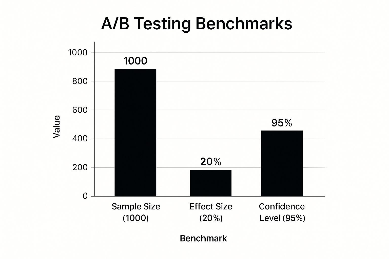
This chart highlights the importance of reaching a sufficient sample size and achieving a high confidence level before declaring a winner, ensuring your conclusions are not due to random chance. For a deeper dive into the strategic elements behind testing methodologies, explore more resources about A/B Testing and Statistical Significance on sugarpixels.com. By meticulously tracking these metrics, you build a reliable framework for continuous improvement.
2. Optimizing Call-to-Action (CTA) Elements
Optimizing call-to-action (CTA) elements is a critical practice for guiding users toward conversion. This involves the strategic design, placement, and messaging of buttons and links that prompt users to take a desired action. A well-crafted CTA stands out, clearly communicates value, and creates a sense of urgency, directly influencing click-through rates and overall conversions. It’s one of the most high-impact components you can refine in your conversion rate optimization best practices.
This approach moves beyond simply having a button; it focuses on the psychology behind user action. The goal is to make the desired path not only visible but also compelling. For instance, Unbounce famously increased conversions by 90% just by changing their CTA text from "Start your free 30-day trial" to the more personal "Start my free 30-day trial." This small shift in language demonstrates the power of precise CTA optimization.

How to Implement CTA Optimization Effectively
Effective CTA optimization requires a methodical approach that considers copy, design, and placement. Start by analyzing your current CTAs to identify areas for improvement, then form a hypothesis for testing. A strong hypothesis could be, "Making the 'Add to Cart' button a contrasting color will increase clicks because it will draw more attention."
- Use Action-Oriented, First-Person Copy: Frame the text from the user's perspective. Instead of "Download your ebook," test "Download my ebook." This personalizes the action and fosters a sense of ownership.
- Create Strong Visual Contrast: Your CTA button should pop off the page. Use a color that contrasts with the background and surrounding elements but still aligns with your brand's palette. ContentVerve saw a 90% increase in clicks by changing a button color from green to red.
- Ensure Strategic Placement: Position your primary CTA in a prominent location where users are likely to look, such as above the fold or at the end of a compelling section of content.
- Test One Variable at a Time: Just like A/B testing, isolate your changes. Test button text, color, size, and placement separately to understand what truly drives performance.
For a deeper understanding of how industry leaders like HubSpot approach this, you can explore their resources on creating effective calls-to-action on HubSpot. By systematically refining these small but powerful elements, you create a clearer, more persuasive path for users to follow, leading to significant gains in conversions.
3. Landing Page Speed Optimization
Landing page speed optimization is the process of improving webpage loading times to reduce bounce rates and increase user engagement. In the digital landscape, speed is not just a technical metric; it is a critical component of the user experience and one of the most impactful conversion rate optimization best practices. Even a one-second delay can lead to a significant drop in conversions, as modern users expect near-instant access to information.
This approach focuses on a combination of technical, content, and server-side enhancements to deliver content as quickly as possible. The impact of speed is well-documented; for instance, Amazon calculated that a page load slowdown of just one second could cost them $1.6 billion in sales each year. Similarly, Walmart discovered that for every one-second improvement in page load time, their conversions increased by a remarkable 2%.
How to Implement Landing Page Speed Optimization
A structured approach to speed optimization begins with diagnosing your current performance and then systematically addressing bottlenecks. The goal is to create a seamless and fast experience from the moment a user clicks your link to when the page is fully interactive. Start with a clear goal, such as "Achieve a load time of under 3 seconds to reduce the bounce rate by 20%."
- Compress and Optimize Images: Use next-gen formats like WebP or AVIF, which offer superior compression and quality compared to traditional JPEGs and PNGs.
- Implement Caching and Compression: Leverage browser caching to store static assets locally and use Gzip or Brotli compression to reduce file sizes for faster transfers.
- Prioritize Above-the-Fold Content: Use techniques like lazy loading to defer the loading of images and videos that are not immediately visible on the screen.
- Audit Performance Regularly: Continuously monitor your site's speed with tools like Google PageSpeed Insights to identify new opportunities for improvement.
The following vertical bar chart illustrates the direct correlation between page load time and the probability of a user bouncing, underscoring the urgency of optimization.

This chart clearly shows that as load times increase, so does the likelihood that a potential customer will leave your site. By focusing on these technical enhancements, you directly improve the user experience and support your conversion goals. For a deeper understanding of the foundational elements that affect site performance, you can explore more about the technical side of building a fast website on sugarpixels.com. Consistently monitoring and improving page speed is a non-negotiable strategy for retaining visitors and maximizing conversions.
4. Social Proof and Trust Signal Implementation
Social proof is a psychological principle where people assume the actions of others reflect correct behavior for a given situation. In conversion rate optimization best practices, this translates to using customer testimonials, reviews, trust badges, and social indicators to build credibility and alleviate purchase anxiety. By showing potential customers that others trust and value your brand, you leverage herd mentality to guide their decisions and boost conversions.
This strategy is effective because it replaces hard-sell tactics with authentic, third-party validation. When a visitor sees that peers, experts, or a large number of people have had a positive experience, it reduces their perceived risk. For instance, Basecamp famously boosted sign-ups by 102.5% simply by showcasing prominent customer logos on their homepage, a testament to the power of borrowing credibility from established brands.
How to Implement Social Proof Effectively
To maximize the impact of social proof, it must be strategically placed and presented authentically. Start by identifying key decision-making points in your user journey, such as product pages, pricing tables, and checkout forms.
- Place Testimonials Near Conversion Points: Position strong, specific reviews or testimonials directly beside call-to-action buttons or sign-up forms to overcome last-minute hesitation.
- Use Specific, Detailed Stories: Generic praise like "Great service!" is less impactful than a detailed testimonial that describes a specific problem and how your solution solved it.
- Include Photos and Full Names: Adding a real face and name to a testimonial significantly increases its authenticity and believability.
- Display Trust Badges and Certifications: Showcase security seals (like Norton or McAfee), payment provider logos (Visa, PayPal), and industry certifications to reassure users about data safety and professionalism.
The goal is to weave these elements seamlessly into the user experience, providing constant, subtle reassurance. For an in-depth analysis of how customer stories can be leveraged, explore the case studies and methodologies on platforms like Trustpilot, which have built entire business models around this concept. By consistently demonstrating that your product is trusted and valued by others, you create a powerful and persuasive argument for conversion.
5. Form Optimization and Friction Reduction
Form optimization is the practice of designing and refining web forms to be as simple, intuitive, and frictionless as possible for the user. Since forms are the final gatekeeper before a conversion, whether for a lead, a signup, or a purchase, any friction at this stage directly causes lost conversions. This element of conversion rate optimization best practices focuses on minimizing user effort and cognitive load to maximize completion rates.
This approach is critical because every unnecessary field or confusing instruction increases the likelihood of user abandonment. For example, Expedia famously increased annual profits by $12 million simply by removing a single, non-essential "Company Name" field from their booking form. This small change significantly reduced user friction and demonstrated the immense impact of form design on revenue.
How to Implement Form Optimization Effectively
A well-optimized form feels effortless to complete. The goal is to guide the user smoothly toward the submission button. Start by mapping the user's journey and critically evaluating every piece of information you request. Ask yourself: "Is this field absolutely necessary to achieve the immediate goal?"
- Ask for Essential Information Only: Reduce the number of fields to the bare minimum. You can always gather more data later. For instance, Imagescape increased conversions by 120% by cutting their form fields from 11 to just 4.
- Use a Single-Column Layout: Studies consistently show that single-column forms are easier for users to scan and complete, leading to higher completion rates compared to multi-column designs.
- Provide Clear Error Messages: Use real-time, inline validation to guide users. Instead of a generic "error" message upon submission, instantly highlight the specific field and explain what needs to be corrected, such as "Please enter a valid email address."
- Optimize for Mobile: Use appropriate input types (e.g.,
type="tel"for phone numbers to bring up a number pad) and ensure fields are large enough to be easily tapped.
By meticulously removing barriers, you make it easier for motivated prospects to become valuable customers or leads. Form design expert Luke Wroblewski has extensively documented these principles, proving that simplicity is a powerful driver of conversions. By applying these friction-reduction techniques, you can transform your forms from conversion blockers into high-performing assets.
6. Mobile-First Responsive Design
Mobile-first responsive design is an essential approach in modern conversion rate optimization best practices. Instead of designing for a large desktop screen and then scaling down, this method prioritizes the mobile experience first and then adapts the layout for larger devices like tablets and desktops. Given that mobile traffic now dominates many industries, designing for the smallest screen ensures that core content, navigation, and calls-to-action are clear, accessible, and optimized for touch interactions from the start.
This strategy forces you to focus on what truly matters to the user, eliminating clutter and streamlining the conversion path. It directly addresses the needs of the majority of today's users, improving their experience and boosting conversion rates. For instance, Starbucks implemented a mobile-first redesign that resulted in a 20% increase in mobile conversions by simplifying its ordering process and improving performance.
How to Implement Mobile-First Design Effectively
A successful mobile-first strategy requires a shift in mindset, focusing on constraints to drive clarity and efficiency. Start by wireframing the mobile experience, prioritizing the most critical elements that lead to conversion. A clear hypothesis could be, "By designing a thumb-friendly navigation and a simplified mobile checkout, we can reduce cart abandonment by 25%."
- Design for Thumbs: Place key navigation elements and CTAs within easy reach of a user's thumb, typically at the bottom or center of the screen.
- Prioritize Essential Content: Display only the most critical information and actions above the fold. Use accordions or carousels for secondary information to save space.
- Optimize Touch Targets: Ensure all buttons, links, and interactive elements have a minimum touch target size of 44×44 pixels to prevent accidental clicks and user frustration.
- Simplify Forms and Checkout: Break down long forms into multiple, manageable steps and utilize mobile-friendly input types (like number pads for phone numbers) to create a seamless process.
The following vertical bar chart illustrates the dramatic shift in global website traffic, underscoring why a mobile-first approach is no longer optional but a necessity for growth.
This chart highlights the clear dominance of mobile devices in accessing online content, a trend that directly impacts conversion potential. Successfully implementing this design philosophy often requires professional expertise; explore how to choose a web design agency on sugarpixels.com to find a partner who can build a high-converting, mobile-first experience. By embracing this approach, you ensure your site is optimized for the largest segment of your audience.
7. Personalization and Dynamic Content
Personalization is a powerful conversion rate optimization best practice that involves tailoring website content, offers, and experiences to individual users. It moves beyond a one-size-fits-all approach by using data like user behavior, demographics, and location to deliver content that is highly relevant to each visitor. This strategy makes users feel understood and valued, which significantly boosts engagement and drives conversions.
The goal is to deliver the right message to the right person at the right time. For example, Netflix uses sophisticated personalization to suggest shows and movies, keeping users engaged on their platform. Similarly, Amazon’s recommendation engine, which personalizes the shopping experience, is famously responsible for a substantial portion of its revenue. This level of customization creates a more seamless and compelling user journey.
How to Implement Personalization Effectively
Effective personalization requires a strategic approach that balances data collection with user privacy. Start by segmenting your audience and gradually introduce more complex dynamic content as you gather more insights. The key is to enhance the user experience without being intrusive.
- Start with Simple Segmentation: Begin by grouping users based on basic criteria like location, traffic source, or whether they are a new or returning visitor.
- Use Progressive Profiling: Instead of asking for all user information at once, gather data incrementally over time. This can be done through forms that ask for new information with each interaction.
- Prioritize High-Intent Pages: Implement personalization on pages where it will have the most impact, such as product pages, pricing tables, and checkout funnels.
- Respect User Privacy: Be transparent about the data you collect and provide clear, easy-to-find opt-out options. This builds trust and ensures compliance with regulations.
By applying these personalization techniques, you can transform a generic website visit into a unique, one-on-one interaction. For businesses looking to implement these strategies, platforms like Optimizely and Dynamic Yield offer robust tools to get started with advanced personalization campaigns.
8. Value Proposition Clarity and Messaging
Your value proposition is the core promise you make to your customers: it clearly answers why someone should buy from you instead of a competitor. Optimizing its clarity and messaging is one of the most impactful conversion rate optimization best practices you can implement. It involves refining your headlines, subheadings, and benefit statements to communicate what makes your product uniquely valuable in a way that resonates instantly with your target audience.
This practice moves beyond simply listing features and instead focuses on articulating the tangible outcomes and solutions your product provides. A strong value proposition should be the first thing a visitor sees and understands. For example, Slack’s early messaging focused on "Be less busy," a powerful outcome-oriented promise that directly addressed a major pain point for teams, driving massive user adoption far more effectively than listing its technical capabilities would have.
How to Implement Value Proposition Optimization
An effective value proposition must be clear, concise, and customer-centric. Start by deeply understanding your customer's problems and language, then craft messaging that speaks directly to their needs. A great starting point is to answer the question: "What specific problem do I solve for my customer, and how do I do it uniquely well?"
- Focus on Outcomes, Not Features: Instead of saying "Our software has a 256-bit encryption feature," say "Keep your data safe and secure with military-grade encryption."
- Use Customer Language: Avoid internal jargon. Use the exact words and phrases your customers use to describe their challenges and desired results.
- Make It Specific and Quantifiable: Where possible, use numbers to demonstrate value. "Save 10 hours per week on administrative tasks" is more compelling than "Save time."
- Ensure Consistency Across All Touchpoints: Your value proposition should be consistent on your website, in your ads, and across all marketing materials to build a strong, coherent brand message.
A powerful example of this in action is Dollar Shave Club, which disrupted an entire industry with its simple, humorous value proposition: "A great shave for a few bucks a month." This message was clear, outcome-focused, and instantly communicated the brand's core benefits of quality, convenience, and affordability. For a deeper understanding of crafting compelling brand positions, explore the work of positioning expert April Dunford, who provides frameworks for nailing your messaging. By continuously testing and refining how you communicate your unique value, you can significantly improve your conversion rates.
9. User Experience (UX) and Conversion Funnel Analysis
Analyzing the user experience (UX) and conversion funnel is a critical practice in conversion rate optimization best practices. This method involves systematically examining the entire customer journey, from the first interaction to the final conversion, to identify and eliminate points of friction. By mapping out user pathways and analyzing flow data, you can pinpoint exactly where potential customers are dropping off and why.
This strategic approach shifts focus from isolated page elements to the holistic user journey. It combines quantitative data (like drop-off rates from Google Analytics) with qualitative insights (like session recordings and heatmaps) to build a complete picture of user behavior. For instance, Dropbox famously streamlined its signup process after a funnel analysis, which led to a 60% increase in signups by removing unnecessary steps and clarifying the value proposition.
How to Implement UX and Funnel Analysis Effectively
A successful funnel analysis requires a structured, data-driven approach. Begin by identifying your most critical conversion path, such as the e-commerce checkout process or a lead generation form submission, and map out each step. Your goal is to make the user’s journey as seamless and intuitive as possible.
- Identify Major Drop-Off Points: Use analytics tools to find the specific stage in your funnel with the highest exit rate. This is your top priority for optimization.
- Gather Qualitative Insights: Employ tools like heatmaps from Hotjar or Crazy Egg to see where users click and how far they scroll. Use session recordings to watch how real users interact with the page, revealing usability issues that data alone cannot.
- Form a Hypothesis and Test: Once you identify a problem (e.g., a confusing form field), develop a hypothesis for a solution ("Simplifying the form will reduce drop-offs") and use A/B testing to validate it.
- Monitor and Iterate Continuously: Conversion funnels are not static. Continuously monitor performance and gather user feedback to make ongoing improvements and adapt to changing user behaviors.
By systematically diagnosing and fixing weaknesses in your conversion funnel, you can guide more users toward completing their desired action, directly boosting your overall conversion rate. To get started with visualizing your user journeys, you can explore powerful platforms like Google Analytics, which provide detailed funnel visualization reports. This methodical analysis ensures your optimization efforts are focused on the areas with the greatest potential impact.
Conversion Optimization Practices Comparison
| Item | Implementation Complexity 🔄 | Resource Requirements ⚡ | Expected Outcomes 📊 | Ideal Use Cases 💡 | Key Advantages ⭐ |
|---|---|---|---|---|---|
| A/B Testing and Statistical Significance | Moderate to High (statistical rigor needed) | High (significant traffic and analysis) | Data-driven optimization, measurable conversion lift | Testing webpage/app variations for optimization | Eliminates guesswork, measurable ROI, risk reduction |
| Optimizing Call-to-Action (CTA) Elements | Low (quick changes) | Low (design and copy tweaks) | Immediate boost in click-through and conversions | Improving button effectiveness and placements | Fast impact, cost-effective, measurable quickly |
| Landing Page Speed Optimization | High (technical expertise needed) | Medium to High (development and tools) | Reduced bounce rates, better SEO, higher conversions | Improving loading times and user experience | Direct effect on conversions and SEO, cost savings |
| Social Proof and Trust Signal Implementation | Low to Moderate (content updates) | Medium (content creation and maintenance) | Increased credibility and trust, reduced anxiety | Building trust and credibility for conversions | Builds strong trust, leverages psychology |
| Form Optimization and Friction Reduction | Moderate (UI/UX design + validation) | Medium (design, testing, and development) | Higher form completion, reduced abandonment | Lead capture and sales funnel improvements | Significant conversion lift, better UX |
| Mobile-First Responsive Design | High (development and testing across devices) | High (design, dev, and QA resources) | Improved mobile conversions, SEO benefits | Websites prioritizing mobile users | Captures mobile audience, future-proofing |
| Personalization and Dynamic Content | High (complex implementation and data use) | High (data collection, AI/tech resources) | Higher engagement and conversions from targeted users | Tailoring experiences based on user data | Competitive advantage, increased relevance |
| Value Proposition Clarity and Messaging | Low to Moderate (content strategy and testing) | Low to Medium (copywriting and testing) | Better qualified leads, stronger brand positioning | Communicating product/service value clearly | Fundamental marketing impact, reduces price sensitivity |
| User Experience (UX) and Conversion Funnel Analysis | High (requires analytic tools and expertise) | High (time, tools, and specialists) | Identifies friction, improved funnel completion rates | Optimizing entire user journey and conversion paths | Prioritizes improvements, holistic UX insights |
Putting It All Together: Your Path to Higher Conversions
We have explored a comprehensive toolkit of nine powerful conversion rate optimization best practices, moving from foundational principles to advanced tactics. You have learned the statistical rigor behind A/B testing, the psychological power of a well-crafted CTA, and the critical impact of lightning-fast page speeds. We delved into building trust with social proof, reducing user frustration through form optimization, and catering to the majority with mobile-first design. Finally, we covered the sophisticated strategies of personalization, the fundamental importance of a clear value proposition, and the necessity of a holistic UX and funnel analysis.
The journey to higher conversions is not a one-time project; it is a continuous, iterative cycle. It’s about cultivating a mindset of curiosity and data-driven decision-making within your organization. Each practice we've discussed is a lever you can pull, but the true magic happens when they work in concert. A clear value proposition means nothing if your site is too slow to load. A compelling CTA will fail if it's buried on a page that isn’t mobile-responsive.
From Knowledge to Action: Your Next Steps
The sheer volume of possibilities can feel overwhelming, but progress is made one step at a time. The key is to transform this knowledge into a tangible action plan. Rather than attempting to overhaul everything at once, focus on a strategic, prioritized approach.
Here’s a simple framework to get started:
- Identify the Low-Hanging Fruit: Begin with your website analytics. Where is the biggest drop-off in your conversion funnel? Is it a high-traffic landing page with an abysmal bounce rate? A checkout form with a high abandonment rate? Pinpoint the most significant bottleneck and start there. Form optimization or CTA adjustments often yield quick wins.
- Formulate a Hypothesis: Based on your analysis, create a clear, testable hypothesis. For example: "By changing the CTA button color from blue to orange and updating the copy from 'Submit' to 'Get My Free Quote,' we believe we can increase form submissions by 15% because it will create more urgency and clarity."
- Test and Measure: Implement an A/B test to validate your hypothesis. Let the test run until it reaches statistical significance, ensuring you have reliable data, not just random chance, guiding your decision.
- Analyze, Learn, and Repeat: Whether your hypothesis was proven correct or incorrect, you have gained a valuable insight into your audience's behavior. Document the findings, apply the winning variation, and move on to the next hypothesis. This is the core loop of successful CRO.
The True Value of Optimization
Mastering these conversion rate optimization best practices does more than just boost a single metric. It fundamentally improves your entire business. By relentlessly focusing on the user, you create a better, more intuitive, and more valuable experience. This leads to happier customers, increased loyalty, and a stronger brand reputation.
Ultimately, CRO is the art and science of understanding your audience on a deeper level and using that understanding to bridge the gap between their needs and your solution. It transforms your website from a digital brochure into a powerful, efficient engine for growth, ensuring every visitor has the best possible opportunity to become a valued customer. Embrace this process, stay persistent, and watch as small, consistent improvements compound into significant, long-term success.
Implementing these strategies effectively requires a unique blend of technical expertise, data analysis, and creative design. If you're ready to transform your website into a high-performing conversion machine but need a dedicated partner to manage the process, Sugar Pixels can help. We specialize in building and optimizing websites that not only look great but are engineered from the ground up to drive results. Let us handle the complexities of CRO so you can focus on what you do best. Visit Sugar Pixels to learn how we can elevate your online presence.