Ever looked at a design and felt it was just… flat? A well-crafted box-shadow is often the secret sauce that brings a user interface to life, adding a subtle sense of depth that makes elements feel tangible.
This isn’t just about dropping a generic shadow behind a box. It’s a design tool for creating a clear visual hierarchy, guiding the user’s eye, and making interactive elements like buttons and cards feel more clickable. A good shadow makes things feel like they're lifting right off the page.
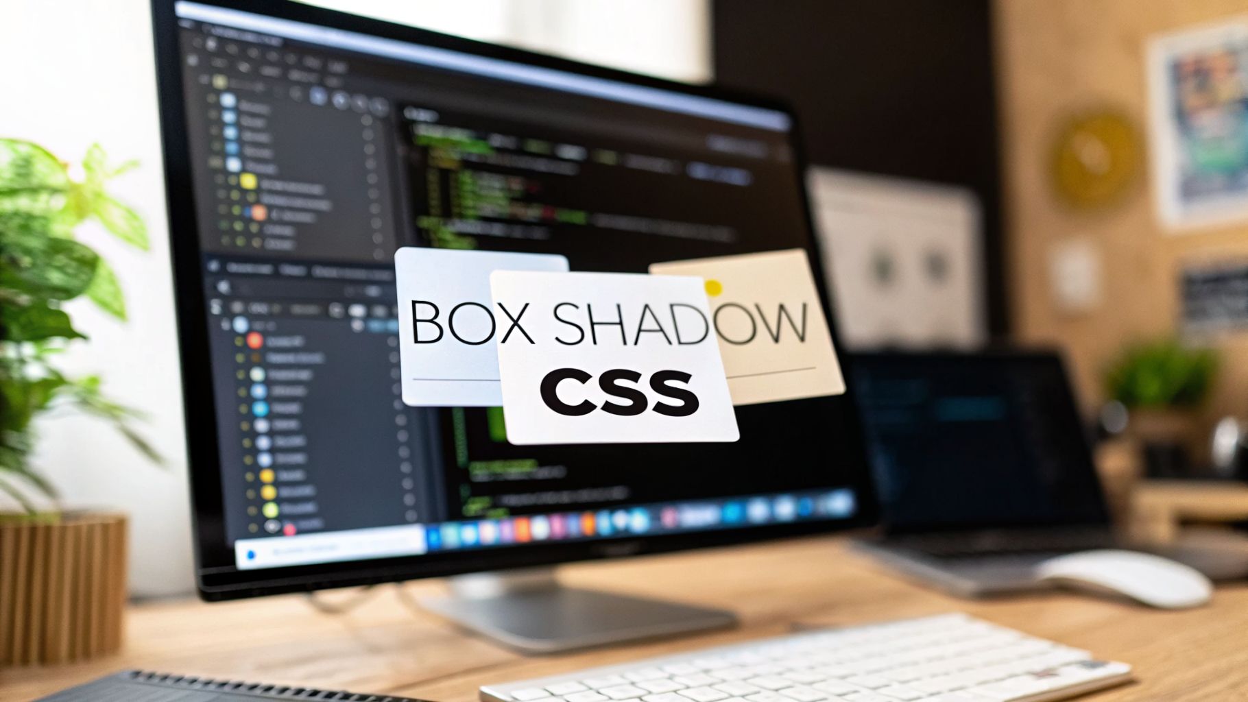
Why Mastering Box Shadow CSS Is a Game Changer
As a developer or designer, you can think of the box-shadow property as your own personal lighting rig for the web. You get to control the direction, softness, and color of the light to define how different elements relate to each other. This is more than just decoration; it’s a way to communicate function and intention.
These small visual cues are the bedrock of modern UI design, dramatically improving the user experience by making interfaces more intuitive. Getting these details right is a huge part of what separates an average site from a great one. We dive deeper into how small details create a big impact in our guide explaining why web design is so important.
A Quick Reference for Box Shadow Values
Before we get into the creative side of things, let's break down the basic syntax. At first glance, it might look a little intimidating, but it’s actually quite logical. Each value you provide gives a specific instruction for how the shadow should behave.
Key Insight: The most realistic shadows are often the most subtle. Instead of one dark, heavy shadow, professional designers frequently stack multiple, semi-transparent shadows to create a soft, layered effect that mimics real-world lighting.
Here's a quick cheat sheet for the box-shadow property. Keep this handy as a reference while we explore how to put these values into practice.
Box Shadow CSS Property Quick Reference
| Value | Description | Example Usage |
|---|---|---|
offset-x |
Controls the shadow's horizontal position. A positive value moves it right; a negative value moves it left. | 10px (moves right) |
offset-y |
Controls the shadow's vertical position. A positive value moves it down; a negative value moves it up. | 10px (moves down) |
blur-radius |
Determines the blurriness of the shadow. A larger value creates a softer, more diffused shadow. 0 results in a sharp edge. |
15px (soft blur) |
spread-radius |
Expands or shrinks the shadow. A positive value makes it larger; a negative value makes it smaller. | 5px (expands shadow) |
color |
Sets the color of the shadow. Using rgba() allows you to control opacity for more realistic effects. |
rgba(0,0,0,0.15) |
inset |
An optional keyword that changes the shadow from an outer (outset) shadow to an inner shadow. | inset |
With these core components in your toolkit, you're ready to start building everything from simple, clean shadows to complex, layered effects.
Understanding the Box Shadow CSS Syntax
To really get the hang of CSS box-shadow, it helps to stop thinking about it as code and start thinking of it like you're aiming a light at an object. Every value you plug in tells the browser how and where to cast a shadow, giving you incredible control over the final look. Forget just copying and pasting snippets you find online; let’s build your intuition from the ground up.
The box-shadow property is made up of several values, all separated by spaces. You can get away with just two (the offsets), but the real magic happens when you use all of them together. Each part builds on the last, letting you craft everything from sharp, subtle outlines to soft, ambient glows.
Let's break down what each value actually does.
The Offset Values: X and Y
First up are offset-x and offset-y. These are the two required values, and they’re the most straightforward part of the property. They simply tell the shadow where to go.
offset-x: This controls the shadow's horizontal position. A positive number like10pxpushes the shadow to the right. A negative number, like-10px, shoves it to the left. A value of0keeps it perfectly centered horizontally.offset-y: This does the same thing, but vertically. A positive value (10px) moves the shadow down, and a negative value (-10px) moves it up from the element.
Think of it this way: if you set box-shadow: 10px 10px;, you're telling the browser the light source is coming from the top-left corner, casting a shadow down and to the right.
The Blur and Spread Radii
Once you've positioned the shadow, you get to style it with the optional blur-radius and spread-radius values. This is where the real artistry comes into play.
The blur-radius is the third value. It controls how soft or fuzzy the shadow's edges are. If you leave it at its default of 0, you get a hard, crisp-edged shadow. The higher the number, the more diffused and blurry the shadow becomes—just like a shadow cast by a soft, distant light source.
Right after blur comes the spread-radius, which is the fourth value. This one’s a bit different; it actually grows or shrinks the shadow itself before any blur is applied. A positive number makes the shadow bigger all around, while a negative value will shrink it. This is fantastic for fine-tuning your effect, whether you need a tight, clean shadow or want to give a blurry shadow more presence.
Key Takeaway: The relationship between
blur-radiusandspread-radiusis crucial. A large blur with a small or negative spread creates a soft, hazy glow. A small blur with a positive spread creates a larger, more defined shadow.
The following diagram shows how all these pieces come together to create a sense of depth and guide a user's eye.

As you can see, mastering the syntax is the first step toward using shadows to build a more effective and intuitive interface.
Color and the Inset Keyword
Last but not least, you can set the shadow's color and add the optional inset keyword.
The color is simple enough, but a pro-tip is to use rgba() to add transparency. A semi-transparent black like rgba(0, 0, 0, 0.15) almost always looks more natural and less heavy-handed than a solid color.
The inset keyword is a complete game-changer. If you add it to the rule, the shadow gets drawn inside the element's border instead of outside. This is how you create those cool "pressed in" button effects or add a sense of depth to a container element.
Here’s how the full syntax looks when you put it all together:
box-shadow: [offset-x] [offset-y] [blur-radius] [spread-radius] [color] [inset];
Once you understand how each of these values works with the others, you can move beyond presets and start creating your own custom, purposeful shadows for any design. You're not just writing code anymore—you're a digital lighting designer.
Creating Realistic Depth with Layered Shadows
If you've ever seen a UI element with a single, dark, fuzzy shadow, you know it can look a bit… off. It’s a common starting point, but it often makes elements feel fake and heavy, like they're crudely stuck onto the page. To create truly believable depth, we need to look at how shadows work in the real world and mimic that subtlety with CSS.

Think about a book resting on your desk. It doesn't cast one uniform shadow. Instead, you'll see a sharp, dark shadow right underneath its edge, where it’s closest to the surface. Then, a much softer, fainter shadow spreads out from there. We can replicate this exact effect by layering multiple shadows on a single element.
The Power of Multiple Shadows
Creating a layered shadow is surprisingly simple: you just define multiple shadows in the box-shadow property, separated by a comma. The browser then stacks them, with the first shadow you list appearing on top.
A go-to professional technique involves stacking two specific types of shadows:
- The Key Shadow: This is a tight, sharp shadow with a small offset and blur. It sits directly under the element, grounding it and defining its edge.
- The Ambient Shadow: This is a much softer, more spread-out shadow with a larger offset, a bigger blur, and lower opacity. It creates the subtle, atmospheric glow that suggests the element is floating above the page.
Combining these two is far more convincing than any single shadow could ever be. This isn't just about aesthetics; good visual hierarchy guides the user's eye and can even influence their behavior. Some studies have found that thoughtful visual cues, like layered shadows using comma-separated values such as 0px 5px 5px rgba(0,0,0,0.2), 0px 10px 20px rgba(0,0,0,0.1), can improve user engagement by up to 25%. You can dig deeper into these findings and see how CSS box-shadow enhances interfaces at TestmuAI.com.
Outset vs Inset Shadows a Critical Distinction
Up to this point, we've been working with the default outset shadow, which paints the shadow outside an element’s border. This is what makes things look like they are popping off the page. But box-shadow has another mode that completely flips this effect on its head: the inset keyword.
When you add inset to your shadow definition, the shadow is cast on the inside of the element. This simple change creates an entirely different illusion—one where the element looks pressed in, recessed, or hollowed out.
Key Insight: Think of it this way:
outsetmakes elements "pop out," whileinsetmakes them "push in." Mastering this distinction is fundamental for creating tactile, interactive UIs.
This one keyword unlocks a ton of design possibilities. You can use inset shadows to give input fields a sense of depth, create a "pressed" state for buttons, or add a subtle inner bevel to containers.
Let's break down the difference:
| Shadow Type | Visual Effect | Common Use Case |
|---|---|---|
| Outset (default) | The element appears to be lifted off the page, casting a shadow onto the surface behind it. | Floating cards, modal windows, raised buttons. |
| Inset | The element's surface appears to be recessed or pressed inward, with a shadow cast on its inner edges. | Clicked button states, input fields, container depth. |
Practical Examples of Layered and Inset Shadows
When you start combining layered shadows with the inset and outset keywords, you have a seriously powerful toolkit. A classic example is making a button feel truly interactive. Give it an outset shadow by default, and then switch to an inset shadow when the user clicks it (:active state). This provides instant, tangible feedback that the click was successful.
Here’s what a beautiful, layered outset shadow for a card element might look like:
.card {
box-shadow:
0 2px 4px rgba(0,0,0,0.08), /* The tight, "key" shadow /
0 10px 20px rgba(0,0,0,0.06); / The soft, "ambient" shadow /
}
And here's how you'd create that satisfying "pressed" button effect using an inset shadow:
.button {
box-shadow: 0 4px 8px rgba(0,0,0,0.15); / Default raised state */
}
.button:active {
box-shadow: inset 0 2px 4px rgba(0,0,0,0.2); /* Pressed-in state */
}
By getting comfortable with these techniques, you're no longer just decorating boxes. You're sculpting an interface with light and shadow, making it not only more beautiful but also more intuitive and satisfying for people to use.
Animating Shadows For Interactive User Interfaces
Static elements get the job done, but interactive elements create an experience. When you animate a box shadow, you give users satisfying visual feedback that makes your entire interface feel more responsive and alive. A simple hover effect can transform a flat card into something that seems to lift right off the page, practically begging to be clicked.

This isn't just about flashy aesthetics; it's about clear communication. When a button's shadow deepens on hover, it intuitively signals to the user, "Hey, I'm clickable!" This kind of micro-interaction makes interfaces far more intuitive. In fact, adding hover shadows to buttons has been shown to boost click-through rates by a surprising 20-30% in some e-commerce contexts.
The Performance Cost Of Animating Box-Shadow
Before you start adding shadow animations to everything, we need to talk about a critical detail: performance. Animating the box-shadow property can be surprisingly demanding on a web browser.
Here’s the problem: unlike properties like transform or opacity, any change to a box-shadow forces the browser to do a full "repaint." Essentially, it has to recalculate and redraw a significant chunk of pixels on the screen for every single frame of the animation.
This repaint process is a resource hog. On complex pages or less powerful devices (like many mobile phones), it can cause your animations to stutter, lag, and feel "janky." You'll fall far short of that buttery-smooth 60 frames per second (fps) that our eyes perceive as fluid motion. If an animation feels clunky, a box-shadow transition is often the culprit.
Achieving Smooth Animations With Transform and Opacity
So, how do we get that slick "lifting" effect without grinding the browser to a halt? The professional trick is to fake it. Instead of animating the box-shadow property directly, we animate transform and opacity—two properties the browser can handle much more efficiently.
This is the strategy the pros use:
- Create Two Layers: We use a pseudo-element (like
::beforeor::after) to act as a dedicated shadow layer, sitting just behind our main element. - Animate Opacity: The shadow layer starts out completely invisible (
opacity: 0). On hover, we simply fade it in by transitioning its opacity to1. - Animate Transform: At the same time, we can use
transform: translateY()to move the main element up a few pixels andtransform: scale()on the pseudo-element to make the shadow appear to grow.
This approach works brilliantly because it offloads the animation work to the computer's GPU, which is designed for this kind of task. It avoids the expensive repaint process entirely, leading to silky-smooth animations.
Key Takeaway: For high-performance UI animations, always transition
opacityandtransformon a pseudo-element's shadow. Avoid transitioning thebox-shadowproperty on the main element itself.
Let's look at how these animation techniques stack up in terms of performance.
Box Shadow Animation Performance Comparison
The table below breaks down the impact of animating box-shadow directly versus using the more performant transform and opacity method on a pseudo-element.
| Property Animated | Performance Impact | Best Use Case |
|---|---|---|
box-shadow |
High (triggers CPU-heavy repaints) | Static states or non-interactive elements where no transitions are needed. |
transform & opacity |
Low (GPU-accelerated) | Any interactive hover or focus effect requiring a smooth, fluid shadow animation. |
As you can see, for anything that moves or changes, the transform and opacity approach is the clear winner for maintaining a high-quality user experience.
Here’s a code snippet showing how to put this performant technique into practice. Notice that the box-shadow values themselves never change during the animation—only the pseudo-element's opacity and the card's position do.
.card {
position: relative;
/* Smoothly transition the card's movement */
transition: transform 0.3s ease-in-out;
}
.card::after {
content: '';
position: absolute;
z-index: -1; /* Place the shadow behind the card /
top: 0;
left: 0;
width: 100%;
height: 100%;
box-shadow: 0 10px 20px rgba(0,0,0,0.1);
opacity: 0; / Shadow is initially invisible /
/ Smoothly transition the shadow's visibility */
transition: opacity 0.3s ease-in-out;
}
.card:hover {
/* Lift the card up on hover */
transform: translateY(-5px);
}
.card:hover::after {
/* Fade the shadow in on hover */
opacity: 1;
}
This method gives you the best of both worlds: a beautiful, dynamic effect that doesn't sacrifice performance. To see how these small details contribute to a larger, more compelling user experience, take a look at our guide on how to create an interactive website. Applying thoughtful animation techniques like this is what separates good design from great design.
Advanced Box Shadow Design Patterns
Once you've gotten the hang of layering shadows and using inset, you can start creating some truly sophisticated and modern UIs. Moving beyond simple, symmetrical shadows is where the real fun begins. By combining different techniques, you can build design patterns that don't just look great but also subtly guide how a user perceives your interface.

Here, we'll dive into some creative styles that will make your work stand out. We’ll look at a few popular effects, breaking down not just how to build them but why they work so well in practice.
Creating Neumorphic UI Elements
Neumorphism is one of the more unique design trends to pop up in recent years. It creates a soft, almost physical interface where UI elements look like they’re extruded from or pushed into the background.
The entire effect is a clever illusion built with two carefully placed shadows:
- A Light Shadow: One
box-shadowuses negative offsets (like-5px -5px) and a very light color, usually a tint of white. This creates the appearance of a light source hitting the element's top and left edges. - A Dark Shadow: The second
box-shadowuses positive offsets (like5px 5px) and a darker, semi-transparent color. This mimics a shadow being cast on the bottom and right edges.
The real secret is that the element and its background must be the exact same color. This trick makes it feel like the button is part of one continuous surface, with its shape defined only by light and shadow. Neumorphism, which gained traction around 2019, uses these dual shadows to create tactile-looking buttons that feel more interactive. Some A/B tests even found this kind of user feedback led to bounce rates dropping by as much as 18%.
Here’s a quick snippet for a simple neumorphic button:
.neumorphic-button {
background-color: #e0e5ec;
border-radius: 20px;
box-shadow:
-7px -7px 20px #ffffff,
7px 7px 20px rgba(94, 104, 121, 0.288);
}
Crafting Clean One-Sided Shadows
Sometimes a full, four-sided shadow can feel too heavy, especially in a clean, minimalist design. A one-sided shadow is a fantastic alternative that adds just enough depth to create separation without cluttering the UI. This is perfect for headers, sidebars, or cards that need to feel distinct from their surroundings.
While there’s no direct way to apply a shadow to just one side, we can achieve it with a clever workaround.
Key Insight: The trick is to use a large negative
spread-radiusthat is equal to theblur-radius. This essentially cancels out the blur on three sides, leaving only the shadow on the offset side visible.
For example, to get a shadow only on the bottom of an element, you’d use a positive offset-y, a blur-radius, and a negative spread-radius of the same value.
Let's see it in action:
.header-with-bottom-shadow {
box-shadow: 0px 15px 10px -15px rgba(0,0,0,0.2);
}
In that example, the 15px blur is pulled back by the -15px spread on the top, left, and right. The positive offset-y pushes the remaining blur downward, resulting in a clean shadow only at the bottom. This is a go-to box shadow css technique for modern layouts.
Other Advanced Shadow Techniques
The world of box-shadow is vast, and there are many other popular design patterns out there. Some designers, for instance, use shadows to create depth in more abstract and artistic ways. If you're exploring advanced patterns, you might also be interested in a good glassmorphism CSS tutorial, as its frosted-glass look often relies on subtle shadows to achieve its sense of depth.
By combining the patterns we've discussed—layered, inset, neumorphic, and one-sided shadows—you have a powerful toolkit for building interfaces that are not only functional but also visually compelling and intuitive.
Optimizing Shadows for Performance and Accessibility
While it's easy to get carried away with creating the perfect box shadow css effect, a beautiful design isn't worth much if it tanks your site’s performance or leaves some users behind. As we push the visual boundaries, we also have to think about the practical side of things: speed and inclusivity.
One often-overlooked detail is how shadows render across different browsers. box-shadow itself has fantastic support, but older browsers might stumble when trying to render multiple, layered shadows. It's always a good idea to test your work on various platforms and have a simpler, single-shadow fallback ready for legacy systems, just in case.
Ensuring Accessibility with Shadows
On a more critical note, we have to make sure our shadows don't get in the way of a good user experience. A shadow that’s too dark or positioned poorly can slash the contrast between text and its background, making your content a chore to read. This is a massive barrier for users with visual impairments. For a much deeper dive into this, take a look at our guide on what is website accessibility.
You also need to consider features like Windows High Contrast Mode. This accessibility setting often strips out background images and colors—and yes, that includes your carefully crafted box shadows—to maximize readability.
Key Takeaway: Never rely on shadows alone to communicate information or define boundaries. Make sure your elements have clear borders or enough white space to stand on their own, even if the shadow effects completely disappear.
Going Beyond the Box with Filter Drop-Shadow
The box-shadow property is a workhorse, but it has one glaring limitation: it only traces the "box" of an element. This becomes a problem when you apply it to a transparent PNG or an intricate SVG shape. The shadow will stubbornly remain rectangular, which just looks wrong.
This is exactly where filter: drop-shadow() saves the day. It’s an entirely different CSS property that applies a shadow to the actual visible parts of an element, respecting transparency.
box-shadow: Creates a shadow based on the element's rectangular container.filter: drop-shadow(): Creates a shadow that perfectly follows the contours of the visible content, like a cut-out.
The syntax is similar to box-shadow but a bit simpler. It accepts an x-offset, y-offset, an optional blur-radius, and a color. The two things it can't do are spread-radius and the inset keyword.
Here's how you’d add a much more realistic shadow to an SVG icon:.svg-icon { filter: drop-shadow(0 4px 6px rgba(0,0,0,0.15));}
By keeping performance, accessibility, and powerful alternatives like filter: drop-shadow() in your back pocket, you’re equipped to build designs that are not only beautiful but also robust and professional.
Common Questions About Box Shadow CSS
As you get more comfortable with box-shadow, you’ll likely run into a few common hurdles and questions. Let's tackle some of the most frequent ones I see developers ask, so you can sidestep these issues and get back to building.
A classic request is creating a shadow on just one side of an element. It’s a clean, modern look, but box-shadow doesn't have a simple box-shadow-bottom property. The trick is to get creative with the values. By setting a negative spread-radius that’s equal to your blur-radius, you essentially "pull in" the shadow on three sides, leaving just the offset side visible. It's a clever hack that works every time.
Can You Animate Box Shadow?
This question comes up all the time. Can you animate box-shadow? Technically, yes. Should you? Probably not. Directly animating the box-shadow property is a performance nightmare. It forces the browser to repaint the pixels on every single frame, which is a heavy task for the CPU. The result is often choppy, janky animation, especially on less powerful devices.
The professional approach is to animate
transformandopacityinstead. A much smoother way to get that interactive feel is to apply the shadow to a pseudo-element (like::after), then simply animate its opacity or transform. This lets the GPU handle the work, keeping your animations buttery smooth at 60fps.
This method gives you the dynamic effect you want without bogging down your page.
Box Shadow vs Filter Drop Shadow
Another point of confusion is box-shadow versus filter: drop-shadow(). They both create shadows, but they work in fundamentally different ways. Knowing which one to reach for is a mark of a seasoned developer.
Here’s the main difference:
box-shadow: This applies a shadow to the element's rectangular box—the "bounding box." It doesn't care about transparency. If you put it on a circular PNG with a transparent background, you'll get a shadow behind a square.filter: drop-shadow(): This is much smarter. It traces the actual visible shape of the element, respecting transparency. This makes it perfect for adding a realistic shadow to an SVG logo, an icon, or a cut-out image.
Think of it this way: box-shadow is for the container, while filter: drop-shadow() is for the content's unique shape. The trade-off is that filter doesn't support the spread-radius or inset keywords, so box-shadow still wins for many standard UI elements like buttons and cards.
Ready to elevate your online presence with a professionally designed website? The team at Sugar Pixels specializes in creating custom, performance-driven web solutions that convert visitors into customers. Visit us today at https://www.sugarpixels.com to learn how we can help your business grow.