
If you want to optimize your e-commerce site, you have to nail three things: technical performance (speed), on-page SEO, and the user experience (UX). A site that’s fast, easy to find, and a breeze to use doesn’t just get visitors—it turns them into customers who keep coming back. This whole process is a blend of behind-the-scenes technical work and front-end design tweaks, all aimed at making the journey from discovery to checkout as smooth as possible.
Building Your Foundation on Speed and Technical Performance

Long before a customer lays eyes on your products, they feel your site's speed. In e-commerce, every single millisecond matters. A slow-loading page is the digital version of a locked storefront door. That’s why technical performance isn't just some "nice-to-have" feature; it’s the bedrock your entire business is built on. A sluggish site doesn't just annoy people—it tanks your search rankings and takes a direct shot at your revenue.
Think about this for a second: just a one-second delay in page load time can cause a 7% drop in conversions. If your store is pulling in $100,000 a day, that single second is costing you more than $2.5 million a year. This is exactly why the very first place you should look to optimize your e-commerce site is always under the hood.
Choosing the Right Engine: Your Hosting Solution
Your hosting is the engine that powers your store. Going with a cheap, shared hosting plan is like trying to win a Grand Prix in a golf cart. It might get you on the track, but the moment you get a traffic spike from a flash sale, that shared server will grind to a halt. The result? A pile of abandoned carts and a flood of lost sales.
For any serious e-commerce operation, a Virtual Private Server (VPS) or dedicated hosting isn't a luxury; it's a necessity. These plans give you dedicated resources, making sure your site stays quick and responsive no matter how many shoppers show up. Managed hosting solutions, especially for platforms like WordPress or Shopify, are also great because they handle all the technical heavy lifting for you.
Deliver Content Instantly with a CDN
A Content Delivery Network (CDN) is an absolute must-have for any store selling to customers in different parts of the world. What it does is simple but brilliant: it stores copies of your site's assets—like images, CSS files, and JavaScript—on servers located all over the globe.
So, when a customer in London visits your site hosted in New York, the CDN serves up those files from a much closer server in Europe. This drastically cuts down the time it takes for the data to travel, making your site feel incredibly fast for everyone, everywhere.
A fast website isn't just about conversions; it's about perception. Speed signals professionalism and reliability, building subconscious trust with a potential customer before they even add an item to their cart.
Practical Steps for Immediate Speed Gains
Beyond your hosting and CDN, there are several on-site tweaks that can give you an instant performance boost. These are the kinds of technical fixes that directly impact Google's Core Web Vitals—the key metrics the search engine uses to judge user experience and, ultimately, your rankings.
Here are three high-impact actions you can take right now:
- Compress Your Images: You need gorgeous, high-resolution product photos, but those huge files are absolute speed killers. Use a tool like TinyPNG or a compression plugin to shrink file sizes by up to 70% without any noticeable drop in quality. It's one of the easiest wins out there.
- Minify Code Files: Minification is the process of stripping out all the unnecessary characters from your site's code—things like extra spaces, line breaks, and comments. This makes your CSS, JavaScript, and HTML files smaller, so they download and run much faster in a visitor's browser.
- Leverage Browser Caching: Caching is a clever way to tell a visitor's browser to save static parts of your website (like your logo, fonts, and stylesheets) on their own computer. The next time they visit, their browser can load those files from its local memory instead of downloading them all over again. This makes return visits and navigating between pages feel almost instantaneous.
Getting these technical fundamentals right creates a solid, reliable foundation. It means that when you start pouring money and effort into SEO and marketing, your site will be ready to provide a fast, seamless experience that actually turns traffic into sales. If you're looking for more in-depth strategies, you can learn more about how to improve website loading speed in our detailed guide.
Climbing the Ranks with Strategic Ecommerce SEO

Once your site is fast and technically solid, the real fun begins: getting found. Ecommerce SEO isn't just about chasing keywords. It's about pulling in qualified traffic—people who are actively looking for exactly what you sell. A smart SEO strategy is what connects your digital storefront to a steady stream of customers who are ready to buy.
Across the globe, e-commerce conversion rates usually sit between 2% and 4%. But traffic from organic search? That often converts closer to 4%, comfortably beating the 2-3% you typically see from paid ads. The message is clear: if you’re not optimizing for search, you’re actively leaving your most valuable, high-converting customers on the table.
Crafting Product Pages That Convert and Rank
Think of your product pages as your most valuable real estate. They have to do double duty: impress search engines and persuade shoppers to click "add to cart." One of the most common pitfalls I see is stores just copying and pasting the manufacturer's product descriptions. This is a recipe for duplicate content, and Google will penalize you for it.
Every single product description needs to be unique. Don't just list specs; tell a story. Focus on the benefits. How does this product make someone’s life easier, better, or more enjoyable? To really start climbing the ranks, it's critical to follow established Ecommerce SEO Best Practices.
Here are the non-negotiables for every product page:
- Unique, Compelling Descriptions: Write your own copy. Weave in your target keywords naturally, but always write for the human first. Anticipate their questions and answer them right in the description.
- High-Quality Visuals: Use sharp, clear photos and, if possible, videos. Make sure to name your image files descriptively (like
blue-suede-running-shoes.jpg) and fill out the alt text. This helps with both accessibility and image search rankings. - Customer Reviews: This is an SEO goldmine. User-generated content keeps your pages fresh with relevant keywords and provides the social proof that hesitant shoppers need to make a purchase.
Standing Out with Structured Data
Structured data, also known as Schema markup, is your secret weapon for standing out in crowded search results. It’s a bit of code that helps search engines understand precisely what’s on your page. For an ecommerce store, this is a must-have. It’s what powers those eye-catching "rich snippets"—the star ratings, price, and stock availability that make your listing jump off the page.
By feeding Google clear, structured information about your products, you're not just hoping it figures things out. You're actively helping it build a richer, more compelling search result for your customers, which can dramatically boost your click-through rates.
Think about it from a user's perspective. Are you more likely to click the plain blue link, or the one with a 4.5-star rating and a price you can see right away? The answer is obvious. A rich snippet can easily outperform a competitor, even if they rank one spot higher.
These are the most common schema types for ecommerce:
| Schema Type | What It Does | Why It's Important |
|---|---|---|
| Product | Defines a specific product, including its name and image. | This is the foundation for all other product-related snippets. |
| Offer | Specifies the price, currency, and stock availability. | Shows shoppers key purchase details directly in the results. |
| AggregateRating | Displays the average star rating from all customer reviews. | Builds immediate trust and is a massive click-through driver. |
| Review | Highlights snippets from individual customer reviews. | Adds powerful social proof and detailed feedback to your listing. |
Building a Logical Site Architecture
A clean site architecture is critical for both shoppers and search engine crawlers. If your site is a maze, people will leave frustrated—and Google’s crawlers will, too. The goal is a shallow, intuitive structure where every product is just a few clicks from the homepage.
This structure gets reinforced by smart internal linking. For instance, a blog post on "choosing the right running shoes" should absolutely link to your main running shoe category and a few specific product examples. This passes authority (or "link equity") through your site and teaches Google how all your pages are related. A well-planned architecture also helps you sidestep many of the common https://www.sugarpixels.com/technical-seo-issues/ that can sneak up on even the most experienced teams.
Designing for Dollars with UX and Conversion Rate Optimization

Let’s be honest: a beautiful website that doesn’t convert is just an expensive digital billboard. Once you’ve laid a fast, SEO-friendly foundation, the real work begins—turning visitors into paying customers. This is where User Experience (UX) and Conversion Rate Optimization (CRO) come into play.
Smart UX isn't just about making things look good; it's about making the entire shopping journey feel intuitive and effortless. CRO is the science of using data and psychology to nudge more of those visitors to click "buy." Together, they're the one-two punch that directly grows your revenue.
Streamlining the Customer Journey
From the moment a visitor lands on your site, the clock is ticking. Confusing navigation is a one-way ticket to a competitor's store. Your goal should be to get shoppers to the products they’re looking for with as few clicks as possible.
Your two best friends here are a clean, logical menu and a powerful on-site search bar. If a user can’t find what they want in a few seconds, they'll assume you don’t have it and bounce. Beyond the initial design, you should always be looking for ways to improve ecommerce customer experience to keep customers coming back.
Every extra click or moment of confusion is a leak in your sales funnel. A smooth journey builds buying momentum, while a clunky one creates friction and invites abandonment.
The Mobile-First Imperative
Mobile commerce isn’t a trend anymore; it's the default. If your site isn’t built for a fantastic mobile experience, you are deliberately turning away most of your potential customers. This goes way beyond a simple responsive design that just shrinks to fit a smaller screen.
You need a true mobile-first mindset, where every element is optimized for thumbs. Think large, easy-to-tap buttons, simple forms, and one-click payment options like Apple Pay or Google Pay. The path to purchase on a phone should feel natural, not like a frustrating chore. For a deeper look, our guide on conversion rate optimization best practices gets into specific mobile strategies.
Optimizing Your Digital Showroom: Product Pages
Your product pages are where the magic happens. This is your digital showroom, and it needs to be persuasive, informative, and compelling. High-quality visuals are completely non-negotiable.
Don't skimp here. In fact, over 70% of shoppers will abandon a purchase because of poor product images. Adding a simple product video can spike conversions by 21%, and just improving on-site search can boost purchases by 31%. When you put it all together, smart UX improvements can lift conversions by as much as 30%.
To build a product page that sells, focus on these must-haves:
- Persuasive Copy: Don't just list features. Write compelling descriptions that solve a customer's problem and highlight the benefits. Use bullet points so people can scan the good stuff.
- A Clear Call-to-Action (CTA): Your "Add to Cart" button should be impossible to miss. Make it pop with a contrasting color and use clear, action-oriented text.
- Social Proof: Display customer reviews and ratings right where people can see them. Shoppers trust other shoppers infinitely more than they trust your marketing copy.
Building Trust with Social Proof and Urgency
People are wired to follow the crowd. If they see others have bought and loved a product, they’re far more likely to buy it themselves. That's the power of social proof. Weaving customer reviews, testimonials, and user-generated photos directly onto your product pages builds instant credibility.
You can also use a bit of psychology to gently nudge customers toward a decision. It works.
| Tactic | How It Works | A Real-World Example |
|---|---|---|
| Scarcity | Highlights limited stock to create a fear of missing out (FOMO). | "Only 3 left in stock!" or "Sale ends tonight." |
| Urgency | Creates a time-sensitive reason to buy now instead of later. | A countdown timer for a flash sale. |
| Social Proof | Shows that others are buying, validating the customer's choice. | "25 people have this in their cart." or star ratings. |
These small but mighty tactics can give your conversion rates a serious lift by creating a sense of immediacy and building confidence. By focusing on a frictionless user journey and applying these proven CRO principles, you can transform your ecommerce site from a simple online catalog into a powerful sales machine.
Plugging the Leaks in Your Sales Funnel
It's a gut-wrenching moment for any store owner: a customer loads up their cart, heads to checkout, and then…poof. They're gone. This isn't just an occasional hiccup; it's a massive, constant drain on potential revenue for almost every online store. But here's the thing: most of those abandoned carts aren't lost causes. They're golden opportunities.
Think of cart abandonment as a symptom of friction. Somewhere along the path from "Add to Cart" to "Complete Purchase," something gave your customer pause. Your job is to become a detective, hunt down those friction points, and smooth them out for good.
Diagnosing the Top Abandonment Culprits
After years in this game, you start to see the same patterns emerge. The number one killer of conversions? Surprise costs. That unexpected shipping fee that only shows up on the final payment screen is notorious for sending shoppers running for the hills.
Right behind that is forcing people to create an account. It’s a huge momentum-killer. If a customer is ready to give you their money, the last thing you want to do is make them stop and fill out a registration form. A clunky, multi-page checkout that feels like doing your taxes is another classic offender. People have zero patience for that today.
Every extra field they have to fill out, every unexpected fee that pops up, and every second of confusion is another reason to leave. The goal isn't just to make checkout possible—it's to make it feel completely effortless and trustworthy.
High-Impact Fixes to Recapture Lost Sales
The scale of this problem is staggering—the average cart abandonment rate hovers around a jaw-dropping 69.4% globally. But the fixes are surprisingly straightforward and powerful. For instance, just moving to a single-page checkout can bump conversions by 17%. Adding digital wallets like Apple Pay can add another 14% lift.
And what about the ones who still leave? A smart retargeting campaign can bring back up to 26% of those seemingly lost customers. Suddenly, that massive leak starts looking like a major revenue stream. You can find more stats on conversion rate optimization on marketingltb.com.
These aren't minor tweaks; they're changes that can directly pad your bottom line, often immediately. Here are a few of the most effective solutions I've seen work time and time again:
- Always Offer Guest Checkout: This is non-negotiable. Never, ever force a first-time buyer to create an account. Let them buy as a guest to remove that massive barrier. You can always ask them to create an account on the "thank you" page after the sale is complete.
- Be Brutally Honest About Costs: Show all costs—shipping, taxes, everything—as early as possible. Use a shipping calculator in the cart or a simple banner like "Free shipping on all orders over $50" to eliminate that dreaded sticker shock.
- Simplify Your Checkout Flow: Cut it down to the absolute essentials. Use address autofill and securely save information for returning customers to make their next visit a one-click affair.
It's crucial to identify the specific reasons customers are leaving your store. The table below outlines some of the most common issues we see and the proven fixes that get results.
High-Impact Fixes for Common Cart Abandonment Issues
| Abandonment Reason | Proven Solution | Potential Impact on Conversions |
|---|---|---|
| Unexpected Shipping Costs | Display a shipping calculator in the cart or offer a clear free-shipping threshold. | 10-20% increase |
| Forced Account Creation | Implement a prominent "Guest Checkout" option. | 12-18% increase |
| Long/Complex Checkout | Condense to a single page, use autofill, and remove non-essential fields. | 15-20% increase |
| Payment Security Concerns | Display trust badges (SSL, McAfee, etc.) and offer familiar payment gateways like PayPal or Stripe. | 5-10% increase |
| No Mobile Optimization | Ensure a fully responsive design with large buttons and simple form inputs for mobile users. | Up to 30% on mobile traffic |
Addressing even one or two of these friction points can have a dramatic effect on your sales. It's about making the entire process as seamless and reassuring as possible for your customer.
The Power of Smart Recovery Strategies
Even with a flawless checkout, life happens. People get distracted. That's where your recovery strategy kicks in, giving you a second shot at closing the deal.
Your best weapon here is an automated abandoned cart email sequence. A simple three-part series is incredibly effective:
- The Gentle Nudge (1 Hour Later): A simple, helpful message. "Did you forget something?" or "Having trouble checking out?"
- The Social Proof Push (24 Hours Later): Remind them what they're missing. Include product reviews or mention that the item is a bestseller.
- The Final Incentive (48-72 Hours Later): If they still haven't converted, a small, time-sensitive offer like a 10% discount or free shipping can be the final push they need.
Another great tool is the exit-intent popup. When a user's cursor shoots up towards the back button or to close the tab, a popup appears with a last-chance offer. It could be a discount code or an option to save their cart for later. It’s a final, non-intrusive attempt to reclaim a sale you’ve already worked so hard to get.
The Ongoing Cycle of Testing, Analytics, and Maintenance
If you want to truly optimize an ecommerce site, you have to get comfortable with one simple truth: the work is never really done. This isn't a project you can check off a list. It’s a continuous loop of testing, learning, and refining your approach. Customer behavior shifts, search engines change their rules, and your competitors are always making moves. Staying ahead means treating your website as a living, breathing system that needs constant care.
Without solid data, you're just guessing. To shift from guesswork to intelligent, predictable growth, you absolutely need a robust analytics setup. Think of Google Analytics 4 (GA4) as your command center for understanding exactly how people interact with your store. It’s about so much more than just counting page views—it's about mapping the entire customer journey from first click to final purchase.
Your first order of business should be setting up enhanced ecommerce tracking in GA4. This unlocks the most critical reports that show you:
- Product Performance: Which items are getting the most views, being added to carts, and actually getting purchased?
- Checkout Behavior: Where are people abandoning the process? Is it the shipping page? The payment step?
- Sales Performance: How are revenue, conversion rates, and average order value trending over time?
This data immediately shines a light on the leaks in your sales funnel. If you see a huge drop-off between the "Add to Cart" and "Begin Checkout" events, you've just found a major friction point. That’s your signal to investigate everything from unexpected shipping costs to the visibility of your checkout button.
Making Data-Driven Decisions with A/B Testing
Once your analytics has shown you where the problems are, A/B testing is how you figure out why and discover a better solution. A/B testing, also known as split testing, is simply the process of comparing two versions of a webpage to see which one performs better. You show version A to 50% of your visitors and version B to the other 50%, then let the numbers tell you which one drives more conversions.
The secret to effective A/B testing is to start with a solid hypothesis. Don't just throw random ideas at the wall. A good hypothesis might sound something like this: "Changing our product page CTA button from 'Buy Now' to 'Add to Bag' will increase add-to-cart rates because 'Add to Bag' feels like a lower-commitment action to shoppers."
A few high-impact elements I always recommend testing include:
- Headlines: Pit a benefit-driven headline against one that's more focused on features.
- Product Images: See how lifestyle photos perform compared to clean, white-background shots.
- Call-to-Action (CTA) Buttons: Experiment with color, text, and placement to see what gets clicked.
A/B testing is the ultimate antidote to guesswork. It removes ego and personal opinion from the decision-making process. The data tells you what your customers actually respond to, not what your design team just thinks looks good.
Proactive Maintenance for Long-Term Success
The final piece of this optimization puzzle is ongoing maintenance. A fast, secure, and error-free site builds trust and keeps both your customers and the search engines happy. Neglecting maintenance is like building a high-performance race car and deciding you never need to change the oil. Sooner or later, things are going to break down.
This diagram perfectly illustrates the simple but powerful process of diagnosing a common problem like cart abandonment, implementing a targeted fix, and then measuring the positive result.
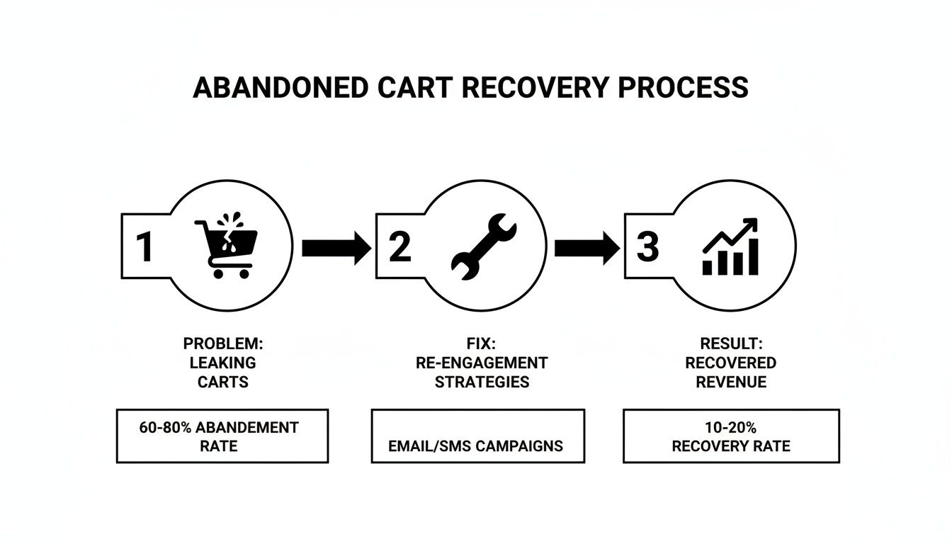
This kind of flow shows that by identifying leaks and applying data-backed solutions, you can turn those frustrating losses into measurable revenue growth.
A practical maintenance schedule is the key to keeping your site in peak condition. Think of it as a recurring checklist that ensures nothing important falls through the cracks.
Here’s a simple monthly maintenance routine to get you started:
- Run Performance Audits: Use tools like Google PageSpeed Insights to check your Core Web Vitals and spot any new speed bottlenecks.
- Check for Broken Links: Use a crawler tool to hunt down and fix any 404 errors. They create a terrible user experience.
- Perform Security Scans: Regularly scan for malware or vulnerabilities, especially right after installing new plugins or apps.
- Review Mobile Usability: Don't just rely on simulators. Manually walk through your checkout process on a few different phones to catch any real-world issues.
This continuous cycle—analyzing data, testing hypotheses, and performing regular maintenance—is what truly separates the thriving ecommerce stores from the ones that stagnate. It transforms your website from a static digital catalog into a dynamic, ever-improving sales engine.
Got Questions? We’ve Got Answers.
Running an ecommerce store means you’re constantly juggling priorities. It's natural to have questions about where to focus your energy for the best results. Let's tackle some of the most common ones we hear from store owners.
The idea here is to cut through the noise and give you clear, actionable advice. From making the most of a small budget to figuring out what’s next in tech, let’s get you some answers.
I'm on a Tight Budget. Where Do I Even Start?
When every dollar counts, you have to be ruthless about prioritizing. The biggest wins almost always come from fixing technical performance and smoothing out the user experience—these two areas affect every single person who lands on your site.
If you’re strapped for cash, here’s your priority list:
- Shrink Your Images. This is non-negotiable and your absolute first step. Gigantic product photos are the number one cause of sluggish websites. You can use free online tools to compress them without losing quality. It costs nothing but a little bit of time and the payoff is huge.
- Walk Through Your Mobile Site. Seriously, grab your phone and try to buy something. Is it a pain? Are the buttons too small? Is the text hard to read? Fixing these little annoyances on mobile can stop a massive leak of potential customers.
- Simplify Your Checkout. Your goal is to remove every single obstacle between a customer and their purchase. The most powerful, immediate change you can make? Always offer guest checkout. Forcing people to create an account is a notorious conversion killer.
Nailing these fundamentals will give you the most bang for your buck and build a solid foundation for everything else.
How Often Should I Be Auditing My Site?
Think of it less like a massive annual project and more like regular maintenance. Consistency beats intensity every time. You don't need to tear the whole thing apart every month, but you can't just set it and forget it for a year, either.
A solid cadence is a full, deep-dive audit every quarter, with lighter monthly health checks in between.
It’s a lot like taking care of a car. You get a major service done a couple of times a year, but you’re still checking the tire pressure and oil levels regularly. Those quick, proactive checks stop small problems from becoming massive, sale-killing breakdowns.
Your monthly check-in should be focused on the vital signs—things like site speed reports and mobile usability scores. The quarterly audit is when you go deeper, analyzing SEO performance, hunting down broken links, and reviewing the entire conversion funnel from top to bottom.
Where Does AI Actually Fit into My Strategy?
Artificial intelligence is already reshaping ecommerce, particularly when it comes to search. With 37% of adults now turning to generative AI tools like ChatGPT for product recommendations, your old SEO playbook needs an update.
AI-powered search engines are getting incredibly good at understanding and answering conversational questions. This means your optimization strategy has to evolve beyond just targeting keywords like "best running shoes." You need to start thinking about how people actually ask for things, like "what are the best running shoes for flat feet under $150?"
Here’s how you can prepare your site right now:
- Build Out FAQ Pages: Create detailed FAQ sections on your product and category pages. This is exactly the kind of structured, helpful content that AI models love to pull from when crafting an answer.
- Write Like a Human: Ditch the corporate jargon. Write your product descriptions and blog posts in a natural, helpful tone that sounds like a real person giving advice.
When you create content that genuinely solves a customer's problem, you’re not just optimizing for today’s search engines—you’re setting your site up for success in the next wave of search.
Ready to stop guessing and start growing? The team at Sugar Pixels provides expert web design, SEO, and maintenance services to turn your ecommerce site into a high-performance sales engine. Let us handle the technical details so you can focus on what you do best. Find out how we can help.