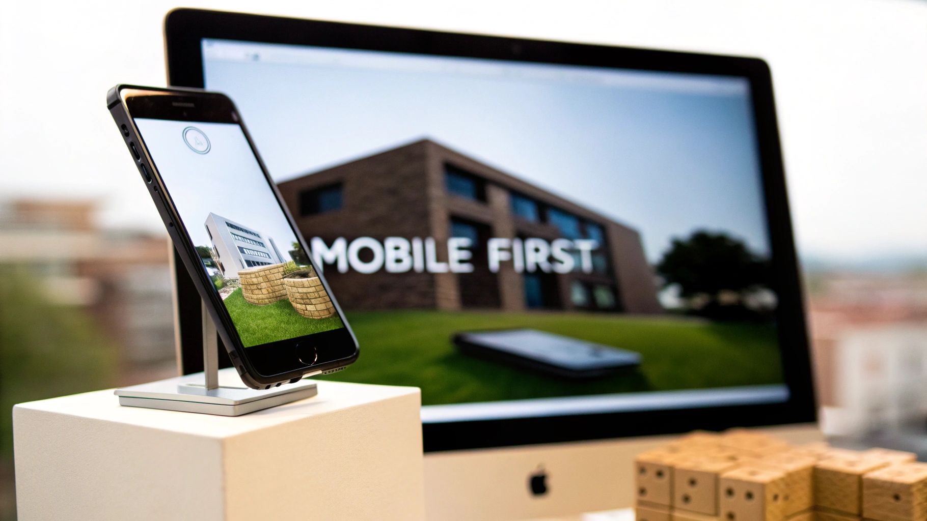
Let's get straight to the point. Mobile-first design is a design philosophy where you build a website for the smallest screen—a smartphone—and then progressively expand the design for tablets and desktops. Think of it as a complete reversal of how things used to be done, when designers would create a massive, feature-rich desktop site and then desperately try to cram it onto a tiny phone screen.
This new way of thinking forces you to focus on what really matters.
Decoding Mobile First Design

Imagine you're building a house. The old "desktop-first" way is like designing a huge mansion with a library, a home cinema, and a ten-car garage, and then trying to squeeze that blueprint into a small city apartment. It’s a mess—cluttered, confusing, and completely impractical.
Mobile-first design flips that whole process on its head.
You start with the small city apartment. You have to be ruthless about what's essential: a bed, a simple kitchen, a bathroom. Every single element has to fight for its place. Only after you’ve perfected that small, efficient space do you start thinking about adding a dining room or a second bedroom for a bigger house. That’s the core idea of mobile-first design.
Prioritizing Content and Functionality
This "start small" approach naturally creates a better user experience for everyone, no matter the device. By focusing on the mobile user from day one, you’re forced to:
- Identify Core Content: What is the one thing your user absolutely needs to do or see? There’s simply no room for fluff on a small screen.
- Simplify Navigation: Menus have to be dead simple to use with one thumb. Those complex, drop-down-within-a-drop-down menus are a non-starter.
- Optimize for Performance: Mobile users aren't always on a blazing-fast Wi-Fi connection. This forces you to prioritize lightweight code and compressed images for quick load times right from the beginning.
This method of starting with a lean, functional core and then adding more features for bigger screens is a strategy called progressive enhancement. You build a rock-solid foundation that works for everyone, and then you layer on the "nice-to-have" features as more screen space and power become available.
This isn't just about making things look pretty on a phone. It’s a direct response to how people actually use the internet. With over 55% of all web traffic now coming from mobile devices, designing for the majority isn't a suggestion—it's a critical business decision.
Ultimately, mobile-first design is more than a trend; it's a strategic necessity. It makes sure your website is fast, easy to use, and accessible to the biggest chunk of your audience. That solid foundation has a direct impact on everything from your Google rankings and user engagement to your sales and overall brand image.
The Journey From Desktop-First to Mobile-First
To really get why "mobile-first" is the way we build for the web today, you have to rewind to the early days of the internet. Back then, websites were designed for one person: someone sitting at a desk, staring at a big monitor, plugged into a fast, stable internet connection. The idea of browsing the web on a device that fits in your pocket was pure science fiction.
This reality gave birth to the desktop-first design philosophy. Developers would create these sprawling, feature-heavy websites for large screens. Mobile? It was a distant afterthought, if it was a thought at all. When designers did try to make their sites work on smaller screens, they used a strategy called graceful degradation.
The Old Way: Graceful Degradation
Graceful degradation is pretty much what it sounds like. You’d build your big, beautiful, complex website for a desktop and then start yanking out features, content, and fancy bits until it could just about cram itself onto a mobile screen. It was like taking a full symphony orchestra and telling instruments to leave one by one until all you had left was a single violin.
The result was almost always a clunky, compromised, and deeply frustrating experience for anyone trying to browse on their phone. This approach effectively treated mobile users as second-class citizens, serving them a watered-down version of the "real" website. For a while, that was okay because so few people were browsing on the go. But then, everything changed.
The launch of the first iPhone in 2007 was the spark that lit the fuse. Suddenly, the internet was untethered from the desk and put directly into millions of hands. This kicked off a massive surge in smartphone adoption that permanently changed how people live and browse. By the early 2010s, mobile internet usage was skyrocketing, and by 2014 it had even overtaken desktop use in many parts of the world. With roughly 73% of the global population over age 10 owning a mobile phone by 2022, designing for the small screen was no longer a nice-to-have; it was a necessity. You can actually see this whole story unfold by exploring the website's evolution over the past thirty years.
A Necessary Evolution: Progressive Enhancement
The old method of graceful degradation was failing spectacularly in this new mobile-centric world. Websites built for desktops were agonizingly slow to load on cellular data, impossible to navigate with a thumb, and often just looked broken on smaller screens. A new way of thinking was desperately needed—one that started with reality.
This led to the rise of progressive enhancement, which is the foundational idea behind mobile-first design. Instead of starting big and chipping away, this strategy starts small, building a solid, functional baseline for the most restrictive environment: a mobile phone.
Progressive enhancement flips the old model on its head. You begin by building a core experience that is fast, accessible, and works perfectly on a small screen. Then, as more screen real estate and processing power become available on tablets and desktops, you progressively add more features and elaborate design elements.
This ensures every single user gets a great experience, no matter what device they're on. The person on their phone gets a site that was built for them—not a stripped-down afterthought. The person on a desktop gets an enriched version that makes smart use of their larger screen. This strategic pivot from graceful degradation to progressive enhancement is what marks the real transition to the mobile-first world we now live in. It wasn't just a trend; it was an evolution essential for survival.
The Core Principles of Mobile-First Design

To really get what mobile-first design is all about, you have to look past the buzzwords and dig into the pillars that make it work so well. These aren't just abstract theories; they're practical guidelines that force you to think with clarity, efficiency, and a laser focus on what the user actually needs. When you build from the smallest screen up, every single decision has a purpose.
At its heart, mobile-first design is a strategy of intentional constraints. It sounds counterintuitive, but starting with a tiny screen forces you to strip away everything non-essential. The result is a stronger, leaner, and more powerful experience for everyone, no matter what device they're on.
Start with a Content-First Mindset
Before you even think about a color palette or write a single line of code, mobile-first design makes you answer one critical question: What is the most important thing for the user to see or do here? On a phone, there’s simply no room for clutter or vanity features.
This limitation is actually your greatest asset. It forces you to prioritize ruthlessly. You have to pinpoint the core message, the key calls-to-action, and the absolute must-have information. This “content-first” approach ensures the design serves the content, not the other way around. It’s all about creating a clear, direct path for the user, free of distractions.
A visual hierarchy is the perfect tool for structuring this content. You use design to guide the user's eye to what matters most.
- Size and Scale: Make essential elements, like a "Buy Now" button, noticeably larger.
- Color and Contrast: Use bold, contrasting colors to make key information and actions pop off the screen.
- Whitespace: Don't be afraid of empty space! It reduces clutter, improves readability, and makes the whole interface feel clean and focused.
Build with Progressive Enhancement
Progressive enhancement is the engine that drives the whole mobile-first philosophy. It’s the practice of starting with a solid, functional baseline experience that works on every device and browser imaginable. From there, you begin layering on more advanced features and richer visuals as the screen size and device capabilities increase.
Think of it like ordering a pizza. The baseline is a simple cheese pizza—it's delicious, it works, and it satisfies the core need. That’s your mobile version. For those who want more (or have a bigger "screen"), you can start adding toppings like pepperoni or extra cheese. These are the enhancements for tablets and desktops. Everyone gets a great pizza, but some get a more tricked-out version.
This approach guarantees that every user gets a complete, functional experience. Nobody is left with a broken website just because their phone is older or their internet is slow. It’s a fundamentally inclusive and future-proof way to build for the web.
Design for Touch, Not Clicks
A desktop user has a mouse, which offers pinpoint precision. A mobile user has a thumb, which is a whole different ballgame. Mobile-first design demands that you think about touch interaction from the very beginning.
This goes way beyond just making things look good. It means creating an interface that feels intuitive and effortless to use with your fingers. This is a massive part of good user experience design best practices and something you absolutely can't afford to get wrong.
Here are a few key things to keep in mind for touch:
- Button Size: Call-to-action buttons and other interactive elements need to be big enough to tap easily without hitting something else by mistake. A common rule of thumb is a minimum target size of around 44×44 pixels.
- Spacing: You need enough breathing room between tappable elements to prevent frustrating "fat finger" errors.
- Gesture Recognition: Think about how people actually use their phones. Design intuitive navigation around common gestures like swiping, pinching, and tapping.
Prioritize Performance and Speed
Mobile users are often on the move, dealing with spotty cellular networks and devices with less processing power than a desktop. For them, performance isn't a luxury—it's a core feature. A slow-loading site is one of the fastest ways to lose a visitor.
A mobile-first strategy forces you to optimize for speed from day one. By focusing on only the essentials for the mobile build, you naturally create a lighter, faster website. This means things like compressing images, minifying code, and avoiding heavy scripts that can bog down a mobile browser. The best part? This focus on performance carries right over to the desktop version, making the experience faster for all users and giving you a nice boost in the SEO department.
How Mobile-First Design Shapes Your SEO and User Experience
Switching to a mobile-first approach isn't just a technical tweak; it's a fundamental business decision that directly impacts how customers find you and what they think of you. The line connecting your design process to your bottom line is crystal clear, and both Google and your users will reward you for getting the mobile experience right.
Think about it this way: Google essentially sees two versions of your website, a mobile one and a desktop one. For the longest time, the desktop site was the main event. Not anymore. Now, Google overwhelmingly uses the mobile version of your site for indexing and ranking.
This is what’s known as mobile-first indexing, and it means your mobile site is now the true reflection of your brand in Google's eyes. If that version is slow, clunky, or missing important information, your search rankings will take a hit. It doesn't matter how incredible your desktop site looks; Google is judging you by your mobile presence.
Google's Love for Mobile-Friendly Sites
Google's pivot to a mobile-first world didn't happen overnight. It started gaining steam around 2010, as it became obvious that phones were becoming the main way people got online. Fast forward to 2022, and with an estimated 7 billion smartphone users globally, search engines had to adapt.
Since July 1, 2019, Google has officially made mobile-first indexing the standard for all new websites. This means a great mobile site is no longer optional for good SEO—it's the foundation.
A smart mobile-first design inherently gives Google what it's looking for.
- Faster Page Speed: By starting with mobile, you're forced to use lighter images and cleaner code. Since speed is a massive ranking factor, this gives you an immediate SEO boost.
- Lower Bounce Rates: When users on their phones can quickly find what they're looking for, they stay. This tells Google your site is valuable, which helps you climb the rankings.
- Easier to Crawl: Simple, logical site structures are a dream for search engine crawlers. They can index your content quickly and efficiently, making sure nothing important gets missed.
Simply put, when you design for your mobile audience first, you are optimizing for Google’s most important ranking criteria. A clunky mobile site can render you invisible to the vast majority of your potential customers.
A Better Experience for Everyone
While the SEO perks are a huge win, the real magic of mobile-first design happens in the user experience (UX). The limitations of a small screen force a kind of ruthless clarity, resulting in a cleaner and more intuitive site for every user, no matter their device.
When you start small, you have to ditch the fluff. You're forced to focus on what truly matters: the core content, the key features, and the most important actions you want users to take. This creates a far more focused and less confusing experience for your visitors.
How Limitations Lead to Clarity
This disciplined focus on simplicity doesn't just stay on the small screen; it benefits the desktop experience, too.
- Blazing-Fast Load Times: A lean mobile design translates into a speedy desktop site. As we cover in our guide on how to improve website loading speed, performance is a cornerstone of a great user experience and a key driver of conversions.
- Improved Accessibility: Clear layouts with large, easy-to-tap buttons don't just help someone on a bumpy train ride; they also make your site more usable for people with certain disabilities.
- Effortless Readability: Focusing on scannable text with short paragraphs and obvious headings makes your content much easier to absorb, whether on a 6-inch phone or a 27-inch monitor.
To make sure your design choices are actually working, it's vital to test them with real users. Applying essential user experience testing methods for mobile apps can give you the feedback you need to create an experience that people love. Because at the end of the day, a great UX leads directly to better business results—more engagement, higher conversions, and happier, more loyal customers.
Mobile-First vs. Responsive vs. Adaptive Design: What’s the Difference?
To really wrap your head around mobile-first design, it helps to see where it fits in with other common approaches. You’ll often hear the terms mobile-first, responsive, and adaptive thrown around together, but they aren't the same thing. They’re distinct concepts that all tackle the same challenge: making a website work beautifully on any device.
Here's a simple way to think about it: mobile-first is the philosophy, while responsive and adaptive are the techniques you use to bring that philosophy to life. One is the "why" and "where to start," while the others are the "how to build it."
The Philosophy vs. The Technique
Choosing a mobile-first approach is a strategic decision to begin the entire design process on the smallest screen. This forces you to get crystal clear on what's absolutely essential. You have to prioritize core content and features right from the start, no fluff allowed. It's less a type of layout and more a mindset that puts mobile users at the heart of your strategy.
On the other hand, responsive and adaptive design are the technical methods for making a site’s layout adjust to different screen sizes.
- Responsive Design: This is like building with a flexible, rubber-like grid. The layout fluidly stretches and contracts to fit whatever screen it’s on, all using a single set of code.
- Adaptive Design: This is more like having a few specific, fixed-size containers. The website detects the user’s screen size and serves up the pre-designed layout that’s the best fit for that particular "box" or device category.
This is more than just a design preference; it’s a direct line to better performance in search engines and a smoother experience for your visitors.
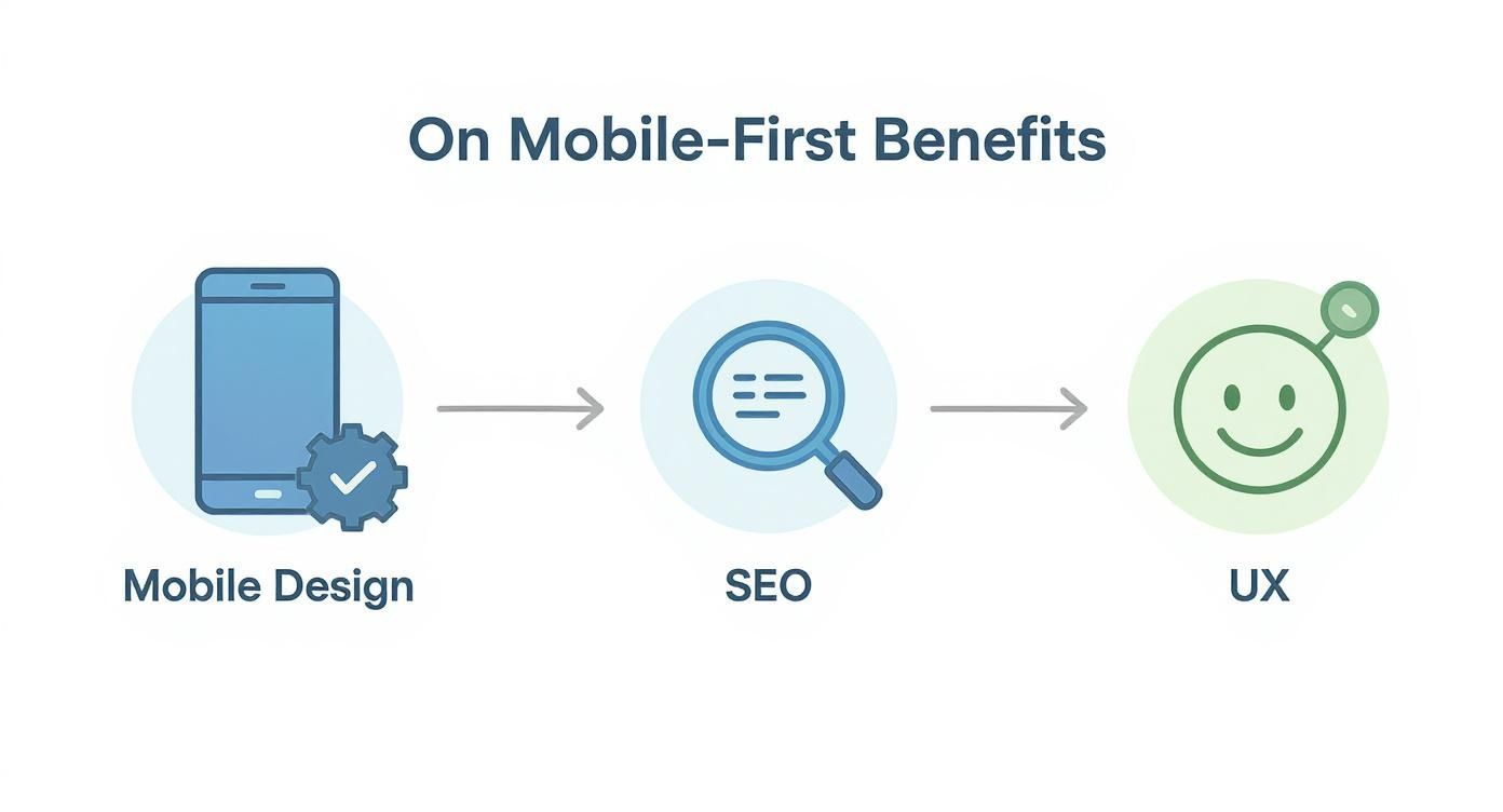
As the diagram shows, a mobile-centric approach creates a positive feedback loop. It improves usability, which Google rewards with better rankings, bringing more happy users to your site.
To get a clearer picture of how these three concepts work, let's look at them side-by-side.
Comparing Web Design Approaches
| Attribute | Mobile First Design | Responsive Design | Adaptive Design |
|---|---|---|---|
| Core Concept | A design philosophy that prioritizes mobile from the start. | A technical approach using one fluid layout for all screens. | A technical approach using multiple fixed layouts for specific screens. |
| Starting Point | Smallest screen (mobile). | Typically starts with desktop and scales down (though can be mobile-first). | Multiple layouts designed in parallel for specific "breakpoints." |
| Flexibility | Focuses on essential content, leading to lean, fast experiences. | Highly flexible; adapts smoothly to any screen size, past or future. | Less flexible; can look awkward on screens between fixed breakpoints. |
| Development | Informs the overall strategy, often paired with responsive techniques. | Single codebase, which can streamline development and maintenance. | More complex; requires building and maintaining multiple separate layouts. |
This table shows that while they all aim for a great multi-device experience, they get there in very different ways. Mobile-first sets the strategy, while responsive and adaptive are methods of execution.
Responsive Design: The Fluid Grid
Responsive design is the go-to method for most websites today. It uses a flexible grid and clever CSS to automatically adjust the layout based on the browser's width. The whole point is to offer a consistent, seamless experience across every device imaginable with just one codebase.
This inherent flexibility makes responsive design a perfect partner for a mobile-first strategy. You start by designing a simple, clean layout for a phone. As the screen gets wider, that "rubber-like" grid stretches, and you can progressively add more complex elements or rearrange content. There are tons of benefits of responsive website design, including much easier maintenance and stronger, more consistent SEO signals.
By combining a mobile-first philosophy with responsive design techniques, you create a website that is not only built on a solid, performance-optimized foundation but can also gracefully adapt to any screen size, now or in the future.
Adaptive Design: The Fixed Breakpoints
Adaptive design takes a different path. Instead of one fluid layout, developers create several distinct, static layouts for specific screen sizes—like a version for phones, one for tablets, and another for desktops. When you visit the site, the server figures out what kind of device you're on and sends the layout designed just for that screen.
The upside? This can sometimes lead to faster load times on mobile because the server only sends the assets needed for that specific version. The downside is that it's more complex and expensive to build and maintain since you're managing multiple versions of your site. It also runs the risk of giving a clunky experience to users on devices that fall between your predefined sizes.
While both responsive and adaptive designs have the same goal, the fluidity of responsive design usually makes it the more practical and future-proof choice for bringing a true mobile-first strategy to life. It ensures that no matter what new device sizes pop up tomorrow, your site will be ready.
Putting Mobile-First Into Action
Moving from theory to a live product needs a solid game plan. Adopting a mobile-first philosophy isn't just about shrinking your design; it's a disciplined process that starts with the smallest screen to build a rock-solid foundation for everyone, no matter what device they're using.
Let's walk through how to actually make it happen.
Your first move, and arguably the most important, is a content inventory. Before anyone sketches a single wireframe, you need to audit every piece of content you have and prioritize it with ruthless efficiency. What information, tasks, and features are absolutely non-negotiable for a user on their phone? This exercise forces you to get crystal clear on what truly matters, cutting out the noise right from the start.
Once you have your core content locked down, it's time to build mobile wireframes. Think of these as simple, bare-bones blueprints for the user's journey. Your entire focus should be on the flow, the navigation, and where you'll place essential elements like calls-to-action. This is all about getting the structure right, making sure the experience feels logical on a small, constrained screen.
Designing for a Hands-On Experience
With a solid structure in place, the focus shifts to the physical reality of mobile devices. Designing for touch is a completely different ballgame than designing for a mouse and cursor. Every button, link, and interactive element has to be built for fingertips, which are far less precise.
This goes way beyond just making buttons bigger; it's about crafting an interface that feels intuitive and easy to handle. To get it right, you need to follow broader app design best practices that ensure a great experience, no matter the device.
- Generous Tap Targets: Make sure your buttons and links are at least 44×44 pixels. This simple rule prevents a world of frustration from users accidentally tapping the wrong thing.
- Adequate Spacing: Give interactive elements enough breathing room. Placing them too close together is a surefire way to cause accidental clicks.
- Intuitive Gestures: Lean into common mobile interactions. Where it makes sense, let users swipe, pinch, and zoom—actions that feel completely natural on a phone.
This whole mindset is a direct result of the mobile revolution. We’ve come a long way from desktop-first thinking, a journey that kicked off with devices like the IBM Simon back in 1994 and exploded after 2007. The early hardware limitations forced designers into a minimalist mindset that now leads web strategy, especially with over 54% of global web traffic coming from mobile in 2022.
Scaling Up and Validating Your Design
After you've nailed the mobile experience, you can start scaling up using progressive enhancement. Now you can begin thinking about how the design will adapt to tablets and desktops. Use the extra screen space to add secondary features, more detailed navigation, or richer visuals—things that enhance the experience but aren't critical to the core functionality you established for mobile.
And finally, you have to test. A design isn't done until it's been put through its paces. It's crucial to test on actual physical devices, not just in simulators. Check how it performs on a blazing-fast Wi-Fi connection and on a spotty 4G network. The goal is to ensure a smooth, reliable experience for every last user.
Common Questions About Mobile-First Design
Whenever you shift your design strategy, questions are bound to pop up. As teams start to really dig into what a mobile-first approach means for them, a few key concerns usually come to the surface. But once you work through them, it becomes clear how this method actually leads to a better product for everyone, regardless of their device.
Getting these questions out in the open is the best way to move forward with confidence.
Does Mobile-First Mean Forgetting About Desktop Users?
Not at all. In fact, it's quite the opposite. Thinking mobile-first is really all about setting smart priorities. It forces you to zero in on the absolute most critical content and features that have to work on the smallest screen. This builds a clean, focused, and incredibly effective foundation.
Once that core experience is solid, scaling up to a desktop view becomes a process of thoughtful enhancement, not subtraction. You're adding to a strong base, not trying to cram a cluttered desktop design into a tiny space. The result is often a more intuitive and powerful desktop experience.
Prioritizing mobile doesn't sideline the desktop experience; it sharpens it. This method forces a clarity that benefits users on every device, ensuring the most important elements are always front and center.
Is This Approach More Expensive?
While it might feel like there's more strategic work at the start, a mobile-first approach is almost always a money-saver in the long run. By figuring out the core user needs from day one, you avoid the painful and expensive redesigns that happen when a site just doesn't work for a huge chunk of your audience.
That initial investment in strategy pays off by streamlining the entire project. Development is more focused, maintenance is simpler, and you end up with a more sustainable product.
Can an Old Site Be Converted to Mobile-First?
Yes, but it's rarely a simple tweak. Think of it less as a conversion and more as a complete rebuild. Shifting a desktop-centric site to a mobile-first mindset means you have to fundamentally rethink everything—your content hierarchy, navigation, and user journeys—all from the perspective of a mobile user.
It’s a fantastic opportunity to build your site on a much stronger, future-proof foundation that truly meets the expectations of modern users and search engines.
Ready to build a website that puts your users first on every device? The team at Sugar Pixels specializes in creating custom, mobile-first designs that drive growth and deliver results. Let's build your future-proof online presence together at https://www.sugarpixels.com.