Ever clicked on an ad and been taken to a special, focused page? That’s a landing page. It's a standalone web page built for one specific purpose, tied directly to a marketing or advertising campaign. It's the destination—where a visitor lands—after clicking a link in an email, a Google ad, or a social media post.
Unlike the other pages on your website, a landing page is designed with a single, laser-focused goal in mind. We call this the call to action, or CTA.
Your Digital Handshake: What Is a Landing Page?

Here’s an easy way to think about it: your website's homepage is like the bustling lobby of a big company. There are signs pointing everywhere—to the blog, the about us section, various product pages, and the contact form. It’s built for people to wander around and explore.
A landing page, on the other hand, is like a private meeting room. When someone clicks your ad for a new ebook, they aren't just dropped in the lobby. They're escorted directly into a room where everything—the messaging, the images, the form—is about one thing and one thing only: getting them to download that ebook. All the other doors and distractions have been removed.
This singular focus is precisely what makes landing pages so incredibly effective. The average landing page conversion rate across all industries is a solid 6.6%. Why so high? Because they guide visitors toward a single decision, eliminating the choice paralysis that can happen on a cluttered homepage.
The Big Difference: Landing Page vs. Homepage
The whole point of a landing page is to drive a specific action—to convert visitors into leads or customers. It’s not meant for casual browsing.
To achieve this, it strips away all the usual website furniture, like the main navigation menu, sidebars, and extra links. This creates a clean, streamlined path that takes the visitor from their initial interest straight to the action you want them to take.
Whether your goal is getting sign-ups for a webinar, downloads for a whitepaper, or bookings for a demo, the landing page provides the perfect, distraction-free environment to make it happen. It's an indispensable tool for any serious marketing campaign.
Let's break down the key differences side-by-side to make it crystal clear.
Landing Page vs Homepage At a Glance
The table below gives you a quick snapshot of how these two types of pages serve very different roles in your marketing strategy.
| Feature | Landing Page | Homepage |
|---|---|---|
| Primary Goal | Single Action (Conversion) | Exploration & Navigation |
| Navigation | Usually Hidden or Removed | Full Website Menu |
| Audience | Highly Targeted (from a specific ad) | General Audience |
| Content | Focused on One Offer | Broad Overview of the Brand |
Ultimately, a homepage is your digital storefront, welcoming everyone. A landing page is your expert salesperson, closing a specific deal with a specific customer. You need both to succeed.
The Anatomy of a Page That Converts
A great landing page isn’t an accident. It's a carefully crafted experience, where every single element has a job to do—building trust, creating a sense of urgency, and guiding a visitor toward one specific goal. If you want to build pages that don't just get traffic but actually drive results, you have to understand the parts that make them work.
Think of it like building with LEGOs. Each brick is simple on its own, but when you combine them the right way, you can build something impressive. A landing page is no different. Every component supports the others to construct a powerful, convincing argument.
To really get a handle on this, it's worth exploring the core marketing agency landing page essentials that form the bedrock of any solid campaign.
The Magnetic Headline and Hero Shot
The very first things anyone sees are your headline and your main image, what we call the hero shot. You have about three seconds to grab their attention and show them they’re in the right place before they hit the back button.
Your headline needs to be a knockout punch. It should be crystal clear and speak directly to a visitor's pain point or desire. This isn't the time to be clever; it's the time to be compelling. It has to immediately answer their unspoken question: "What’s in this for me?"
The hero shot, whether it's a static image or a quick video, has to back up that promise visually. If your headline is about simplifying project management, the image better show someone looking calm and organized, not stressed and chaotic. When they work together, the headline and hero shot create an immediate gut-level connection.
A strong headline grabs their attention, but a powerful hero shot tells the story in a heartbeat. You want the visitor to instantly feel like you get them.
The Irresistible Offer and Call to Action
Okay, you’ve got their attention. Now what? You have to present your Unique Selling Proposition (USP). This is just a simple, clear statement that spells out what makes your offer different and better than anyone else's. It’s the "why us" part of the pitch.
This leads right into the most important part of the page: the Call to Action (CTA). This is more than just a button; it's your final instruction. Great CTAs use strong, benefit-driven language like "Get Your Free Guide" or "Start My Trial"—not a lazy word like "Submit." The color, size, and placement of that button can make or break your conversion rate.
- Be Specific: Tell people exactly what they're getting when they click. No surprises.
- Create Contrast: That CTA button needs to pop. Make it stand out visually from everything else on the page.
- Keep it Simple: Don't surround the CTA with other links or distractions. Give it room to breathe.
Building Trust with Social Proof
Let's be honest—people are skeptical online. This is where social proof comes in to break down those walls of doubt and build some real credibility. It’s basically third-party validation that you are who you say you are and your offer is legit. Getting this right is a huge part of our recommended landing page design best practices.
Here are the must-have trust-builders:
- Testimonials: Real quotes from happy customers.
- Case Studies: Deeper dives into success stories.
- Trust Badges: Things like security seals (SSL certificates) or industry awards.
- Client Logos: If you've worked with well-known companies, show them off.
Every testimonial, logo, or badge is another little piece of evidence that tells visitors they're making a smart, safe choice.
Choosing the Right Landing Page for Your Goal
Not all landing pages are created equal, and they shouldn't be. You wouldn't use a sledgehammer to hang a picture frame, right? In the same way, you can't expect one type of landing page to work for every single marketing goal you have.
The first, most critical step is to match the page's design and function to your specific objective. Are you trying to grow your email list? Or are you trying to warm up a potential customer before they see a price tag? These are two very different goals that demand fundamentally different pages. Getting a handle on the main types of landing pages is your first big step toward success.
This diagram shows the basic building blocks that nearly every effective landing page is built from.
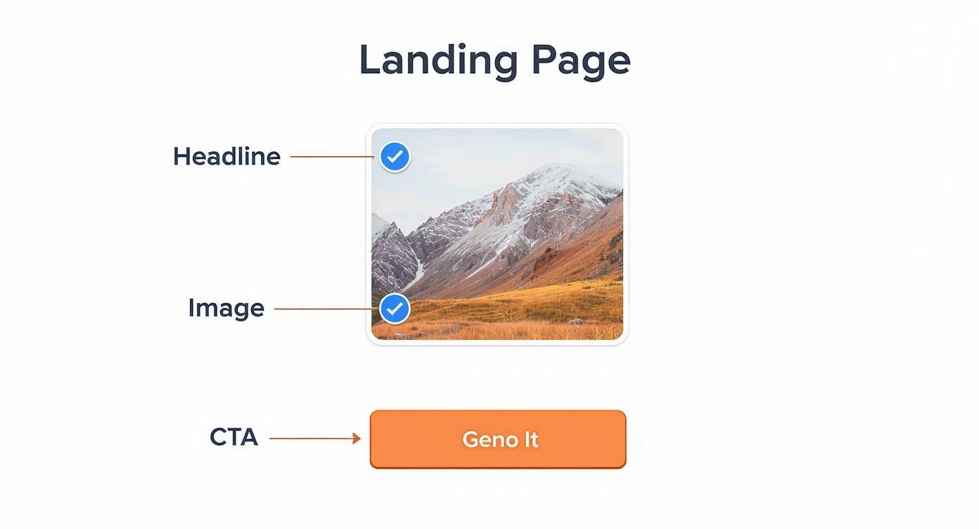
Each piece—from the headline that grabs attention to the image that sets the mood and the button that prompts action—has to work in harmony.
Lead Generation Landing Pages
Think of a lead generation landing page as a digital handshake. The whole point is to capture a visitor's contact info—like a name and an email address—by offering them something valuable in return. We call this valuable offer a "lead magnet."
What makes a good lead magnet? Here are a few popular examples:
- Ebooks or Whitepapers: Detailed guides that offer a solution to a nagging problem.
- Webinar Registrations: A spot in an exclusive online event, either live or recorded.
- Free Consultations or Demos: A one-on-one chat with an expert or a walkthrough of your software.
- Newsletter Subscriptions: The promise of great content sent straight to their inbox.
The form is the star of the show here. Every single word, image, and testimonial on the page is there for one reason: to convince the visitor that filling out that form is an absolute no-brainer.
Click-Through Landing Pages
A click-through landing page, on the other hand, isn't the final destination; it's more like a bridge. Its job is to "warm up" a visitor, giving them just enough compelling information to build interest and trust before you send them on their way—usually to a shopping cart or a detailed pricing page.
These pages don't have a form. Their primary call-to-action is a single button that encourages the user to continue their journey, such as "Shop Now" or "See Pricing."
This two-step approach works wonders for e-commerce or any product that needs a bit of explanation. You get to sell the visitor on all the amazing benefits and features first, using great copy and powerful visuals, before you even mention a price.
By breaking the decision-making process into smaller, less intimidating chunks, you can seriously boost your final conversion rates. It’s a key piece of the puzzle when you learn how to create a sales funnel that actually works. Once a visitor is primed with all the key details, clicking "buy" feels like the natural, logical next step.
Real-World Landing Pages That Get Results
It's one thing to talk about the theory behind a good landing page, but seeing these principles in action is where the real learning happens. Let's break down a few examples from brands that have mastered the art of conversion. Each one uses a clever mix of psychology, design, and sharp messaging to guide visitors toward a single goal.
By looking at these, you'll start to see the why behind the what—the strategy that makes a page truly effective. If you're looking for inspiration, checking out a collection of diverse landing page examples is a great way to see what's working right now. Think of it as a playbook of proven ideas you can adapt for your own campaigns.
SaaS Frictionless Free Trial
Software-as-a-Service (SaaS) companies are in a constant battle to get people to just try their product. Their landing pages are often brilliant studies in frictionless design, built to remove every single obstacle that might make someone hesitate. The whole point is to make signing up feel like the easiest, most obvious next step.
Take a look at how a high-performing SaaS page pulls this off. You’ll immediately notice the super simple form—it only asks for what’s absolutely necessary. You’ll also see trust-building logos from well-known companies and a headline that screams benefits, not features. Every single element is aimed at one action: click to start the free trial.
This hyper-focused approach is what separates a landing page from any other page on a website. Its success is all about conversion rates, which can vary wildly. One industry report found the median conversion rate for landing pages hovers around 6.6%, proving just how powerful a well-crafted page can be.
A great SaaS landing page doesn't sell the software; it sells the outcome. The copy focuses on the user's future success, not the product's features.
E-commerce Persuasive Product Page
E-commerce landing pages face a different kind of challenge: they have to turn a casual browser into a committed buyer. That means they need to spark desire, answer unspoken questions, and create a little bit of urgency, all at once. The best ones achieve this by blending stunning visuals with copy that speaks directly to a shopper's needs and wants.
Here’s what makes an e-commerce page click:
- High-Quality Imagery: You’ll see multiple product shots, photos of the product in use (lifestyle shots), and often a video to show it in its best light.
- Benefit-Oriented Descriptions: The copy doesn't just list technical specs. It explains how those features will actually make the customer's life better.
- Urgency Triggers: Things like "limited-time offer" or "only 3 left in stock!" create a gentle nudge to buy now instead of later.
- Customer Reviews: This is huge. Seeing star ratings and reading what other buyers have to say builds a massive amount of trust right when it's needed most.
When all these elements come together, clicking "Add to Cart" feels like an easy, confident decision.
How to Measure and Improve Your Performance
Getting your landing page live is just the first step. The real magic happens when you start listening to what the data is telling you. To truly master the art of the landing page, you have to measure its performance. This is how you stop guessing and start making smart, data-backed decisions that actually move the needle.
You don't need to track dozens of different numbers. The one metric that matters most is your conversion rate. It's a simple percentage that tells you, in no uncertain terms, whether your page is doing its job.
The conversion rate is the percentage of visitors who take the specific action you want them to. You calculate it by dividing the number of conversions (like form submissions) by the total number of visitors. It's the ultimate report card for your landing page.
For example, if 1,000 people land on your page and 50 of them sign up for your webinar, your conversion rate is 5%. This single number cuts through all the noise and answers the most important question: "Is this page working?"
Using A/B Testing to Get Better Results
Okay, so you know your conversion rate. How do you make it better? The answer is A/B testing.
Think of it like a simple science experiment for your marketing. You create two versions of your page: the original (Version A) and a new one with just one thing changed (Version B). That single change could be anything:
- A punchier headline
- A different call-to-action button color (say, green vs. orange)
- A shorter sign-up form
- A completely new hero image
You then split your traffic, showing Version A to half your visitors and Version B to the other half. Whichever version gets more conversions wins. This methodical approach takes guesswork out of the equation and lets your audience's behavior guide your design. By testing just one element at a time, you know for sure what caused the change in performance.
For a deeper dive, check out our guide on conversion rate optimization best practices.
Understanding Your Performance in Context
It's also important to know how your numbers stack up. Industry benchmarks can vary wildly, so context is key. For example, in 2025, the average conversion rate for e-commerce sites hovers under 2%, which is way lower than the overall landing page median of 6.6%. This just shows how tough the competition is for online stores. You can explore more about these e-commerce conversion statistics.
Ultimately, measuring performance is an ongoing conversation with your audience. Their actions—or inaction—give you all the feedback you need to refine your message, tweak your design, and build a better page. By focusing on your conversion rate and continuously testing new ideas, you turn a static webpage into a powerful, ever-improving conversion machine.
Your Next Step: Building Your First Landing Page
Okay, you've got the theory down. Now it’s time to roll up your sleeves and put that knowledge into practice. The first big decision is how you're going to build your landing page. For most people just starting out, a DIY landing page builder is the perfect entry point.
These tools are brilliant because they’re built for non-techies. With simple drag-and-drop features, you can get a polished, professional-looking page up and running in an afternoon—no coding required. They’re ideal for startups or small marketing teams who need to get an offer out the door quickly and see what sticks.
When to Partner with an Agency
But what happens when "good enough" isn't good enough anymore? There's a tipping point where a DIY page starts leaving money on the table. If your campaigns are getting bigger or you’re fighting for every click in a crowded market, bringing in the pros is a smart, strategic investment.
An agency like Sugar Pixels offers a whole different level of firepower. You’re not just getting a designer; you’re getting a dedicated team of specialists in copywriting, user experience, and conversion rate optimization who live and breathe this stuff.
An expert agency doesn't just build a page; they build a conversion machine. They use data-driven insights and A/B testing to refine every element for peak performance, ensuring your ad spend delivers measurable results.
Think of it this way: a DIY tool helps you build a functional page. An agency engineers a system designed to squeeze every last drop of value out of your ad budget. Whether you start with a simple builder or decide to work with an expert team, the goal is always the same: create a focused experience that gets people to act.
Landing Page FAQs
Even with all the details covered, a few common questions always seem to come up right when you're ready to get started. Let's tackle them head-on so you can move forward with total clarity.
Can I Just Use a Blog Post as a Landing Page?
Technically, you could, but you almost never should. Think of it this way: your blog is like a library, full of different aisles and interesting things to explore. It’s designed for browsing.
A landing page, on the other hand, is a private, guided tour. It's built to eliminate all distractions—no sidebars, no extra menus, no links to other posts—and focus the visitor's attention on one single action. Sending campaign traffic to a blog is asking your visitor to find their own way; sending them to a landing page is showing them exactly where to go.
A landing page is a one-way street leading to a conversion. A blog is a network of roads designed for exploration. For a targeted campaign, always choose the one-way street.
Seriously, How Many Landing Pages Do I Need?
The simple rule is this: create one unique landing page for every distinct offer, ad, or audience you're targeting.
If you’re running three different ads—one for an ebook, another for a webinar, and a third for a free trial—you need three separate landing pages. Why? Because you want the message on the page to perfectly match the promise in the ad that brought them there. This consistency is key. One study even found that businesses with 31 to 40 landing pages generated 7 times more leads than those with just 1 to 5.
What's a Good Conversion Rate to Aim For?
This is the million-dollar question, and the answer is always "it depends." Across all industries, the median conversion rate hovers around 6.6%, but that number can be misleading.
What’s considered "good" is completely contextual. An e-commerce page converting at 2-3% could be wildly profitable. A lead generation page for a free checklist might aim for 10% or higher to be considered successful. Instead of chasing a universal benchmark, focus on establishing your own baseline and then working to improve it with consistent A/B testing.
Ready to build a landing page that doesn't just look good but actually drives results? The team at Sugar Pixels lives and breathes this stuff. We can help you design and launch a high-performing page that turns your ad spend into real, measurable growth.
Learn more about our web design services and get started today!