When a shopper ditches their cart right at the finish line, it’s not just a lost sale—it's a massive clue. They were this close to buying. Something in your checkout process stopped them cold. Tackling those friction points, like surprise shipping fees or forcing them to create an account, is one of the fastest ways to claw back revenue.
Why Do Shoppers Really Abandon Their Carts?
Think of every abandoned cart as a story. It's not a failure; it's direct feedback on your user experience. When someone adds a product to their cart, they've raised their hand and shown serious buying intent. The fact that they bail just moments before entering their payment info tells you exactly where the process broke down.
For years, the global average cart abandonment rate has been stuck at a frustratingly high 70%. A comprehensive analysis from the Baymard Institute pegs the average documented rate at 70.22%, pulled from 50 different studies. This isn't a new problem, but it’s a persistent one, highlighting that checkout hurdles, unexpected costs, and clunky design are still major roadblocks. For any business willing to smooth out these bumps, there's a huge opportunity waiting.
Getting Inside the Customer's Head
To build effective shopping cart abandonment solutions, you first have to understand why people leave. The reasons are surprisingly predictable and almost always boil down to basic human emotions: frustration, distrust, and impatience. A customer ambushed by hidden fees at the last second feels tricked. Someone forced to create a full account just to buy one thing feels like their time is being wasted.
This chart breaks down the most common reasons shoppers walk away, showing you exactly where to focus your energy for the biggest wins.
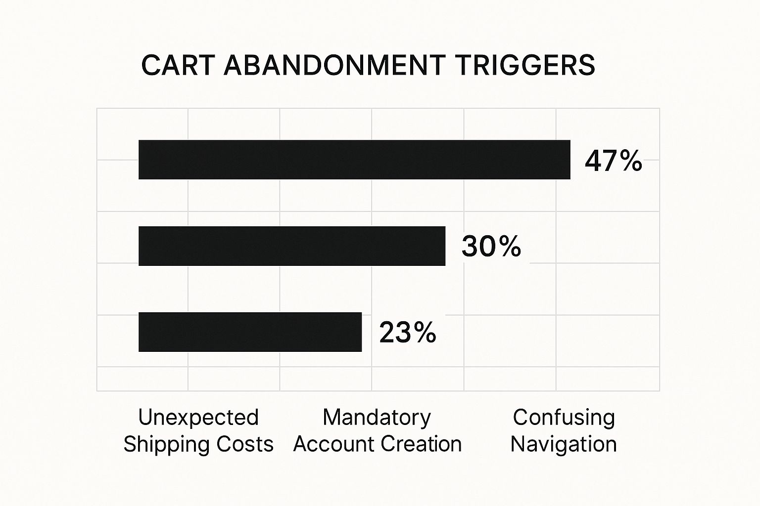
The numbers don't lie. Unexpected shipping costs are the number one conversion killer, responsible for nearly half of all abandoned carts.
Top Abandonment Triggers and Actionable Solutions
I've put together a quick-reference table that pairs these common checkout headaches with practical, easy-to-implement solutions. These are the fixes that will give you the most bang for your buck right away.
| Abandonment Trigger | Impact on Customer | Actionable Solution |
|---|---|---|
| Unexpected Costs | Causes "sticker shock," erodes trust, and makes the customer feel misled. | Display all taxes and shipping fees upfront on the product and cart pages. Add a shipping calculator early in the process. |
| Mandatory Account Creation | Creates friction and feels like an unnecessary time commitment, especially for first-time buyers. | Offer a prominent guest checkout option. You can always invite them to create an account on the confirmation page. |
| Complex Checkout Process | Overwhelms the user with too many fields, steps, or distractions, leading to frustration and fatigue. | Simplify the checkout form to only essential fields. Use a progress bar to show how many steps are left. |
| Security Concerns | Customers worry their payment information isn't safe, especially on unfamiliar sites. | Display trust badges (SSL certificates, payment provider logos) and offer recognizable payment options like PayPal or Apple Pay. |
Fixing these core issues addresses the root causes of abandonment, turning frustrating dead-ends into smooth, trust-building experiences that encourage customers to complete their purchase.
Where to Focus for Immediate Improvement
You don't need to rebuild your entire checkout from scratch. Small, strategic tweaks in the right places can make a world of difference. Here’s where to start:
- Be Radically Transparent About Costs: Show everything—shipping, taxes, the works—as early as you possibly can. A simple shipping calculator on the cart page can completely eliminate that last-minute sticker shock.
- Make Checkout Effortless: A guest checkout option is non-negotiable. Forcing someone to create an account is a surefire way to lose them. Data shows this one roadblock stops nearly 30% of potential buyers in their tracks.
- Simplify the Path to Purchase: Your checkout flow should be dead simple. Guide the user from cart to confirmation with obvious calls-to-action and zero distractions. If it's not essential to the transaction, get it off the page.
Designing a Checkout Experience That Actually Converts
Once a customer hits that "buy" button, your job is to get out of their way. The checkout process should feel like a smooth, guided path to the finish line—not a surprise obstacle course. This is exactly where I see so many e-commerce stores drop the ball, introducing just enough friction to make a committed buyer second-guess their purchase.
A great checkout isn't just about a clean design. It's about psychology. The real goal is to reduce cognitive load, which is just a fancy way of saying "the mental effort someone has to put in." If your checkout page is cluttered, confusing, or asks for their entire life story, it creates stress. That small bit of friction is often all it takes for someone to think, "I'll do this later," and never come back.
Simplify, Simplify, Simplify
One of the most powerful things you can do to prevent cart abandonment is to get ruthless with your forms. I mean it. Every single field you ask a customer to fill out is a potential exit point.
Take a hard look at your current checkout form and ask these questions for every field:
- Is this absolutely essential to ship the order? Do you really need a mandatory phone number?
- Can I ask for this later? Things like signing up for a newsletter or providing a birthday can wait until after the sale is complete.
- Can technology do the heavy lifting? Use an address auto-filler. It's a small touch that saves a ton of typing and frustration.
Beyond just the forms, you need to manage expectations with visual cues. A simple progress bar at the top of the page showing steps like "Shipping," "Payment," and "Confirm" works wonders. It instantly tells people where they are and how close they are to being done, which cuts down on the impatience that kills conversions. For a deeper dive, these Shopify checkout optimization strategies offer some brilliant, actionable advice.
A great checkout experience doesn't feel like a transaction; it feels like a service. It anticipates the user's needs, answers their questions before they have to ask, and makes them feel secure and confident in their purchase.
Don't Make Paying a Hassle
The final hurdle—payment—is where trust is everything. Your customer is about to hand over their financial information, and any hint of insecurity will stop the sale cold. One of the biggest mistakes is not offering enough familiar and convenient ways to pay.
Credit cards are the baseline, but today's shoppers expect more. Integrating digital wallets isn't a "nice-to-have" anymore; it's a must.
Your Payment Menu Should Include:
- Digital Wallets: Think PayPal, Apple Pay, and Google Pay. These let people pay with a single click, completely skipping the chore of typing in card numbers and addresses.
- Buy Now, Pay Later (BNPL): Services like Klarna or Afterpay are huge, especially for more expensive products. They let customers break the cost down, removing the sticker shock.
- Major Credit/Debit Cards: Of course, accept all the major cards. But don't just accept them—show their logos. Those familiar logos are instant trust signals.
By offering a solid mix of payment gateways, you're not just providing options; you're signaling that your store is modern, secure, and legitimate. It removes that final barrier and lets people pay in the way they feel most comfortable. If you want to get the fundamentals of user-friendly design right, these user experience design best practices are a fantastic starting point.
Mastering Automated Cart Recovery Emails
Let's be realistic: even with a flawless checkout process, people are still going to wander off and leave items in their carts. It just happens. This is where your recovery strategy becomes your most valuable player, and nothing works harder for you than a smart automated email sequence.
When done right, these emails can pull a significant chunk of that "lost" revenue back from the brink, turning a distracted shopper into a happy customer.
The secret is to stop sending generic, robotic "You left something in your cart!" messages. The best recovery emails feel like a helpful tap on the shoulder from a personal shopper, not a demand for payment. They anticipate why someone might have hesitated, get them excited about their items all over again, and make it ridiculously simple to jump back in and finish the purchase.
Crafting a Subject Line That Actually Gets Opened
Everything hinges on the subject line. If nobody opens your email, the brilliant copy and beautiful images inside don't matter one bit. Your goal is to be compelling and helpful, not pushy or desperate.
Ask yourself what would make you open that email. It's usually a blend of personalization, curiosity, and a gentle reminder.
- Create a little urgency: "Your cart items are waiting (but not for long!)"
- Offer a helping hand: "Having any trouble with your order?"
- Show some personality: "Did you forget something awesome?"
- Keep it simple and direct: "Hey [Customer Name], you left these behind."
You absolutely must A/B test your subject lines. I’ve seen clients shocked when a simple, straightforward line crushed their "clever" one, and vice versa. Your audience will tell you what works.
Building a Smart Multi-Email Recovery Sequence
One email is a good start, but a strategic sequence is where the real magic happens. By sending a series of emails, you can slowly dial up the persuasion and offer incentives without training people to abandon carts just to get a coupon.
An abandoned cart isn't a lost sale—it's the start of a new conversation. Your email sequence is your opportunity to keep that conversation going, overcome hesitation, and gently guide a customer back to something they were genuinely excited about.
Here’s a tried-and-true three-part email flow I’ve seen work wonders. It’s all about balancing helpful reminders with a persuasive nudge.
Email 1: The Gentle Nudge
- When to send: About 1 hour after abandonment.
- The Goal: This is just a friendly, low-pressure reminder. Life happens. Maybe their kid started crying, their boss walked in, or the Wi-Fi dropped.
- What to include: Keep it super simple. Show them crisp images of what’s in their cart and include one big, obvious button that takes them directly back to it. Resist the urge to offer a discount here—you don't want to give away margin unnecessarily.
Email 2: The Hesitation Helper
- When to send: 24 hours after abandonment.
- The Goal: Now, it's time to address the "what-ifs." Why did they hesitate?
- What to include: This is your chance to build confidence. Remind them of your amazing return policy, sprinkle in some five-star reviews for the items they chose, or answer common questions about shipping. If you want to see how the pros build this out, check out these great drip marketing examples to see how a story can unfold over multiple emails.
Email 3: The Final Offer
- When to send: 48-72 hours after abandonment.
- The Goal: Create one last compelling reason to come back and seal the deal.
- What to include: If they still haven't come back, it's time to pull out an incentive. This could be a modest 10% off discount, but honestly, free shipping often converts even better. Frame it as a special offer that won't last forever to add a touch of urgency.
By setting up an automated sequence like this, you’re building a system that works for you 24/7, methodically recovering sales that would have otherwise vanished into thin air.
Optimizing Your Mobile Checkout Journey
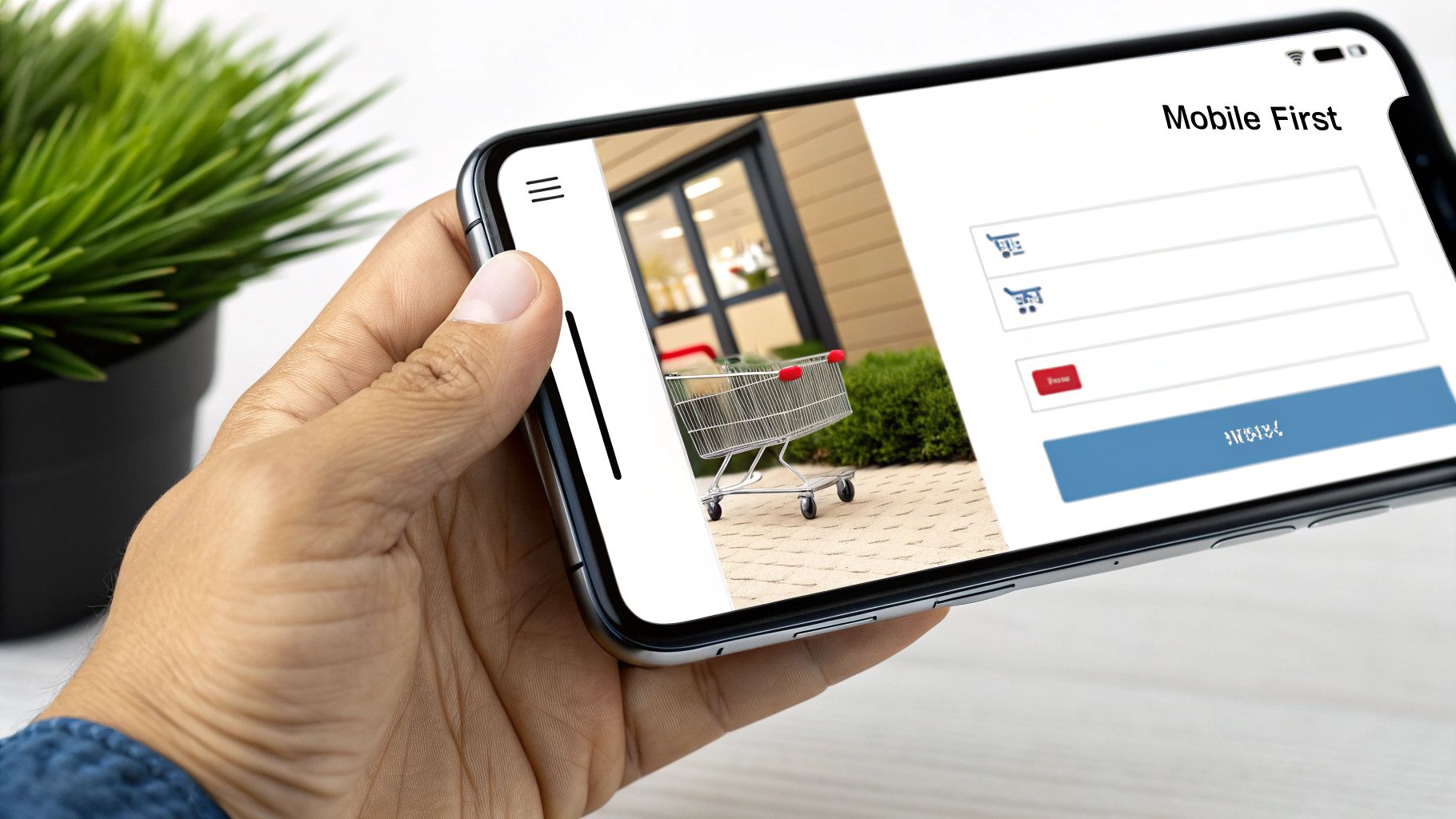
For too many brands, the mobile checkout is where a promising sale goes to die. If your checkout is just a shrunken-down version of your desktop site, you’re practically asking customers to leave. A genuine mobile-first strategy isn’t just about making things look good on a small screen; it’s about making the entire process feel completely natural for someone tapping away with their thumb.
It’s no secret that the device a customer uses dramatically changes their likelihood of finishing a purchase. Mobile users abandon carts at a staggering rate, with recent data showing it hovers between 80–85%. That's significantly higher than the 70–73% we see on desktops. This gap is a massive red flag, signaling that most mobile experiences are just not good enough and are costing stores a fortune. You can dig into more data on how device choice impacts cart abandonment to see the full picture.
Making Every Tap Count
On a phone, convenience is everything. Your customers have zero patience for pinching to zoom or fumbling with tiny form fields. Every extra tap, every moment of confusion, is another reason for them to just give up and move on.
So, your number one job is to design for thumbs, not mouse clicks. This isn't just theory; it means putting practical tactics in place to reduce both physical and mental effort.
- Large, Thumb-Friendly CTAs: That "Complete Purchase" button needs to be impossible to miss and easy to tap without hitting anything else by mistake.
- Minimalist Forms: Get rid of every single field that isn't absolutely essential. Use auto-fill and auto-detect for addresses and card details wherever you can.
- Click-to-Call Numbers: If a shopper runs into a problem, let them tap your support number to immediately start a call. Don't make them copy and paste.
Simply having a responsive design isn't the solution. A truly great mobile checkout anticipates the user's situation—they're probably distracted, in a hurry, and using a clumsy tool (their thumb). Your design has to actively solve these problems for them.
Speed and Simplicity Are Your Best Friends
Mobile users are impatient. A page that takes more than a few seconds to load might as well be broken. Slow load times aren't just a minor annoyance; they're a direct cause of abandoned carts, especially in those final moments of a purchase.
Compressing your images and cleaning up your code are non-negotiable first steps. But beyond just raw speed, the flow itself has to be dead simple. Stick to a single-column layout to eliminate any need for side-scrolling.
And don't forget about payment. This is where you can win big. Integrating digital wallets like Apple Pay and Google Pay is a total game-changer for mobile. These tools let a customer check out with a single, secure tap, completely skipping the painful process of typing in card numbers and shipping addresses. This one move can radically improve your mobile conversion rates, turning what was once your biggest problem area into a real strength.
Using Pop-Ups and Retargeting Ads Strategically
https://www.youtube.com/embed/1Jzr29sftjs
Once you've tightened up your checkout flow and have your recovery emails humming along, it's time to bring in two more heavy hitters: exit-intent pop-ups and retargeting ads. Think of these as your last line of defense, designed to catch shoppers right at that critical moment of hesitation before they bounce for good.
The trick is to be helpful, not annoying. An exit-intent pop-up, for instance, only appears when a visitor’s mouse movements suggest they're about to leave the page—like drifting up to close the tab. This is your final shot to change their mind. Forget generic "Please don't go!" messages. Instead, hit them with a genuinely compelling offer they can’t refuse.
Something as simple as a pop-up with a code for 10% off or free shipping can be exactly what a price-conscious shopper needs to pull the trigger. It shows you understand their hesitation and you're willing to meet them halfway.
Re-Engaging Shoppers After They Leave
Just because someone has left your website doesn't mean the conversation is over. This is where retargeting ads shine. They act as gentle reminders on platforms like Facebook, Instagram, or across the Google Display Network, bringing those products they considered back into view. The goal isn't to be creepy; it's to remind them of something they were already interested in.
But a successful retargeting campaign is more art than science. You can't just spam everyone with the same generic ad.
- Segment Your Audience: Don't treat every abandoned cart the same. A shopper who left a $500 home theater system in their cart is motivated by different things than someone who abandoned a $25 t-shirt. Your ad creative and offers should reflect that.
- Craft Compelling Ad Copy: Go beyond just showing a picture of the product. Try a friendly question like, "Still thinking it over?" or remind them about a key benefit they might have forgotten, like your famous no-questions-asked return policy.
- Set Frequency Caps: Seeing the same ad a dozen times in one day is a surefire way to annoy a potential customer. Be smart about it. Capping impressions at 3-5 times per day for any single person is a solid place to start.
Retargeting is less about shouting and more about whispering a timely reminder. It’s a chance to re-ignite that initial spark of interest by showing the right product, to the right person, at the right time.
This targeted approach keeps your brand top-of-mind without feeling aggressive. For brands ready to really dive in, mastering paid advertising is a game-changer. You can find a comprehensive guide to ecommerce PPC marketing that breaks down how to build campaigns that actually deliver.
By weaving together well-timed pop-ups with a smart retargeting strategy, you build a powerful system for recovering sales both on and off your site.
Got Questions About Cart Abandonment? Let's Get Them Answered.
Even when you've got a solid plan, a few questions always pop up when you're trying to win back those almost-customers. I hear the same ones all the time, so let's walk through them so you can tighten up your strategy and bring those sales home.
When’s the Best Time to Send That First Email?
This is probably the number one question I get. "How soon is too soon?" You want to hit that sweet spot right after they leave, when the thought of buying is still fresh.
I've found that sending the first nudge within 30-60 minutes works wonders. Any sooner and it can feel a bit pushy, but wait too long and they've already moved on. An email that lands in their inbox within the hour feels less like a hard sell and more like a helpful reminder, catching those who simply got distracted or hit a technical snag.
Are Discounts in Recovery Emails a Bad Idea?
It's a totally fair question. Nobody wants to slash their profit margins. But think of it this way: you're not just giving away a discount, you're recovering a sale that was already gone. The revenue you get from that purchase, even with 10% off, is infinitely better than the zero dollars you had a minute ago.
The key is to be strategic about it. You don't have to lead with your best offer. Try a tiered approach:
- First Email (sent after 1 hour): Keep it simple. A friendly "Did you forget something?" reminder with a link back to their cart is often all it takes. No discount needed.
- Second Email (sent after 24 hours): This is a great time to build confidence. You could highlight customer reviews or mention your easy return policy.
- Third Email (sent after 48-72 hours): If they still haven't bitten, now's the time to bring out a small incentive. A little something like free shipping or a modest discount can be the final push they need to click "buy."
This way, you're only sacrificing a bit of margin on the toughest-to-convert shoppers.
If you do nothing else, get rid of surprise costs at checkout. Time and time again, the data is clear: unexpectedly high shipping fees, taxes, and other last-minute charges are the absolute biggest reason people bail on a purchase. Be upfront about everything.
If I Can Only Fix One Thing, What Should It Be?
Easy. Eliminate surprise costs. If your resources are limited and you need the biggest bang for your buck, this is it. Seeing shipping fees and taxes appear out of nowhere at the very last step is the ultimate conversion killer.
The fix is radical transparency. Put a shipping calculator on your product pages. Display a prominent banner that clearly states your free shipping threshold. When you set expectations early, you build trust and people are far more likely to complete their purchase.
This single adjustment can have a massive impact on your abandonment rate. For a deeper look at turning lost sales around, check out this complete strategy guide to recovering abandoned carts. By tackling these common issues with proven tactics, you can transform abandoned carts from a source of frustration into a steady stream of recovered revenue.
Ready to turn your website into a conversion machine? Sugar Pixels builds powerful, custom e-commerce sites with optimized checkout experiences designed to minimize cart abandonment from day one. https://www.sugarpixels.com