In digital marketing, your landing page is the critical moment of conversion. It's the dedicated space where traffic becomes leads and interest turns into action. Creating a page that not only looks good but consistently converts is both an art and a science, demanding a strategic approach that goes far beyond simple aesthetics.
Many businesses invest heavily in driving traffic, only to see potential customers bounce due to confusing layouts, slow load times, or an unclear message. The difference between a page that leaks visitors and one that captures them lies in a set of proven strategies. A well-designed landing page is a powerful tool, directly impacting lead generation, sales, and overall campaign return on investment by creating a seamless and persuasive user experience.
This comprehensive guide moves beyond generic advice to provide a detailed roundup of the top eight landing page design best practices essential for success. We'll explore specific, actionable techniques that deliver measurable results, from crafting an irresistible value proposition to leveraging the psychology of social proof. Each point is designed to give you a clear blueprint for turning clicks into valuable customer relationships. Whether you're an e-commerce entrepreneur, a marketer at a growing business, or part of a large enterprise, these principles will help you build pages that work. You'll gain practical insights into creating high-performing assets that form the foundation of any successful digital campaign.
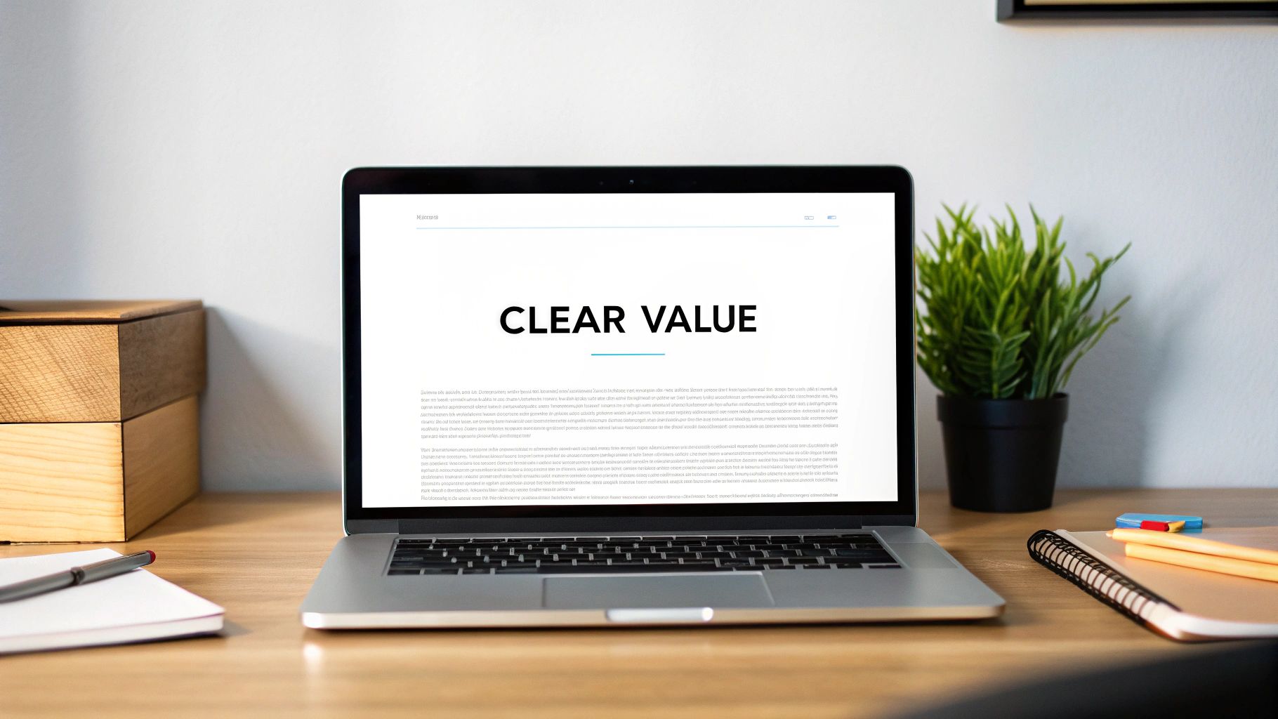
1. Clear and Compelling Value Proposition
Your value proposition is the single most important element of your landing page. It's a concise, powerful statement that instantly tells visitors what you do, who you do it for, and why you’re the best choice. This isn't just a catchy tagline; it's a strategic promise that forms the foundation of one of the most crucial landing page design best practices. A strong value proposition immediately answers the visitor’s unspoken question: "What's in it for me?"
It should be the first thing a user sees, prominently displayed "above the fold" (the part of the page visible without scrolling). When a visitor arrives from an ad or a search result, you have only seconds to convince them they've landed in the right place. A clear value proposition hooks them, prevents an immediate bounce, and sets the stage for the rest of your page's content.
How to Craft a Winning Value Proposition
A compelling value proposition typically consists of a headline, a sub-headline, and sometimes a few bullet points to add detail. The goal is to articulate the primary benefit of your offering in a way that resonates with your target audience.
- Focus on Benefits, Not Features: Instead of listing what your product has (e.g., "10GB of cloud storage"), describe what your customer gets (e.g., "Never worry about losing a file again").
- Use the Customer's Language: Avoid internal jargon or technical terms. Speak in a way that your ideal customer would, addressing their specific pain points and goals.
- Be Specific and Concrete: Vague claims like "the best solution" are easily ignored. Instead, use specific outcomes. For example, "Create a professional website in under an hour" is far more powerful than "Easy website builder."
A great example comes from the project management tool Slack. Their classic value proposition, "Be more productive at work with less effort," perfectly encapsulates the core benefit. It’s short, benefit-driven, and easy for any professional to understand. This clarity is a hallmark of excellent landing page design.
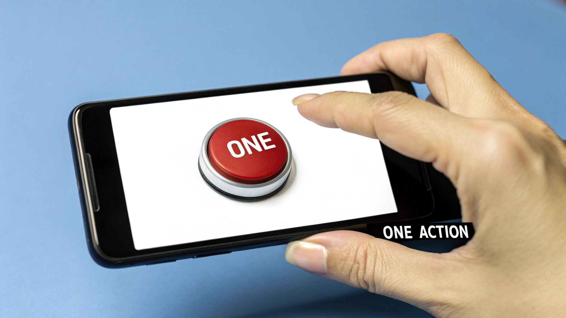
2. Single, Focused Call-to-Action (CTA)
Your landing page has one job: to persuade a visitor to take a specific action. The call-to-action (CTA) is the button or link that triggers this action, and its clarity is paramount. The most effective landing pages eliminate confusion by presenting a single, focused goal, which is why a singular CTA is one of the most fundamental landing page design best practices. Overwhelming visitors with multiple choices leads to decision paralysis and diluted focus, causing them to abandon the page without converting.
The primary CTA should be the undeniable visual focal point of your page. Its purpose is to guide the user's journey to its logical conclusion, turning their interest into a tangible outcome like a sign-up, a download, or a purchase. By dedicating the entire page to supporting one CTA, you create a seamless and persuasive argument that culminates in a clear, easy-to-take next step.
How to Design a High-Converting CTA
An effective CTA combines strategic design, compelling copy, and thoughtful placement to maximize its impact. The goal is to make the desired action feel like an obvious and effortless choice for the visitor.
- Use Contrasting Colors: Your CTA button should pop. Choose a color that stands out from the page's background and branding but still feels harmonious. This visual contrast draws the user's eye directly to the button.
- Write Action-Oriented Text: Ditch generic words like "Submit" or "Click Here." Use strong, benefit-driven verbs that tell users exactly what they will get. Phrases like "Get Your Free Trial," "Download the Guide," or "Start Building Now" are far more enticing.
- Prioritize Placement and Size: Place your CTA where visitors are most likely to act, such as after your value proposition and again at the bottom of the page for longer content. Ensure the button is large enough to be easily tapped on mobile devices without being obtrusive.
A masterclass in CTA design comes from Netflix. Their simple, red "Get Started" button is unmistakable against their dark background. The copy is direct and inviting, removing any friction or ambiguity about what happens next. This focused approach is a core reason for their high conversion rates and a key lesson in effective landing page design.
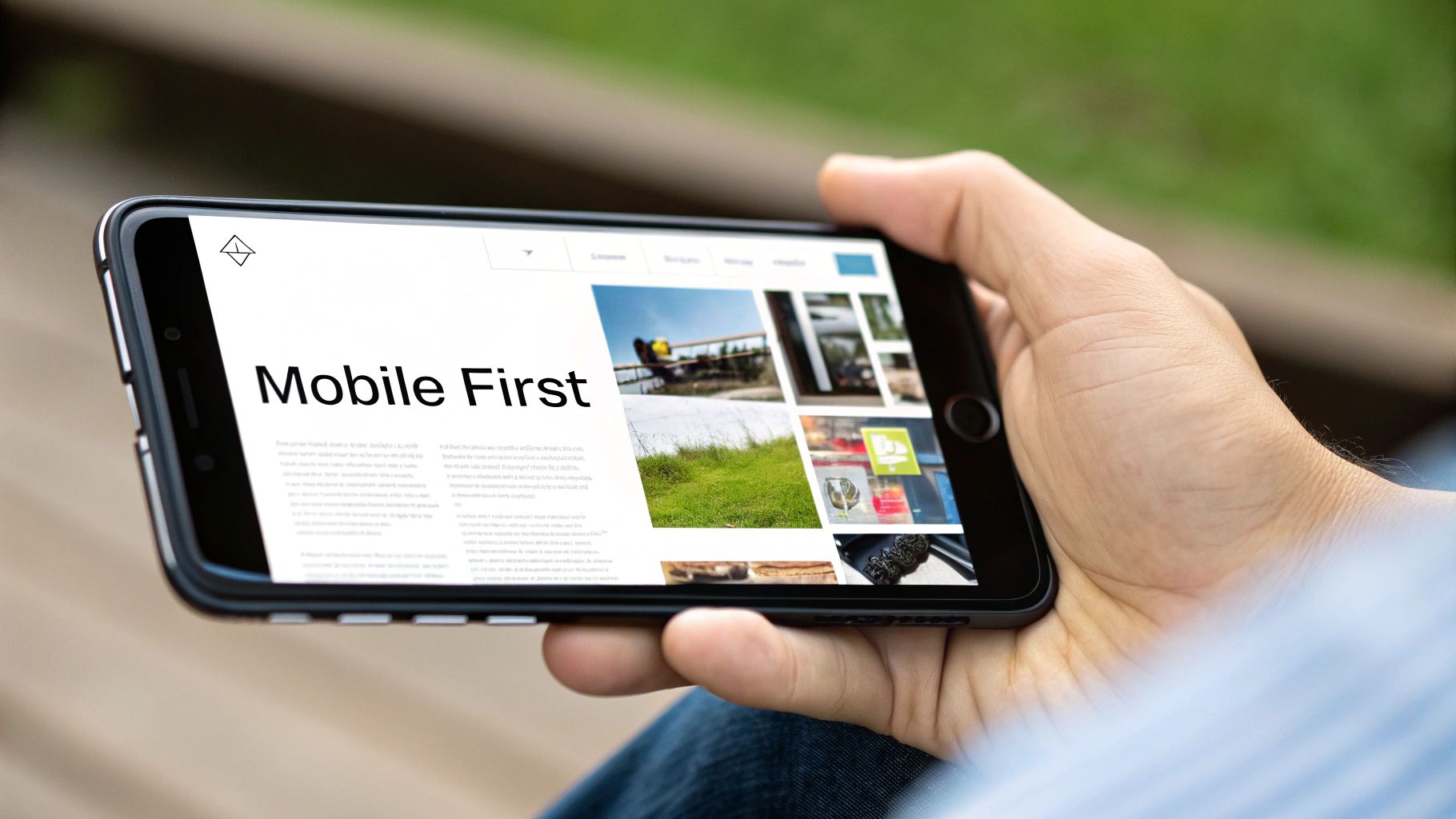
3. Mobile-First Responsive Design
In today's digital landscape, assuming your audience is on a desktop is a critical mistake. Mobile-first responsive design is a strategic approach where you design an experience for the smallest screen first and then work your way up to larger screens like tablets and desktops. With a significant portion of web traffic originating from mobile devices, implementing this strategy has become one of the most essential landing page design best practices to ensure a seamless user experience for everyone.
This approach forces you to prioritize what is most important. Limited screen real estate means you must focus on core content and the primary call-to-action, eliminating clutter and streamlining the user journey. By starting with mobile constraints, you ensure that the foundational experience is fast, focused, and user-friendly, which then gracefully scales up rather than trying to awkwardly cram a complex desktop design onto a small screen.
How to Implement Mobile-First Design
Adopting a mobile-first mindset requires a shift in the traditional design process. Instead of subtracting elements for smaller screens, you progressively enhance the design as more screen space becomes available. This ensures that every user gets the best possible experience for their device.
- Prioritize Content Hierarchy: On a small screen, you must decide what is absolutely critical. Start by mapping out the most important information and actions, ensuring they are immediately visible without extensive scrolling.
- Design for Touch: Mobile users interact with their thumbs. Design your layout with key interactive elements, like buttons and links, placed in easily reachable zones. Use a minimum touch target size of 44×44 pixels to prevent frustrating mis-taps.
- Optimize Performance: Mobile users often have less stable internet connections. Optimize images, use efficient code, and minimize resource-heavy scripts to ensure your landing page loads lightning-fast.
A great example is Airbnb's mobile booking experience. It strips away non-essential information, presenting a clear, step-by-step process with large, touch-friendly buttons and forms. The focus is entirely on helping the user find and book a stay quickly, demonstrating the power of a well-executed mobile-first strategy. For those looking to dive deeper into this topic, you can learn more about building a mobile-responsive website on sugarpixels.com.
4. Fast Loading Speed Optimization
In the world of digital marketing, speed is not a feature; it's a fundamental requirement. Page loading speed is a critical factor for landing page success, as studies consistently show that even a one-second delay can drastically decrease conversions and increase bounce rates. This is an essential aspect of landing page design best practices because a user's patience is incredibly thin. If your page takes too long to appear, all your efforts in design and copy become irrelevant.
Fast-loading pages directly correlate with a better user experience, higher engagement, and improved SEO rankings, as search engines like Google prioritize speed in their algorithms. A slow page communicates inefficiency and can erode trust before a visitor even reads your headline. The goal is to present your value proposition to the user as close to instantaneously as possible.
How to Achieve Lightning-Fast Load Times
Optimizing for speed involves a multi-faceted approach focused on reducing the amount of data the user's browser needs to download and process. It's about being lean and efficient with every element on your page, from images to code.
- Optimize Your Images: Large, uncompressed images are the most common cause of slow landing pages. Use modern formats like WebP, which offer superior compression, and ensure all images are sized correctly for their containers.
- Enable Browser Caching: Configure your server to tell browsers to store static assets like CSS files, logos, and JavaScript locally. This means repeat visitors will experience much faster load times as their browser won't need to re-download these files.
- Use a Content Delivery Network (CDN): A CDN stores copies of your landing page on servers around the globe. This reduces latency by serving content to users from a server that is geographically closer to them, significantly speeding up delivery.
- Implement Lazy Loading: This technique defers the loading of images and videos that are "below the fold" (not immediately visible). Content only loads as the user scrolls down, which dramatically improves the initial page load time.
The impact of speed is well-documented. For example, Walmart found that for every one-second improvement in page load time, conversions increased by 2%. Similarly, Pinterest reduced perceived wait times by 40%, which led to a 15% increase in sign-ups. These examples highlight that optimizing for speed is not just a technical task; it's a direct driver of business growth.
5. Social Proof and Trust Signals
Social proof is the psychological phenomenon where people assume the actions of others reflect correct behavior for a given situation. On a landing page, this translates into building credibility by showing visitors that other people already trust and value your offering. This is one of the most powerful landing page design best practices because it directly addresses a user's natural skepticism and reduces the perceived risk of conversion.
When a visitor is unsure, seeing evidence that others have had a positive experience can be the final push they need to click the call-to-action button. Trust signals like security badges, guarantees, and client logos work in tandem with social proof to create a powerful sense of security and confidence, making the decision to convert feel safe and smart.
How to Build Credibility with Social Proof
Effectively implementing social proof involves strategically placing various elements throughout your page to reinforce trust at every stage of the user journey. The key is to make these signals feel authentic and relevant to the visitor's needs.
- Use Specific, Detailed Testimonials: Vague praise like "Great product!" is forgettable. Instead, feature testimonials that tell a story or highlight a specific benefit, like, "This tool cut our project reporting time in half." Including a photo and the person's name and company adds a huge layer of authenticity.
- Showcase Recognizable Logos: If you have well-known clients, display their logos prominently. This "borrowed credibility" instantly elevates your brand's status. Zoom does this masterfully by featuring logos of major enterprise clients on its homepage.
- Display Trust Badges and Guarantees: For pages collecting sensitive data or payments, security badges (e.g., SSL certificates) are non-negotiable. Furthermore, building trust also involves being transparent with how you handle user information; adhering to modern data privacy best practices is crucial for establishing long-term credibility.
A great example is ConvertKit, which displays its total number of creators served alongside glowing testimonials from well-known figures in its target market. This combination of quantitative data (large numbers) and qualitative proof (respected testimonials) creates an almost irresistible case for signing up, solidifying its place as a key landing page design strategy.
6. Minimal Form Design with Progressive Profiling
Your form is the gateway between a visitor and a conversion, but a long and intimidating form is one of the quickest ways to kill your conversion rate. Minimal form design drastically reduces friction by asking for only the absolute essential information upfront. This approach is a core component of effective landing page design best practices because it respects the user's time and removes psychological barriers to conversion.
The strategy is simple: make the initial step as easy as possible. Once you've captured the lead with basic details like an email address, you can use progressive profiling to gather more information over subsequent interactions. This method balances the need for high conversion rates with the goal of collecting valuable, high-quality lead data, preventing form abandonment while still building a detailed customer profile over time.
How to Implement Minimalist Forms and Progressive Profiling
The goal is to lower the initial barrier to entry significantly. By asking for less, you increase the likelihood of a user completing the form. Progressive profiling then smartly builds on this initial conversion.
- Start with 3 Fields or Fewer: For initial lead capture, stick to the essentials. Name and email are often enough. Every additional field you add increases the chance a user will leave.
- Use Single-Column Layouts: A single, vertical column is easier for users to scan and complete, especially on mobile devices. This linear path guides the user's eye directly from one field to the next without interruption.
- Leverage Smart Forms and Conditional Logic: Use marketing automation tools like HubSpot to create "smart" forms. These forms recognize returning visitors and present new fields to fill out, progressively building their profile without asking for the same information twice.
- Provide Real-Time Validation: Give immediate feedback as a user fills out the form. A green checkmark for a valid email or a red outline for an error helps users correct mistakes instantly, reducing frustration.
A great example is Slack. Their initial signup form often asks for just an email address. All the complex details, like creating a workspace, inviting team members, and setting up channels, are handled after the initial conversion. This two-step process makes the first commitment feel effortless and highly effective.
7. Visual Hierarchy and Scannable Layout
People don’t read websites; they scan them. Acknowledging this fundamental user behavior is critical to effective design. A strong visual hierarchy guides a visitor's eye through your content in a deliberate, logical sequence using design principles like size, color, contrast, and whitespace. This is one of the most essential landing page design best practices because it ensures your most important message is seen first, leading users toward your call to action without friction.
A scannable layout makes it effortless for visitors to digest key information quickly. By breaking content into digestible chunks with clear headings, short paragraphs, and bullet points, you cater to the modern user's short attention span. Instead of overwhelming them with a wall of text, you provide a clear path, making the experience feel intuitive and reducing the cognitive load required to understand your offer.
How to Implement a Clear Hierarchy and Scannable Design
The goal is to create an information architecture that feels natural and directs attention intentionally. This involves making conscious design choices about every element on the page, from the headline down to the footer links.
- Embrace Whitespace: Generous spacing around key elements like your headline, CTA button, and images makes them stand out. Don't be afraid of empty space; it’s a powerful tool for creating focus and improving readability.
- Use Size and Scale to Show Importance: Your main headline should be the largest text element on the page. Sub-headings should be smaller, and body text smaller still. This creates a clear typographic hierarchy that users understand instantly.
- Leverage Color and Contrast: Use a bold, contrasting color for your CTA button to make it pop. Similarly, ensure your text has sufficient contrast against its background to be easily legible. Beyond just layout, the choice of typography significantly impacts readability and visual appeal, which are crucial for guiding the user's eye; for additional design inspiration and font resources, you might explore 7 Unmissable Sources for Copy and Paste Fonts for Designers.
A master of this principle is Apple. Their product pages use a minimalist design with abundant whitespace, large, impactful imagery, and a crystal-clear typographic hierarchy. The user’s eye is drawn exactly where Apple wants it to go, creating a seamless and persuasive journey. For complex design projects like these, understanding how to choose a web design agency that prioritizes user experience is key to success.
8. A/B Testing and Data-Driven Optimization
Even the most well-designed landing page is built on assumptions. A/B testing, or split testing, is the scientific method for turning those assumptions into certainties. It involves creating two or more versions of a page (a "control" and a "variation") and showing them to different segments of your audience to see which one performs better. This data-driven approach is one of the most powerful landing page design best practices because it eliminates guesswork and allows you to make decisions based on real user behavior.
The core principle is simple: change one element at a time, measure the impact on your key metric (like sign-ups or sales), and implement the winner. This continuous cycle of testing and refinement ensures your landing page evolves to its maximum potential, consistently improving conversion rates over time. Without it, you are simply hoping your design works rather than proving it does.
How to Implement Effective A/B Testing
A successful A/B testing strategy is systematic, not random. It starts with a hypothesis and ends with a statistically significant result that informs your next move. The goal is to learn what resonates most with your audience, from headlines to button colors.
- Test One Element at a Time: To know what caused a change in performance, isolate your variables. If you change the headline, the button text, and the main image all at once, you won't know which element was responsible for the lift (or drop) in conversions.
- Focus on High-Impact Elements First: Start by testing the elements that have the biggest potential impact on user decisions. This typically includes your main headline, your call-to-action (CTA) button copy and color, and your hero image or video.
- Ensure Statistical Significance: Don’t end a test prematurely. You need enough data to be confident that your results aren't due to random chance. Most A/B testing tools will tell you when you've reached statistical significance, usually at a 95% confidence level.
A famous example is how the 2012 Obama campaign A/B tested their donation page, ultimately raising an additional $60 million. Similarly, Humana saw a 433% conversion improvement just by testing different headlines. These cases prove that small changes, validated by data, can lead to monumental results. To further enhance your data-driven optimization efforts, explore strategies for Mastering Personalization on the Web to deliver truly customized experiences. Explore more about developing a strong digital strategy in our digital strategy section on sugarpixels.com.
Landing Page Design Best Practices Comparison
| Item | Implementation Complexity 🔄 | Resource Requirements ⚡ | Expected Outcomes 📊 | Ideal Use Cases 💡 | Key Advantages ⭐ |
|---|---|---|---|---|---|
| Clear and Compelling Value Proposition | Medium – requires audience insight and refinement | Moderate – copywriting and testing needed | High – improved conversion & reduced bounce rate | Early engagement, landing page hero sections | Clear purpose, builds visitor confidence |
| Single, Focused Call-to-Action (CTA) | Low to Medium – design & copy focus | Low – design and placement optimize | High – increased conversions, clear next step | Conversion funnels needing focused user action | Eliminates decision paralysis, easy to optimize |
| Mobile-First Responsive Design | Medium to High – development and testing on devices | High – design and development effort | High – better UX, SEO, and mobile user capture | Sites with high mobile traffic or multi-device users | Future-proof, improved SEO & usability |
| Fast Loading Speed Optimization | Medium to High – technical optimizations required | Moderate to High – tools and developer time | High – better SEO, UX, conversions, low bounce | Any site prioritizing performance and SEO | Critical for retention, fast performance |
| Social Proof and Trust Signals | Low to Medium – content creation and integration | Low to Moderate – requires authentic content | High – increased trust and conversion rates | New or established brands building credibility | Builds trust, reduces purchase anxiety |
| Minimal Form Design with Progressive Profiling | Medium – design plus integration with CRM/process | Moderate – technical setup and follow-up | High – better form completion and lead quality | Lead capture needing gradual qualification | Reduces friction, improves qualification |
| Visual Hierarchy and Scannable Layout | Medium – requires careful UX/design planning | Moderate – UX/design resources | Medium to High – higher engagement and comprehension | Content-heavy pages requiring efficient scanning | Improves readability and engagement |
| A/B Testing and Data-Driven Optimization | High – requires setup, tools, and traffic | High – analytics tools and expert time | High – measurable improvements and ROI | Continuous optimization and data-driven decision making | Removes guesswork, supports iterative growth |
Start Building Landing Pages That Convert Today
The journey through the essential elements of high-converting landing pages reveals a core truth: effective design is not about flashy graphics or clever gimmicks. It is about creating a clear, focused, and persuasive pathway for your visitors. Mastering the landing page design best practices detailed in this guide is the first step toward transforming your digital marketing efforts from a guessing game into a predictable engine for growth. Each principle we've explored is a powerful tool in your conversion arsenal, designed to remove friction, build trust, and guide users toward a single, valuable action.
Remember, these are not isolated tactics to be checked off a list. They are interconnected components of a comprehensive user experience. A compelling value proposition means nothing if your page loads too slowly for anyone to see it. A perfectly designed CTA will fail if it's buried in a confusing visual hierarchy or undermined by a lack of social proof. The true power emerges when these elements work in harmony.
From Theory to Tangible Results
The most significant takeaway is that a landing page is never truly "finished." It is a dynamic asset that should evolve with your audience's behavior and your business goals. The difference between a good landing page and a great one often lies in the commitment to continuous improvement.
Your immediate next steps should be both strategic and actionable. Don't feel overwhelmed by the need to implement all eight practices at once. Instead, adopt an iterative approach:
- Audit Your Current Pages: Start by evaluating your most critical landing page against the principles we've discussed. Where is the biggest opportunity for improvement? Is your CTA clear? Is your value proposition immediately obvious on a mobile device?
- Prioritize One or Two Changes: Select the most impactful, low-effort changes you can make. Perhaps it’s simplifying your form or adding a few powerful customer testimonials.
- Implement and Measure: Make the changes and then turn to your analytics. Use A/B testing to validate your hypotheses and gather concrete data on what resonates with your audience.
- Repeat the Cycle: Use the insights from your tests to inform the next round of optimizations. This data-driven loop of implementation, testing, and refinement is the engine of conversion rate optimization.
Embracing this methodical process demystifies the art of conversion and turns it into a science. By focusing on creating a seamless, trustworthy, and user-centric experience, you build more than just a landing page; you build a stronger relationship with your audience. You prove that you understand their needs and respect their time. This is the foundation of turning a casual visitor into a loyal customer, and mastering these landing page design best practices is your roadmap to achieving it.
Ready to move beyond theory and build landing pages that drive measurable growth for your business? The team at Sugar Pixels specializes in combining data-driven strategy with compelling creative to design conversion-focused digital experiences. Visit Sugar Pixels to see how our expertise in landing page design can help you turn more clicks into customers.