
In today's multi-device reality, your audience interacts with your brand on desktops, tablets, and smartphones, often switching between them throughout the day. A static, one-size-fits-all website fails to meet this modern user behavior. This is where responsive design becomes a non-negotiable asset, ensuring your site offers a seamless, high-quality experience regardless of screen size. The core benefits of responsive website design extend far beyond simple aesthetics; they directly influence your search engine visibility, user satisfaction, operational efficiency, and ultimately, your revenue.
This comprehensive guide moves beyond theory to provide a detailed breakdown of the seven most critical advantages. We will explore how a fluid layout improves everything from mobile traffic engagement and SEO rankings to conversion rates and long-term site maintenance. You'll gain actionable insights and see practical examples of how a single, adaptable website can become your most powerful tool for growth. For a deeper understanding of the fundamental principles behind effective responsive design, exploring dedicated articles can provide additional context. By the end of this listicle, you'll understand why responsiveness is the foundational element for any successful, future-proof digital strategy.
1. Superior User Experience (UX) Across All Devices
At its core, one of the most significant benefits of responsive website design is its ability to deliver a consistent, high-quality user experience (UX) to every visitor. Responsive design ensures your website automatically adjusts its layout, images, navigation, and text to fit the screen it's being viewed on, whether it's a widescreen desktop monitor, a tablet, or a smartphone. This adaptability eliminates common user frustrations like pinching to zoom, excessive horizontal scrolling, and tapping on minuscule links.
A seamless experience is no longer a luxury; it's an expectation. When a website "just works" on any device, it communicates professionalism and a user-centric philosophy. This builds immediate trust and encourages visitors to engage more deeply with your content. Brands like Starbucks and Airbnb exemplify this principle. Their websites offer an equally intuitive and functional experience, whether a user is browsing a menu on their phone or booking a stay from their laptop.
The Tangible Impact of a Flawless UX
A positive UX directly influences critical performance metrics. By removing friction and making navigation intuitive, you can significantly lower bounce rates and boost user satisfaction, which are foundational to achieving business goals like conversions and brand loyalty.
The following infographic highlights key data points demonstrating the power of a superior user experience driven by responsive design.
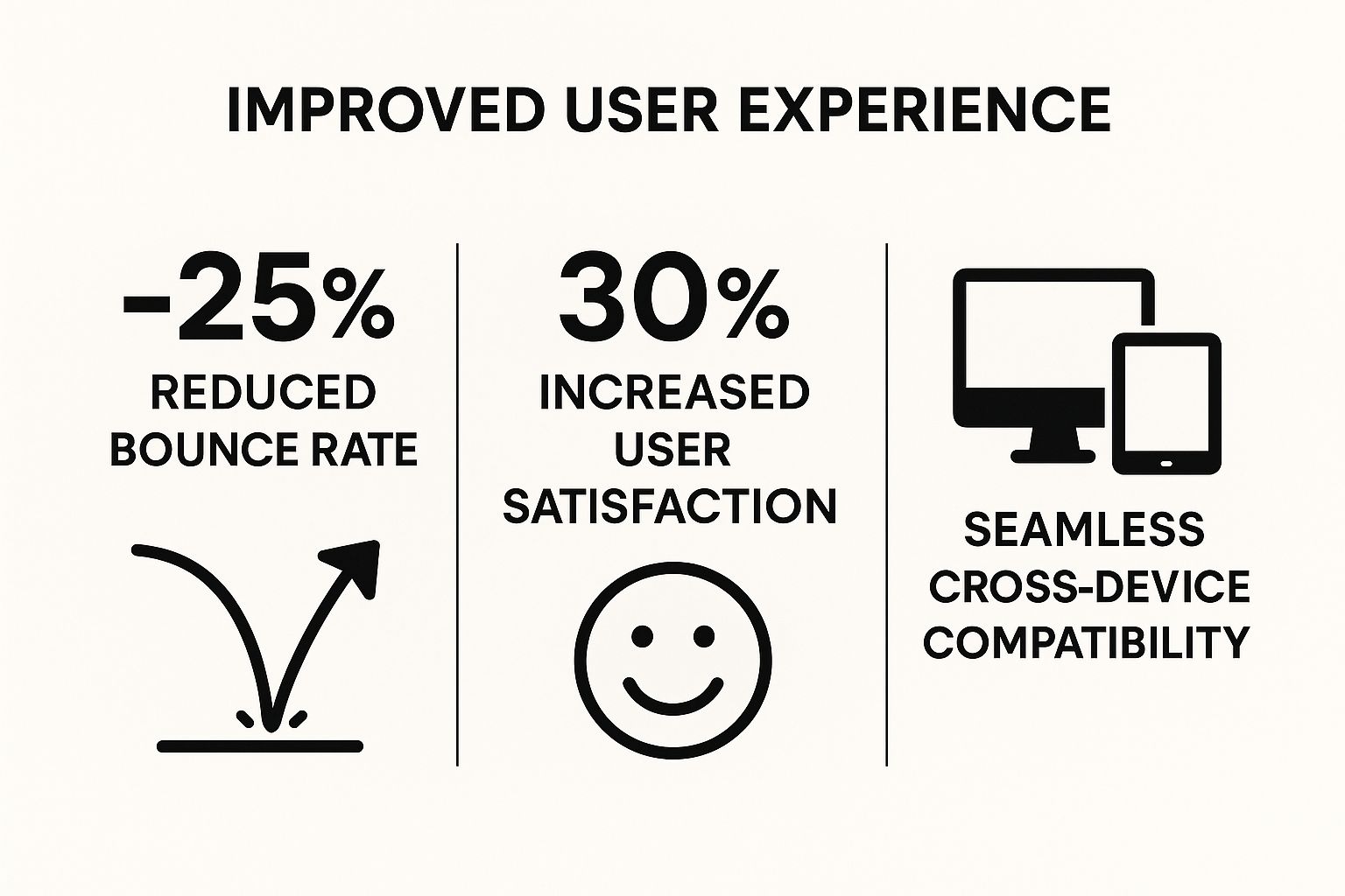
These statistics clearly show that a user-friendly, responsive interface is not just a design choice but a strategic business decision that leads to more engaged and satisfied visitors.
How to Implement a User-Centric Responsive Design
Pioneered by figures like Ethan Marcotte and championed by Google's mobile-first indexing, responsive design is the industry standard. For those looking to implement or refine their approach, here are actionable best practices:
- Adopt a Mobile-First Approach: Design for the smallest screen (mobile) first and then scale the design up for tablets and desktops. This forces you to prioritize essential content and functionality from the start.
- Prioritize Content Hierarchy: On smaller screens, space is limited. Ensure the most critical information, like your value proposition or key calls-to-action, is immediately visible without scrolling.
- Ensure Tappable Targets: Buttons, links, and other interactive elements should have a minimum size of 44×44 pixels to be easily and accurately tapped by a finger, preventing user frustration.
- Test on Real Devices: While browser emulators are useful, they can't replicate every nuance of a real device. Testing on actual iPhones, Androids, and tablets is essential for catching platform-specific quirks. To truly master user experience across all devices, delving into our comprehensive guide on key tips for better Divi mobile responsiveness is crucial for achieving seamless adaptability.
2. Enhanced Mobile Traffic Performance
Given that mobile devices now generate the majority of global web traffic, another of the critical benefits of responsive website design is its ability to capitalize on this massive audience. Responsive design ensures your website performs optimally on smartphones and tablets, directly leading to better engagement, longer session durations, and higher conversion rates. Without it, mobile users encountering a clunky, desktop-only site are likely to leave immediately, costing you valuable traffic and potential revenue.
This performance boost is not just theoretical; it's a proven driver of business growth. For instance, Amazon saw its mobile sales jump significantly after implementing a responsive framework, and The Guardian experienced a substantial increase in mobile page views. These examples underscore a simple truth: meeting users on their preferred devices with an optimized experience is fundamental to succeeding in the modern digital landscape. A non-responsive site is effectively closing its doors to more than half of its potential customers.
The Tangible Impact of Mobile Optimization
A mobile-friendly experience directly translates into improved business outcomes. By making your site easy to browse and use on a smaller screen, you cater to the on-the-go user, capturing their attention and guiding them toward conversion. This reduces mobile-specific bounce rates and turns casual browsers into loyal customers.
A seamless mobile experience is no longer a competitive advantage; it's the baseline expectation for every user visiting your site. Neglecting it means willingly sacrificing a huge segment of your market.
These statistics clearly demonstrate that a mobile-optimized, responsive interface is a non-negotiable component of a successful digital strategy, leading to more engaged and profitable mobile traffic.
How to Implement a Mobile-First Performance Strategy
Optimizing for mobile goes beyond just having a layout that fits the screen. It's about designing for the mobile user's specific context and behaviors. To truly enhance your mobile traffic performance, consider these actionable best practices:
- Implement Accelerated Mobile Pages (AMP): For content-heavy sites like blogs or news portals, AMP can create stripped-down, lightning-fast versions of your pages that load almost instantly from Google search results, drastically improving the user experience.
- Optimize for Thumb Navigation: Design your mobile layout with the "thumb zone" in mind. Place key navigation elements and call-to-action buttons in areas of the screen that are easy to reach with a thumb while holding the phone one-handed.
- Minimize Form Fields: Typing on mobile is more cumbersome than on a desktop. Streamline your forms by asking for only the most essential information. Use features like auto-fill and social logins to further reduce friction. For e-commerce, a simplified checkout process is essential. You can find more strategies for boosting mobile sales in our detailed guide on essential strategies for boosting mobile e-commerce sales.
- Leverage Progressive Web App (PWA) Features: Consider adding PWA functionalities like offline access and push notifications. This can create a more app-like experience directly in the browser, encouraging repeat visits and deeper engagement from your most loyal mobile users.
3. Better Search Engine Optimization (SEO)
Beyond user experience, one of the most compelling benefits of responsive website design is its profound and positive impact on Search Engine Optimization (SEO). With Google's shift to mobile-first indexing, having a single, responsive website is no longer a best practice; it is a foundational requirement for strong organic search visibility. This approach means Google predominantly uses the mobile version of your content for indexing and ranking, making a flawless mobile experience critical for success.
A responsive design uses a single URL and the same HTML code across all devices, which is highly efficient for search engine crawlers. This eliminates the technical complexities and potential pitfalls of maintaining separate desktop and mobile (m-dot) sites, such as duplicate content issues and diluted link equity. By consolidating all your SEO authority onto one domain, you strengthen your site's overall ranking potential. Companies like Moz and Smashing Magazine have demonstrated this with significant gains in organic traffic and mobile rankings after implementing responsive designs.
The Tangible Impact of Responsive SEO
A mobile-friendly site directly influences user engagement signals that Google values highly. Lower bounce rates, longer time on site, and higher page views from mobile users send strong positive signals to search algorithms, indicating your content is relevant and valuable. This boosts your rankings across the board.
The consolidation of link equity is a major, yet often overlooked, SEO advantage of responsive design. Every backlink points to a single, authoritative URL, maximizing its impact on your search rankings instead of being split between separate desktop and mobile versions.
These signals, combined with the technical efficiency of a single URL, create a powerful flywheel effect that enhances your organic search performance and helps you outrank competitors who may still be using outdated mobile solutions.
How to Implement a Responsive Design for SEO
Championed by Google advocates like John Mueller and SEO experts such as Barry Schwartz, responsive design is the universally recommended approach for modern SEO. To ensure your responsive site is fully optimized for search engines, follow these actionable best practices:
- Ensure Mobile Content Parity: The content on your mobile site, including text, images, and videos, must be the same as your desktop site. Hiding content on mobile can cause Google to miss critical information during indexing.
- Optimize for Page Speed: Site speed is a confirmed ranking factor. Use tools like Google's PageSpeed Insights to compress images, leverage browser caching, and minify code to ensure your site loads quickly on all devices, especially mobile networks.
- Implement Structured Data: Use schema markup to help search engines understand your content's context. This can enhance your search results with rich snippets, like reviews or event details, making your listings more attractive to users.
- Use a Logical Heading Hierarchy: Structure your content with proper heading tags (H1, H2, H3). This not only improves readability for users but also helps search crawlers understand the organization and importance of your content.
4. Cost-Effective Development and Maintenance
Beyond improving user experience and SEO, one of the most practical benefits of responsive website design is its significant impact on your budget and resources. This approach streamlines your digital presence by creating a single, flexible website that works everywhere, eliminating the need to build and manage separate versions for desktop and mobile users. This unified strategy drastically cuts down initial development costs, ongoing hosting fees, and the complexity of maintenance.

Managing one website is inherently simpler and more efficient than juggling two. Every update, from a simple content change to a major security patch, only needs to be performed once. This consolidation saves valuable time and reduces the chance of errors or inconsistencies between your desktop and mobile platforms. Companies like Time Inc. and The Boston Globe have famously leveraged this benefit, with the latter saving an estimated $500,000 annually by moving to a single responsive site.
The Tangible Impact of a Unified Approach
A single codebase simplifies everything from development to deployment. By focusing resources on one high-quality responsive site, you not only reduce upfront investment but also lower long-term operational overhead. This financial efficiency allows you to allocate budget toward other critical areas like content marketing, feature development, or customer support, maximizing your return on investment.
These savings are not just theoretical; they are a strategic advantage. For instance, Disney successfully cut its website maintenance time by an estimated 40% after implementing a responsive redesign, demonstrating the powerful efficiency gains of this modern approach. This streamlined process is a core reason why a responsive framework is a smart business decision.
How to Implement a Cost-Effective Responsive Strategy
Building a website that is both effective and budget-friendly requires careful planning and the right tools. For those aiming to maximize their investment, here are actionable best practices:
- Plan for Long-Term Savings: While the initial investment in a quality responsive design might seem higher than a simple template, it pays for itself by eliminating the future costs of building a separate mobile site and halving maintenance efforts.
- Invest in Quality Frameworks: Utilize robust CSS frameworks like Bootstrap or Foundation. These pre-built, well-tested components accelerate development time and ensure a high degree of cross-browser compatibility, reducing debugging hours.
- Use Component-Based Development: Build your website using reusable components or blocks (e.g., headers, footers, call-to-action cards). This modular approach makes it faster to build new pages and easier to apply site-wide updates.
- Implement Automated Testing: Employ automated testing tools to check your site's appearance and functionality across various screen sizes. This catches bugs early in the development cycle, saving costly manual testing time. To get started on the right foot, explore our in-depth guide to building a modern website on sugarpixels.com.
5. Increased Conversion Rates and Sales
Ultimately, the goal of most websites is to drive a specific action, whether it's making a purchase, filling out a form, or signing up for a newsletter. Responsive design directly impacts this bottom line by creating a frictionless path to conversion for every user. When a potential customer lands on your site via their smartphone, a clunky, non-responsive experience adds unnecessary hurdles, often leading them to abandon their cart or form.
A responsive website ensures the entire user journey, from browsing products to completing the checkout, is smooth and intuitive on any device. This seamless experience builds trust and minimizes user frustration, making them significantly more likely to complete their desired action. Real-world results are compelling; for instance, Skinny Ties boosted their mobile conversion rate by an impressive 42% after implementing a responsive design. Similarly, O'Neill Clothing saw its mobile revenue jump by over 65%, demonstrating the direct financial upside.
The Tangible Impact of a Seamless Path to Purchase
Optimizing the user journey for all screen sizes directly correlates with higher conversion rates and sales. By eliminating barriers like difficult-to-use forms or confusing checkout flows on mobile, you are actively removing reasons for a user to leave. This is a critical component of the benefits of responsive website design, as it turns traffic into tangible business results.
"A responsive design is no longer a feature, it's a fundamental requirement for a successful e-commerce strategy. It meets customers where they are and provides the seamless experience they expect, which is the shortest path to a sale."
These statistics and case studies clearly illustrate that a user-friendly, responsive interface is not just an aesthetic choice but a powerful revenue-driving tool that nurtures visitors from interest to purchase.
How to Implement a Conversion-Focused Responsive Design
A responsive design that prioritizes conversions requires careful attention to the most critical steps in the user journey. To transform your website into a conversion machine across all devices, focus on these actionable best practices:
- Optimize Forms for Mobile Input: Simplify forms by reducing the number of fields and using mobile-friendly input types (e.g., numeric keypads for phone numbers). Ensure fields are large and easy to tap.
- Use Large, Touch-Friendly Buttons: All calls-to-action (CTAs), such as "Add to Cart" or "Buy Now," must be prominent, clear, and large enough to be easily tapped without accidental clicks.
- Implement Guest Checkout Options: Forcing mobile users to create an account before purchasing is a major point of friction. Offering a guest checkout option can dramatically reduce cart abandonment rates.
- Test the Full Checkout Flow: Rigorously test the entire purchasing process on multiple real devices. This helps you identify and fix bottlenecks that may not be apparent on a desktop or in an emulator. To explore how this strategy fits into a broader digital marketing plan, you can learn more about website design and digital marketing on sugarpixels.com.
6. Faster Page Loading Times
In today's fast-paced digital environment, speed is paramount. One of the most critical yet often overlooked benefits of responsive website design is its direct contribution to faster page loading times. Modern responsive frameworks are built for efficiency, loading only the assets necessary for the specific device being used. This prevents a mobile phone from having to download and process large, high-resolution images and complex scripts intended for a widescreen desktop monitor, significantly cutting down load time.
This improved performance is not just a technical win; it's a user satisfaction and business necessity. A faster website directly reduces bounce rates, keeps users engaged, and creates a more positive impression of your brand. Success stories from major companies like AliExpress, which improved its page speed by 36% with responsive optimization, and Pinterest, which reduced perceived wait times by 40%, highlight the tangible impact of a speedy, responsive site.

The Tangible Impact of Improved Performance
Faster loading times have a cascading effect on key business metrics. Quick-loading pages are favored by search engines like Google, which can boost your SEO rankings. More importantly, they provide a better user experience, leading to higher engagement, longer session durations, and ultimately, more conversions. For e-commerce sites, every second saved can translate directly into increased revenue.
These statistics confirm that site speed is a foundational element of a successful digital strategy. A responsive design that prioritizes performance is essential for capturing and retaining user attention in a competitive online landscape.
How to Implement a Performance-First Responsive Design
Achieving optimal speed requires more than just a responsive layout; it involves a holistic approach to performance optimization. Here are actionable best practices to ensure your responsive website is as fast as it is flexible:
- Implement Lazy Loading: Configure images and videos to load only when they are about to enter the user's viewport. This dramatically reduces the initial page load weight and saves bandwidth, especially on mobile devices.
- Use Modern Image Formats: Utilize next-generation image formats like WebP, which offer superior compression and quality compared to traditional JPEGs and PNGs. This can significantly reduce file sizes without sacrificing visual fidelity.
- Minimize HTTP Requests: Each file (CSS, JavaScript, image) on your site requires a separate HTTP request. Combine CSS and JavaScript files and use CSS sprites for images to reduce the total number of requests the browser has to make.
- Leverage Browser Caching: Instruct browsers to store static files locally on a user's device. When the visitor returns, their browser can load the page from its cache instead of re-downloading everything, resulting in nearly instant load times for repeat visits.
7. Future-Proof Design Adaptability
In the fast-evolving digital landscape, one of the most strategic benefits of responsive website design is its inherent future-proofing capability. Responsive design builds a flexible foundation that allows your website to adapt to new devices, screen sizes, and resolutions as they emerge, without needing a complete and costly overhaul. This forward-thinking approach ensures your digital presence remains functional, accessible, and visually compelling for years to come.
This adaptability protects your initial investment. Instead of creating a separate, rigid design for every new device that hits the market, a responsive site uses fluid grids and flexible images to gracefully scale. Think of how websites for major tech players like Apple and Microsoft seamlessly adapt their presentation, whether on a new foldable phone, an ultra-wide monitor, or a next-generation tablet. Netflix also masters this, providing a consistent user interface that scales perfectly from a large smart TV down to the smallest smartphone screen.
The Tangible Impact of an Adaptable Framework
A future-proof design framework saves significant time, money, and resources in the long run. By building for change, you avoid the cyclical, expensive process of redesigning your site every few years just to keep up with technological advancements. This allows you to focus resources on content, marketing, and feature enhancements rather than on basic compatibility.
A website built with adaptability in mind is a long-term asset, not a short-term expense. It anticipates future changes in user behavior and technology, ensuring lasting relevance and performance.
This strategic foresight is crucial for maintaining a competitive edge and delivering a consistent brand experience as the device ecosystem continues to diversify.
How to Implement a Future-Proof Responsive Design
Building an adaptable website requires moving beyond fixed-width thinking. To ensure your site is ready for the devices of tomorrow, you should implement these core principles:
- Use Relative Units: Design with relative units like percentages (%),
em,rem, and viewport units (vw,vh) instead of fixed pixels (px). This allows layout elements and fonts to scale proportionally to any screen size, not just predefined ones. - Design with Flexible Breakpoints: Instead of targeting specific devices (e.g., "iPhone breakpoint"), create breakpoints where your content and layout naturally start to break. This content-driven approach ensures your design works on any screen, regardless of its specific dimensions.
- Plan for Unknown Screen Sizes: Your design should not have a maximum width. By using fluid grids and flexible containers, you ensure your website looks great on today's largest monitors and will continue to do so on even wider screens in the future.
- Embrace Progressive Enhancement: Start with a basic, functional version of your website that works on all browsers and devices. Then, layer on more advanced features and styles for more capable browsers. This ensures universal accessibility and longevity. For a deeper look into what lies ahead, exploring emerging website design trends for 2025 can provide valuable insights for future-proofing your projects.
7 Benefits of Responsive Web Design Comparison
| Aspect | Improved User Experience Across All Devices | Enhanced Mobile Traffic Performance | Better Search Engine Optimization (SEO) | Cost-Effective Development and Maintenance | Increased Conversion Rates and Sales | Faster Page Loading Times | Future-Proof Design Adaptability |
|---|---|---|---|---|---|---|---|
| Implementation Complexity 🔄 | Medium – initial design complexity, longer dev time | Low-Medium – mobile optimizations needed | High – complex technical SEO setup | Medium – complex planning, higher initial investment | Medium – requires conversion optimization and testing | High – performance optimization expertise required | High – complex initial architecture, future planning |
| Resource Requirements ⚡ | Moderate – extensive testing across devices | Moderate – focus on mobile-specific features | High – ongoing SEO optimization | Moderate – single codebase reduces long-term costs | Moderate – analytics and A/B testing resources | High – continuous performance monitoring | Moderate – requires flexible, scalable development |
| Expected Outcomes 📊 | ⭐⭐⭐⭐⭐ Consistent UX, higher satisfaction, accessibility | ⭐⭐⭐⭐ Better mobile engagement and conversion | ⭐⭐⭐⭐⭐ Higher search rankings, better crawl efficiency | ⭐⭐⭐⭐ Significant cost and maintenance savings | ⭐⭐⭐⭐⭐ Increased conversions and sales | ⭐⭐⭐⭐ Faster loading, reduced bounce rates | ⭐⭐⭐⭐ Adaptability to new devices, reduced redesign need |
| Ideal Use Cases 💡 | Multi-device websites needing seamless UI | Mobile-focused sites wanting optimized mobile traffic | Sites targeting strong organic search presence | Businesses seeking to cut costs on multi-site management | E-commerce and sites focused on maximizing conversions | Sites requiring fast load times to boost engagement | Future-facing brands anticipating new device formats |
| Key Advantages ⭐ | Consistent brand experience, touch-friendly, accessible | Captures mobile market, improved mobile SEO | Single URL, consolidated link equity, mobile-first treated | Unified content management, lower hosting and update costs | Optimized checkout, device-appropriate UX, better retention | Reduced bounce, better UX and search rankings | Scalable design, supports emerging tech, fewer redesigns |
Embrace Responsiveness as Your Digital Foundation
As we have explored, the conversation around responsive website design has fundamentally shifted. It is no longer a "nice-to-have" feature or a simple box to check on a development list. Instead, it has become the bedrock of a successful, modern digital strategy. The benefits of responsive website design are not isolated perks; they are interconnected pillars that support your entire online presence, creating a powerful engine for growth and engagement.
From delivering a seamless user experience on a 4-inch smartphone screen to a 27-inch desktop monitor, responsiveness ensures your brand is accessible, professional, and consistent. This adaptability directly fuels stronger SEO rankings, as search engines like Google explicitly reward mobile-friendly sites. By catering to the vast and growing segment of mobile users, you are not just improving traffic performance; you are meeting your audience where they are most active.
From Strategy to Bottom-Line Impact
The strategic value of responsiveness translates directly into tangible business outcomes. The unified codebase for all devices drastically reduces development and maintenance overhead, freeing up valuable resources that can be reinvested into other growth areas like marketing or content creation. This streamlined approach also leads to faster page loading times, a critical factor that satisfies impatient users and further boosts your SEO standing.
Ultimately, every one of these advantages culminates in the most crucial metric for any business: conversions. A positive, frictionless user experience combined with fast load times and high search visibility creates a clear and compelling path for visitors to become customers. This makes your website an asset that actively works for you, driving sales, leads, and brand loyalty around the clock.
Your Next Step: Building a Future-Proof Digital Home
Adopting a responsive framework is more than a short-term fix; it is a long-term investment in your brand's future. As new devices with different screen sizes and resolutions enter the market, a responsive site is inherently designed to adapt. This forward-thinking approach ensures you remain relevant and competitive without needing costly, recurring redesigns.
Ignoring responsiveness in today's digital ecosystem is akin to locking the door to a significant portion of your potential customers. The decision is clear: prioritize a responsive design to build a scalable, efficient, and profitable foundation for your digital future. It is the single most effective investment you can make to guarantee a consistent, high-quality experience for every visitor, solidifying your brand's credibility and paving the way for sustained growth.
Ready to transform your online presence with a website that looks and performs beautifully on every device? The experts at Sugar Pixels specialize in crafting custom, high-performance responsive websites designed to drive results. Visit Sugar Pixels today to see how we can build a future-proof digital foundation for your brand.